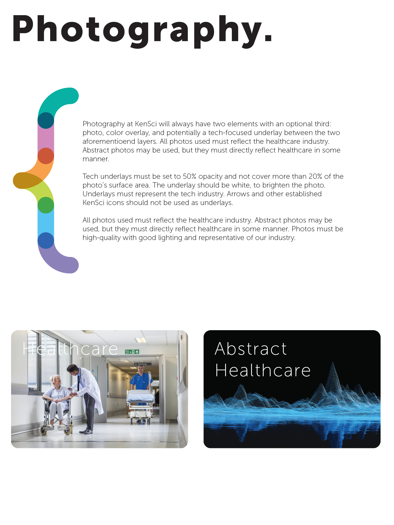
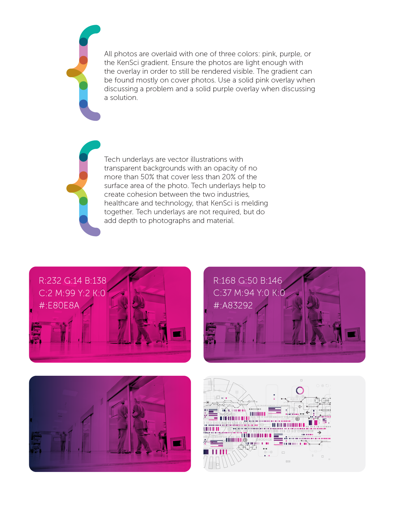
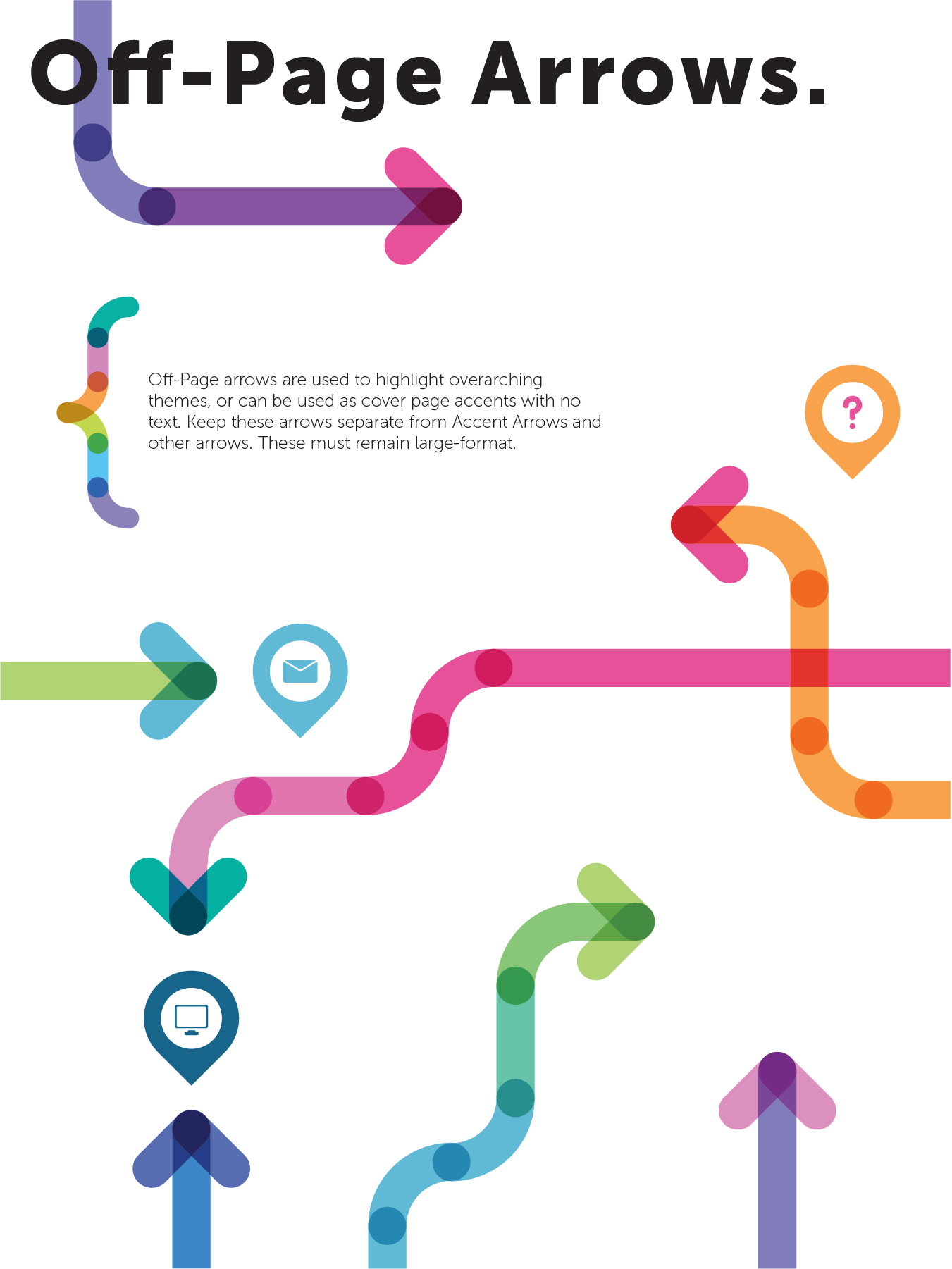
Branding
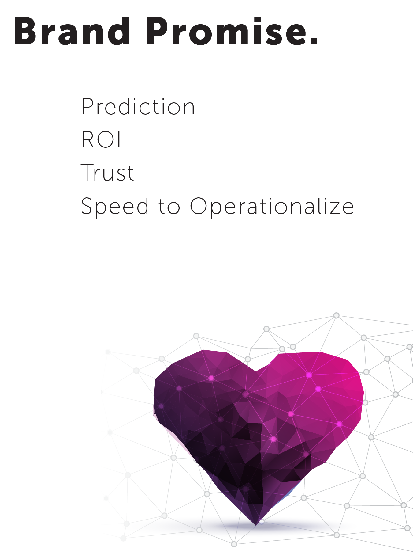
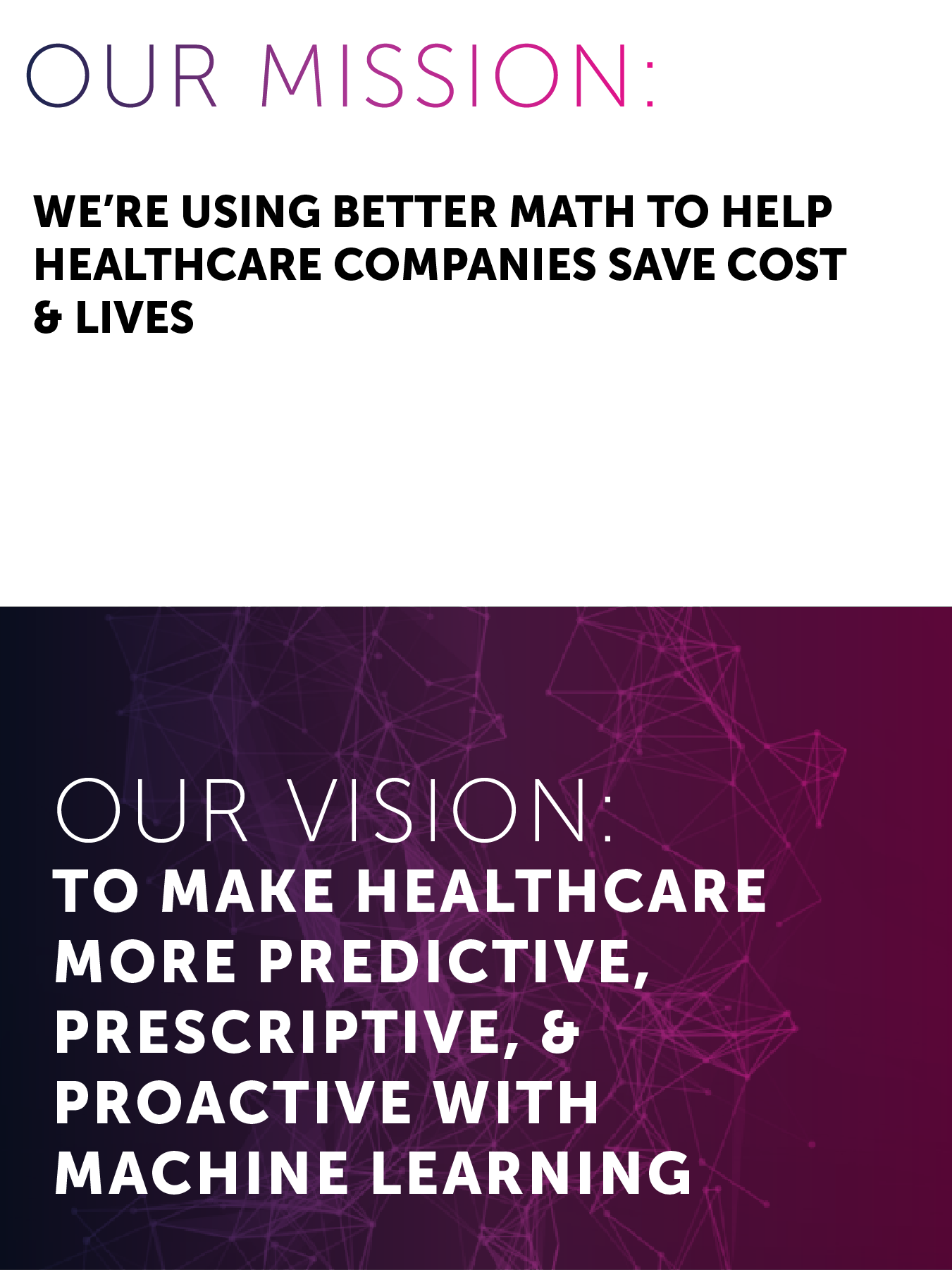
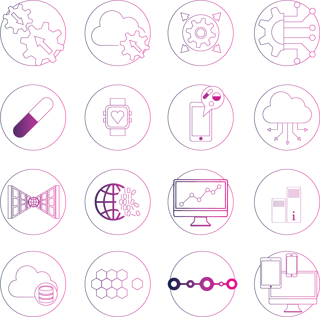
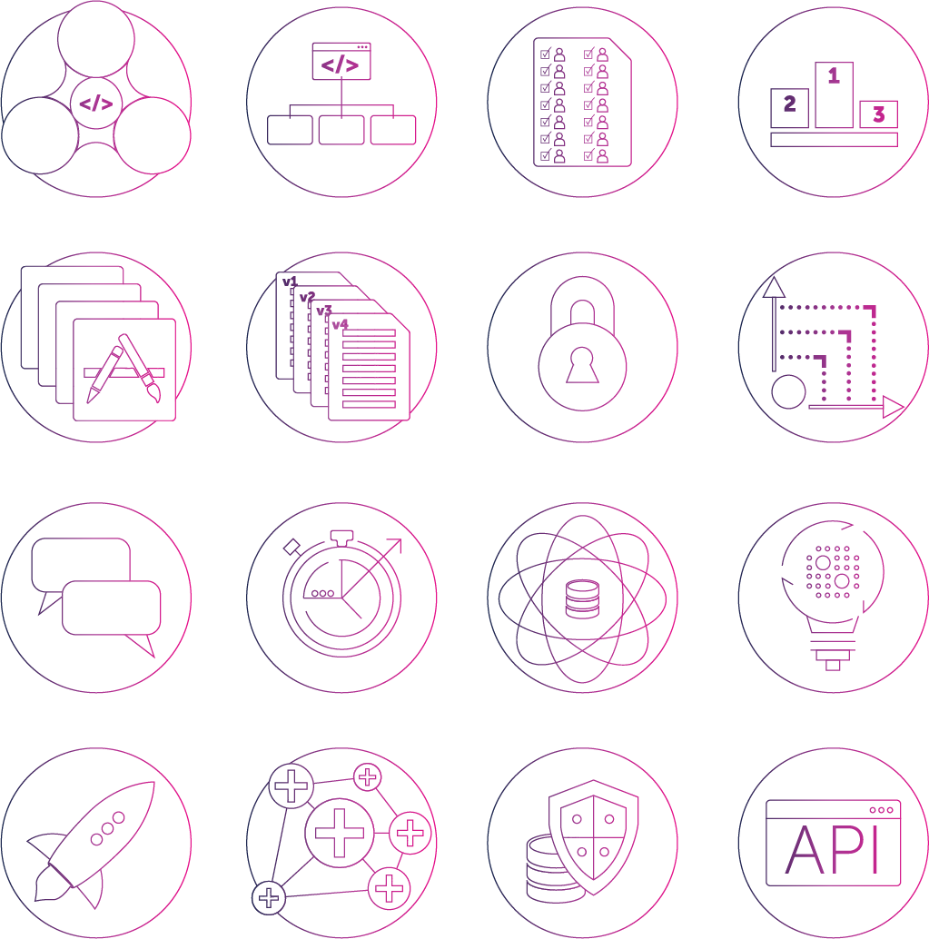
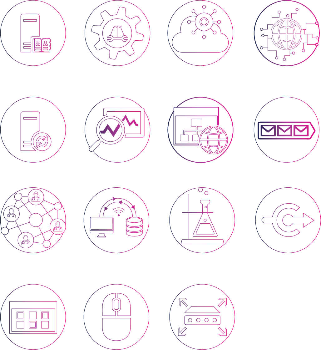
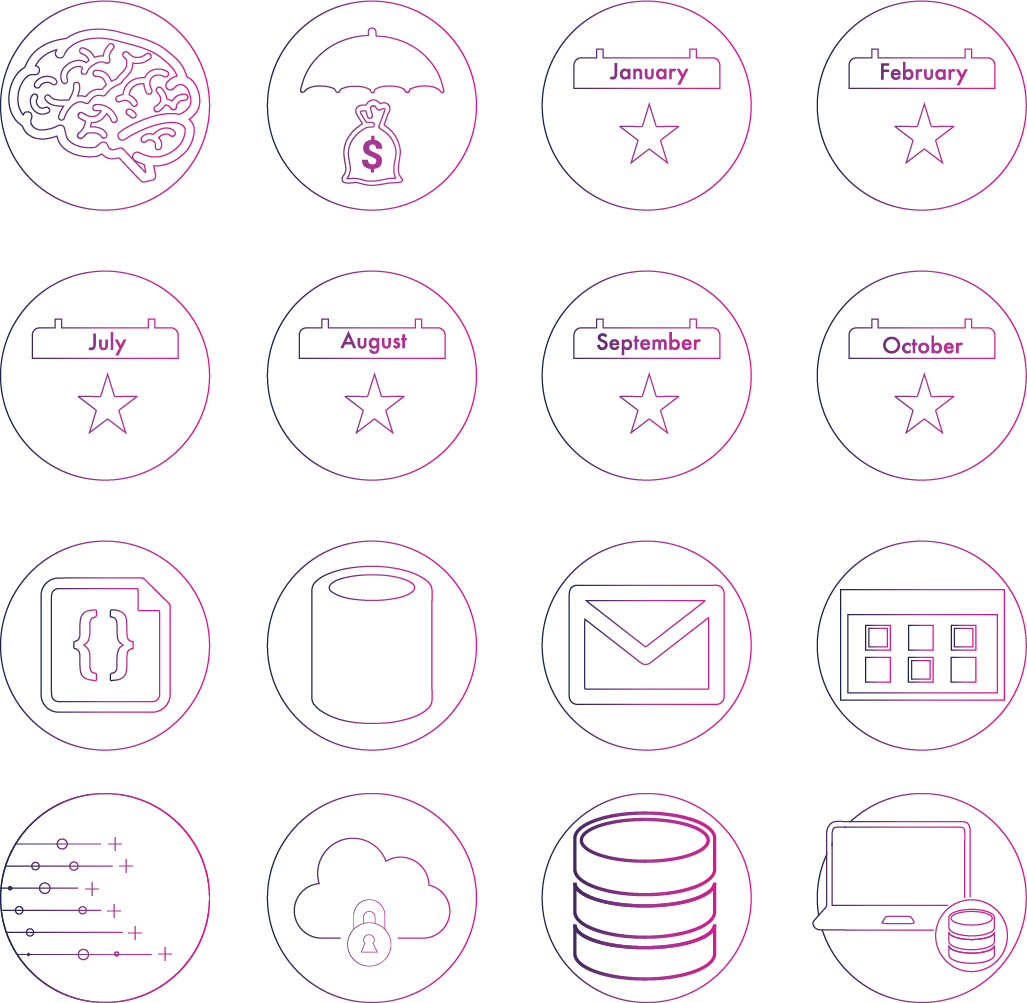
When I began at KenSci, I had very little direction. I sought out opinions from various departments on what the marketing & design needs were. I then set out to standardize the KenSci brand. That started with standardizing the logo and tagline, moving to the vision, mission and values (and pushing that standardized information to the company as part of an internal branding drive), then creating a whole new set of iconography (150+ icons in the first batch I rolled out), photography standards, social media standards, vector design standards, and a technical infographic design language. I then iterated on the brand in 2018 Q4 in order to push out new design elements to the company at the beginning of 2019 Q1. Part of that iteration was developing a unique font for KenSci.
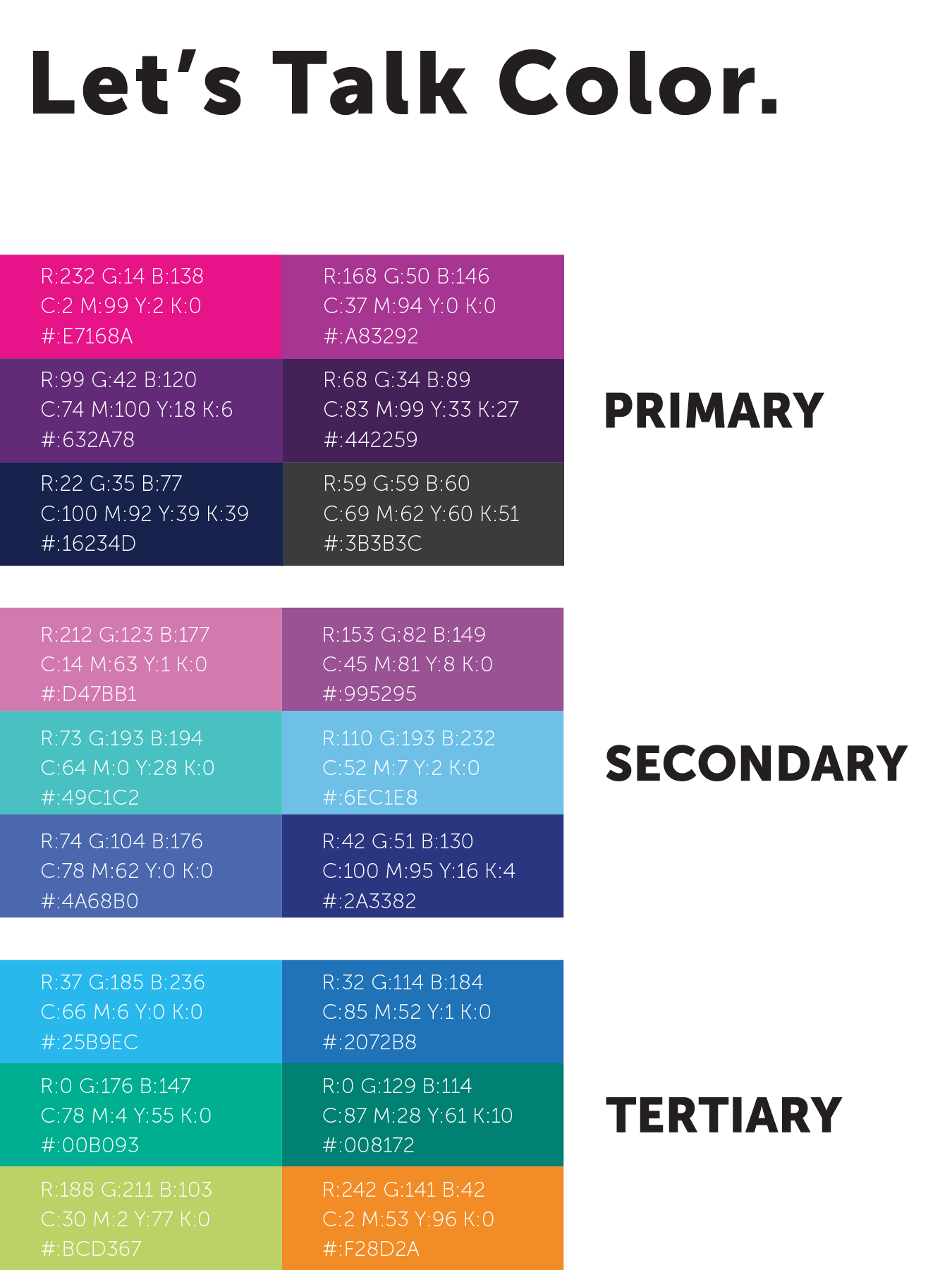
The work began with standardizing and documenting all of the branding work that happened in the past. With minor critiquing I was able to complete a brand book quickly.
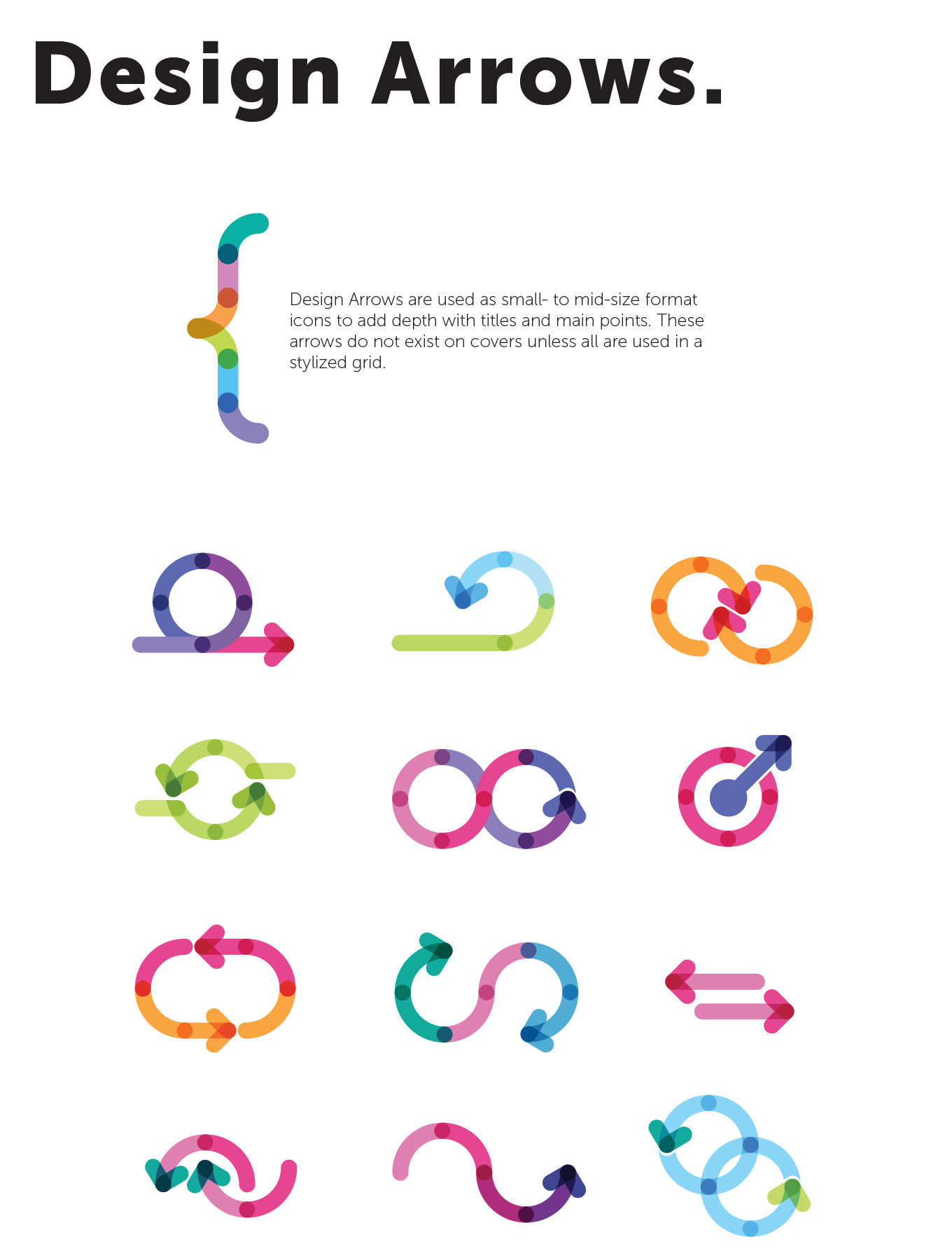
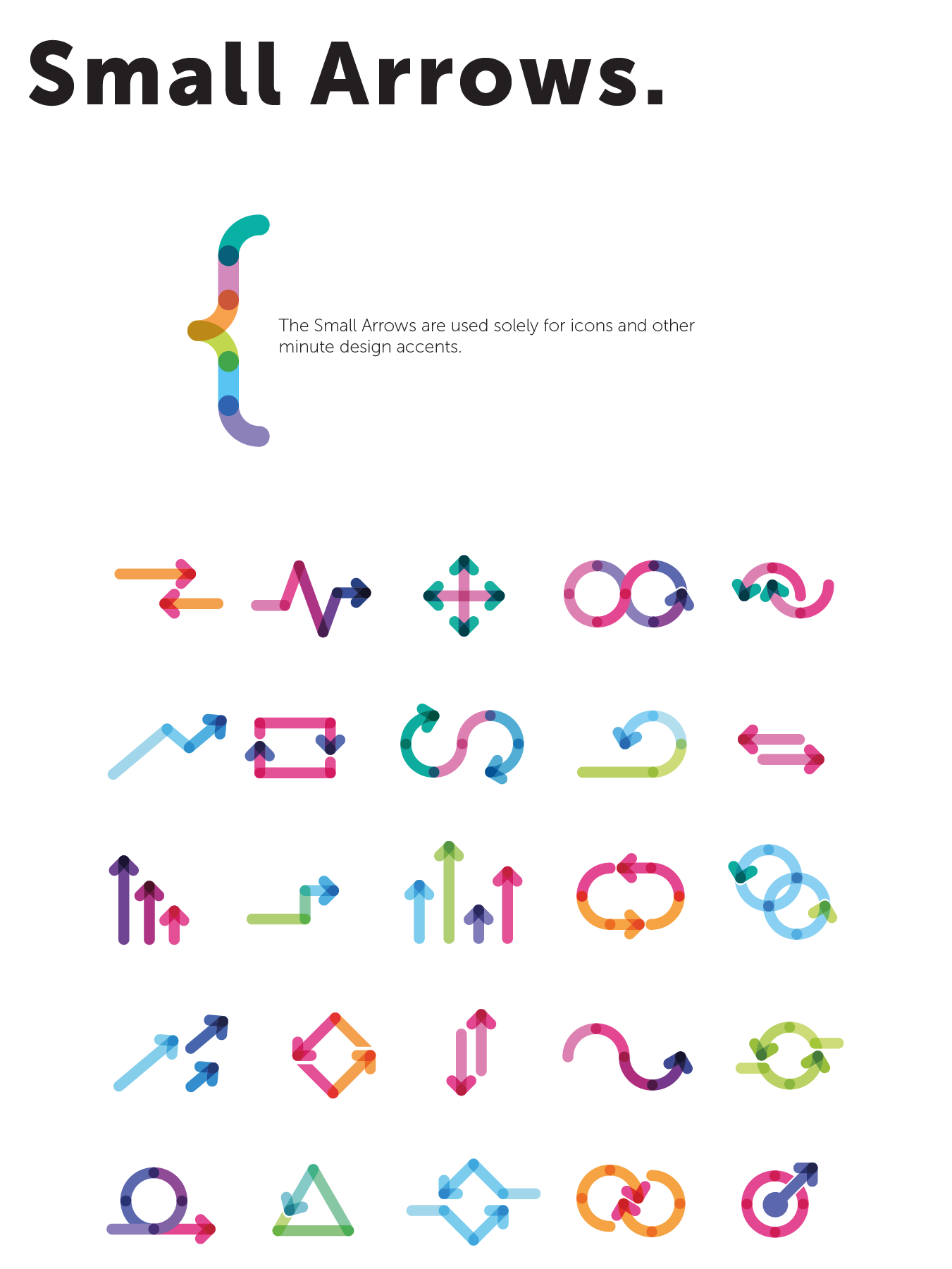
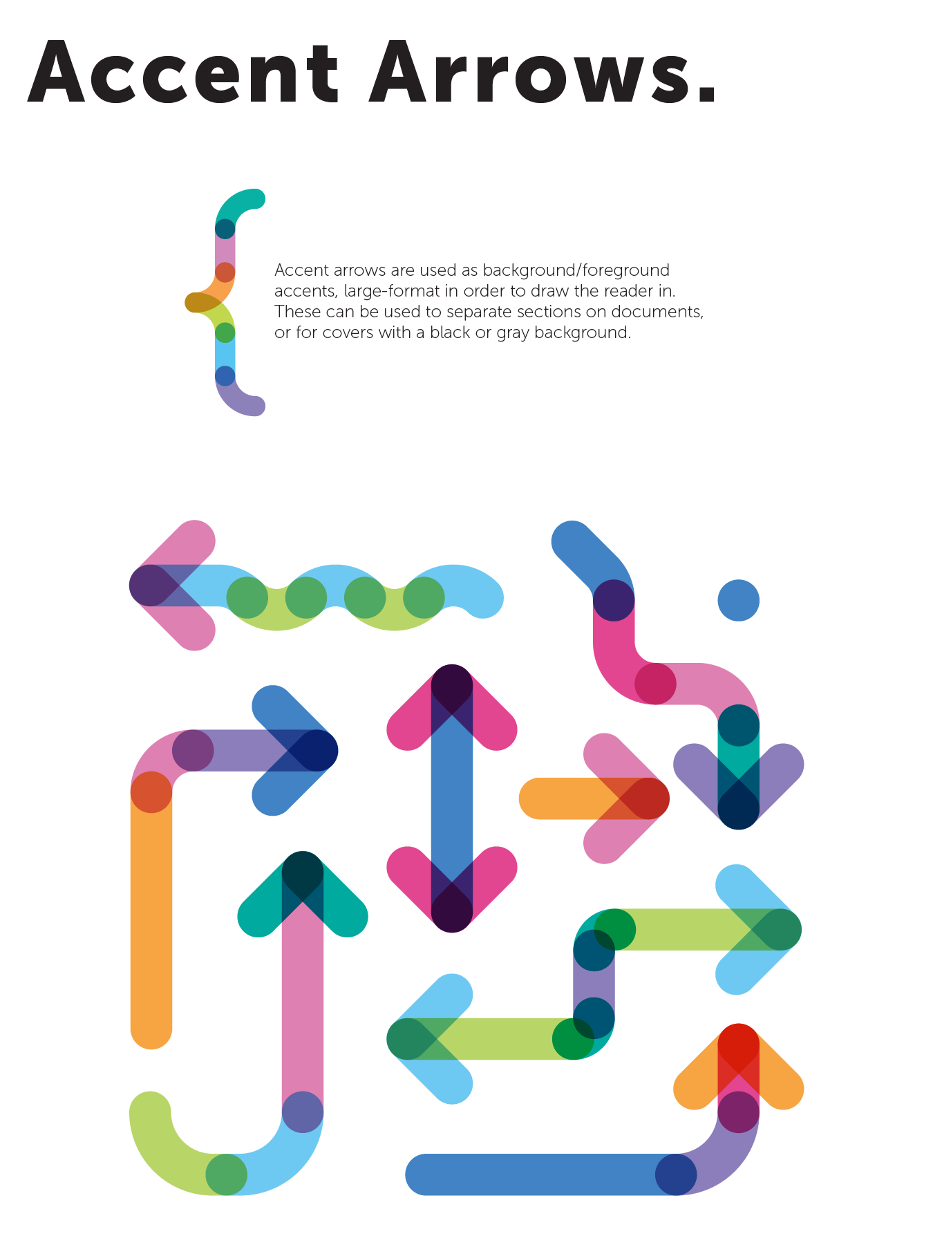
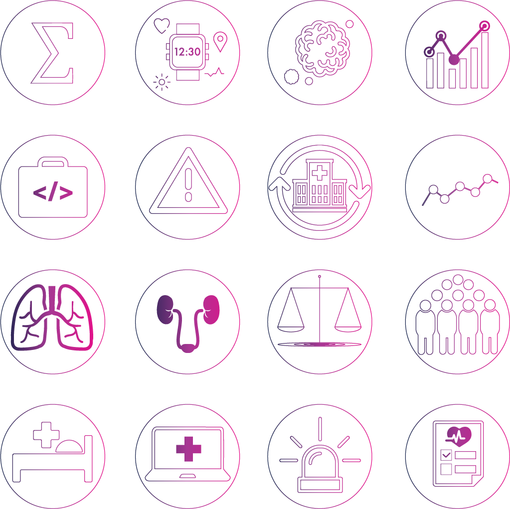
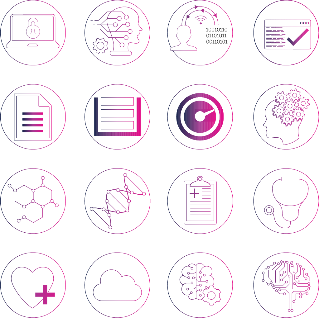
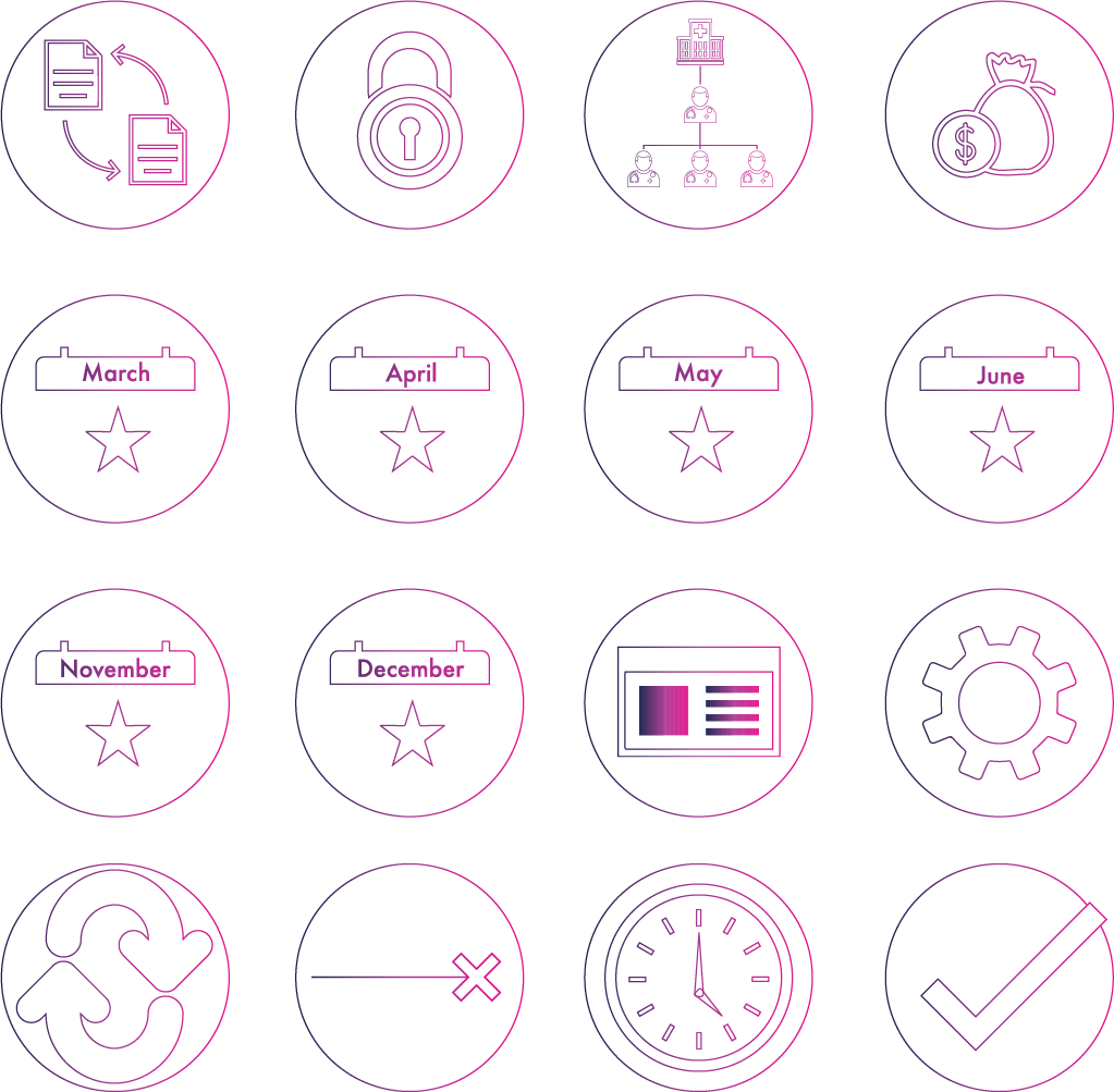
Iconography & Font
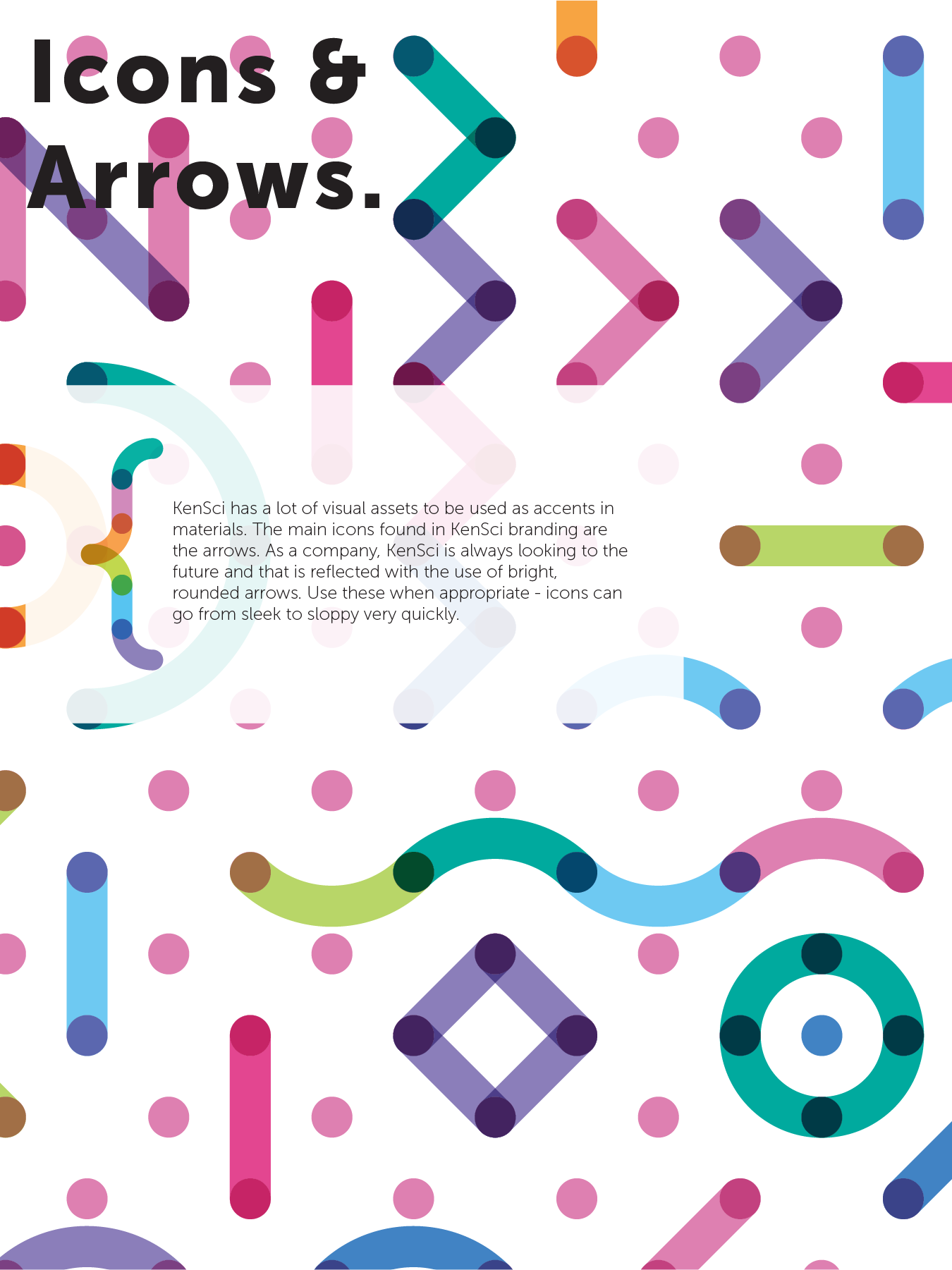
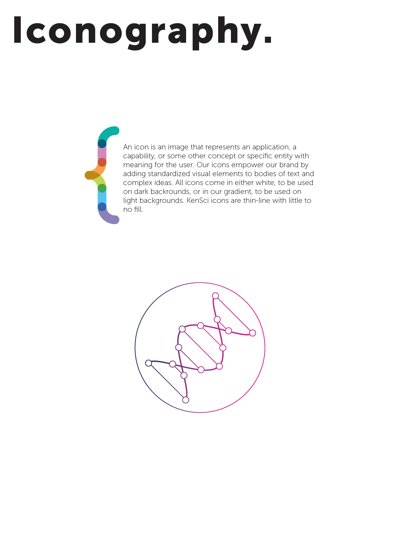
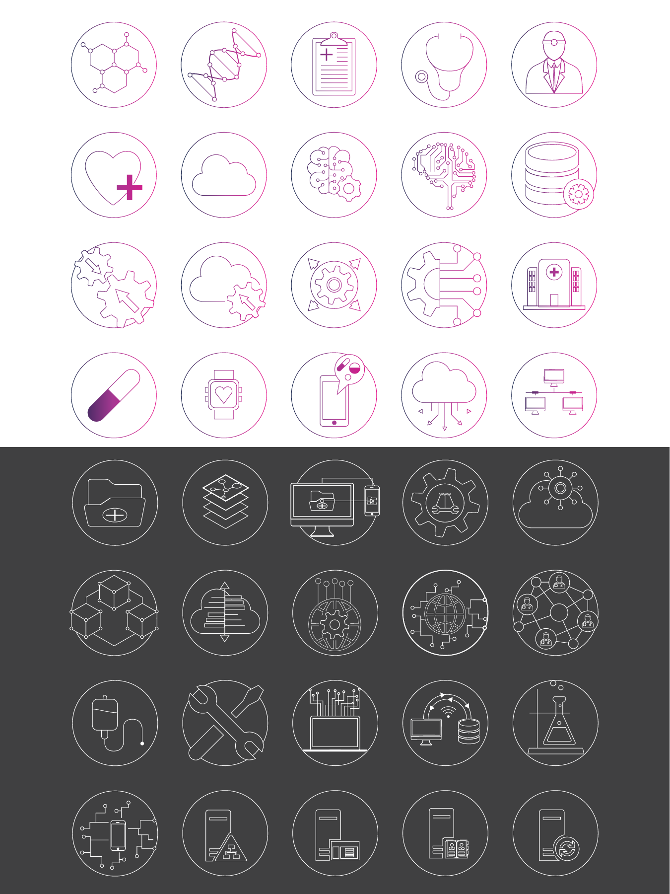
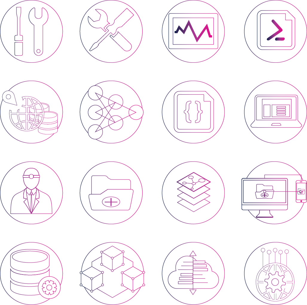
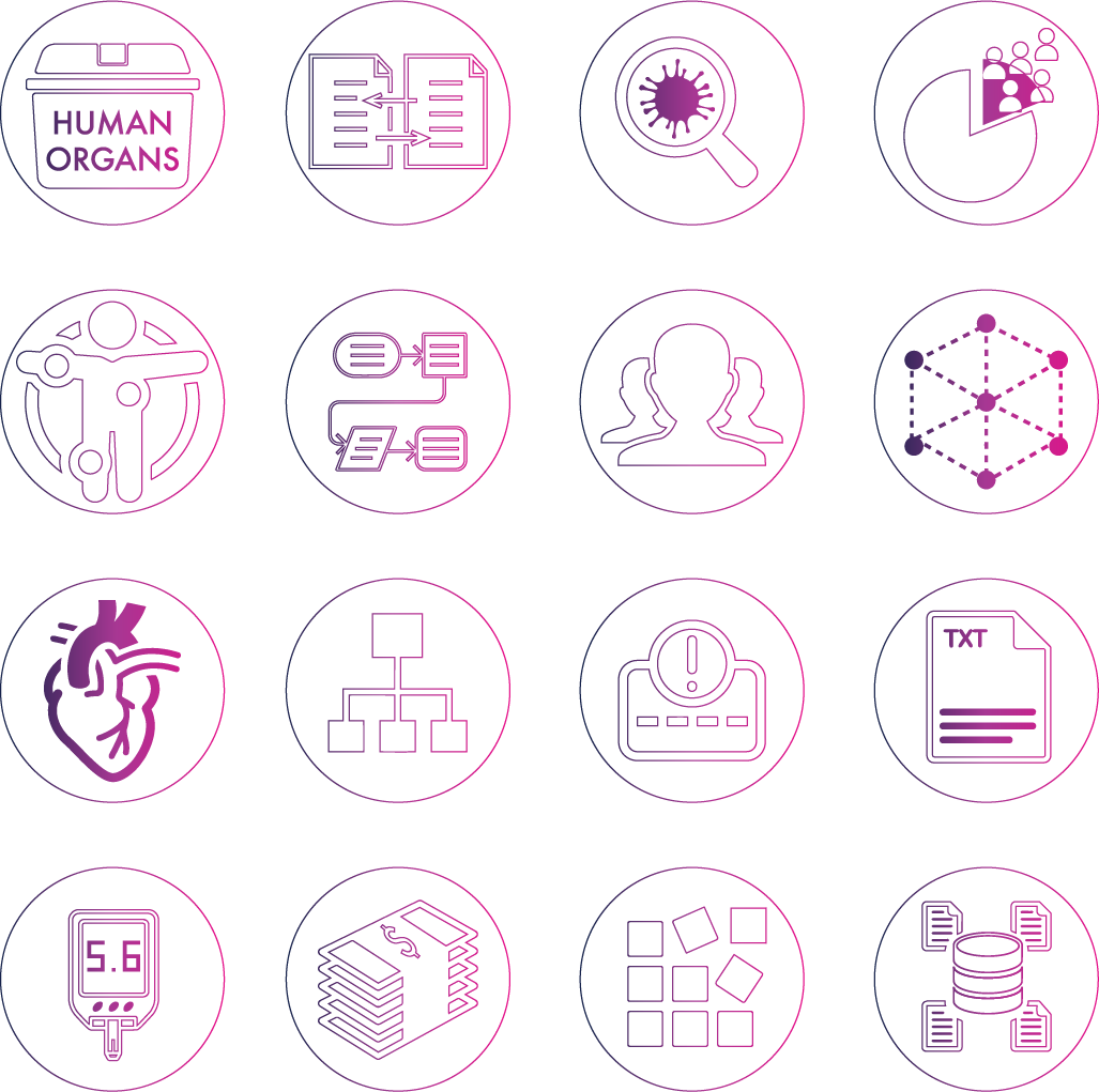
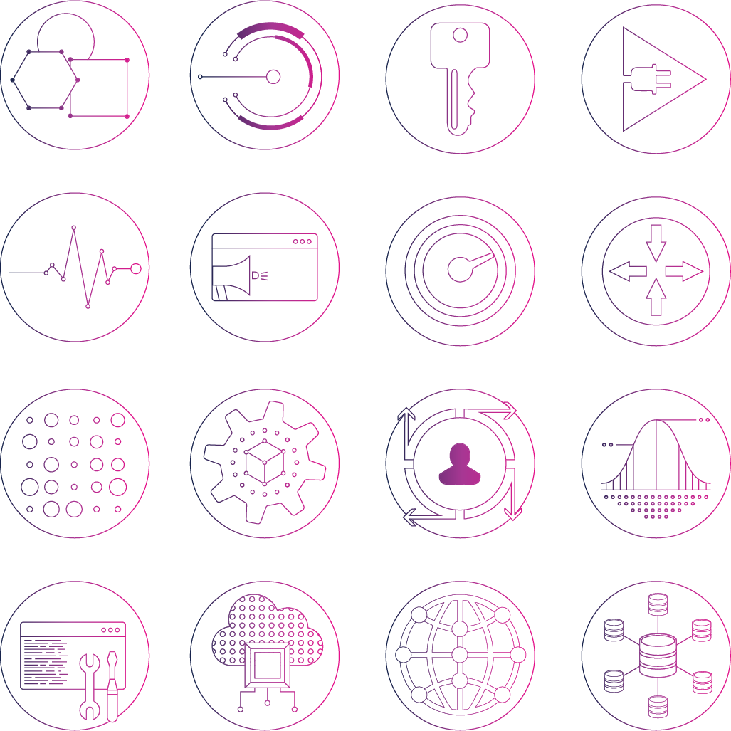
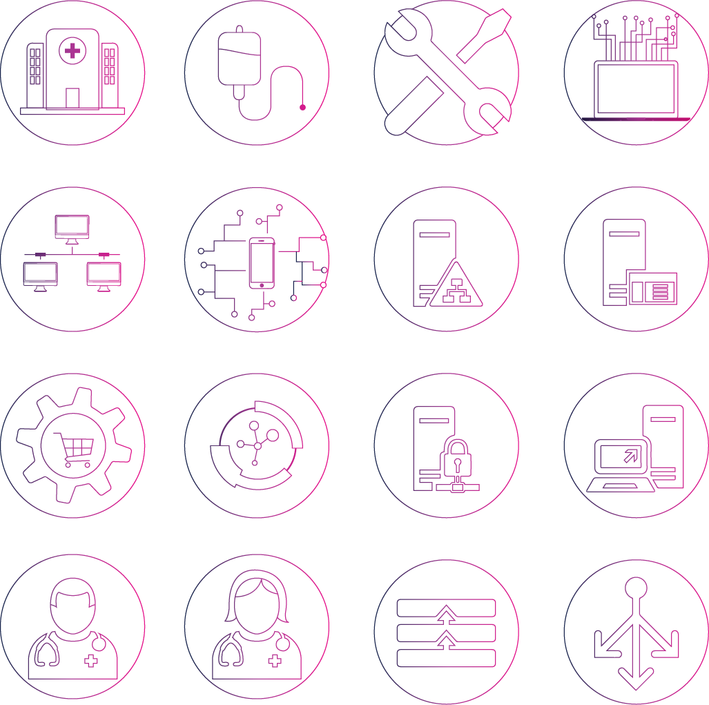
In the first month, I identified the need for icons. After talking to the engineering, PM, product, sales and leadership teams about their immediate and secondary needs, I created a list of 150 icons that I released to the company. I committed to designing and releasing a minimum of 25 additional icons per quarter.
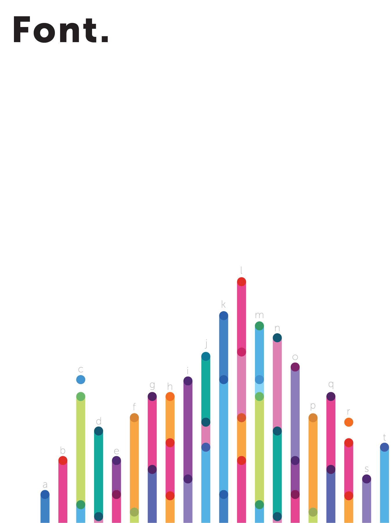
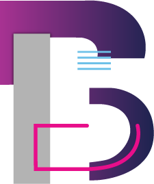
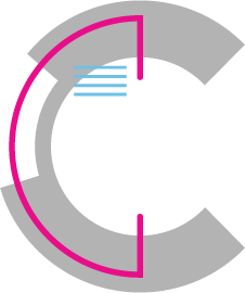
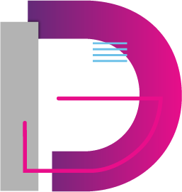
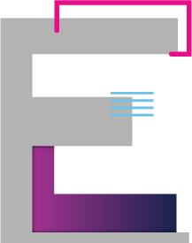
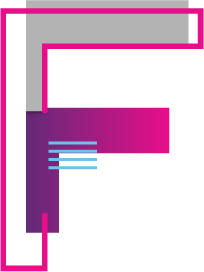
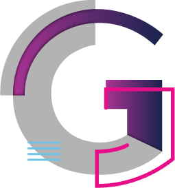
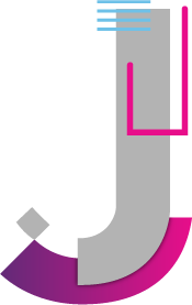
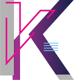
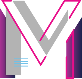
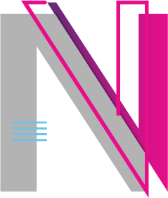
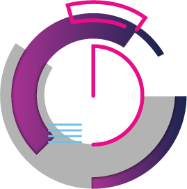
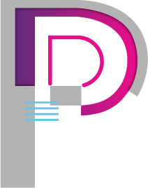
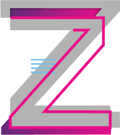
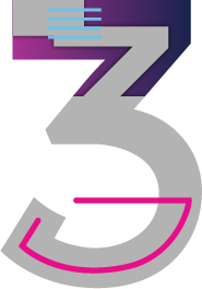
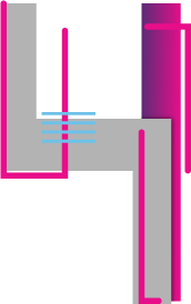
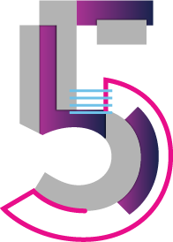
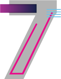
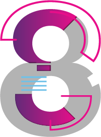
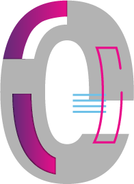
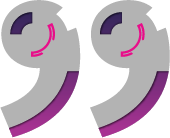
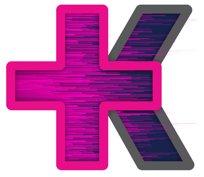
In the second year of the brand, I worked to create a new, unique font for KenSci to be used on their materials.
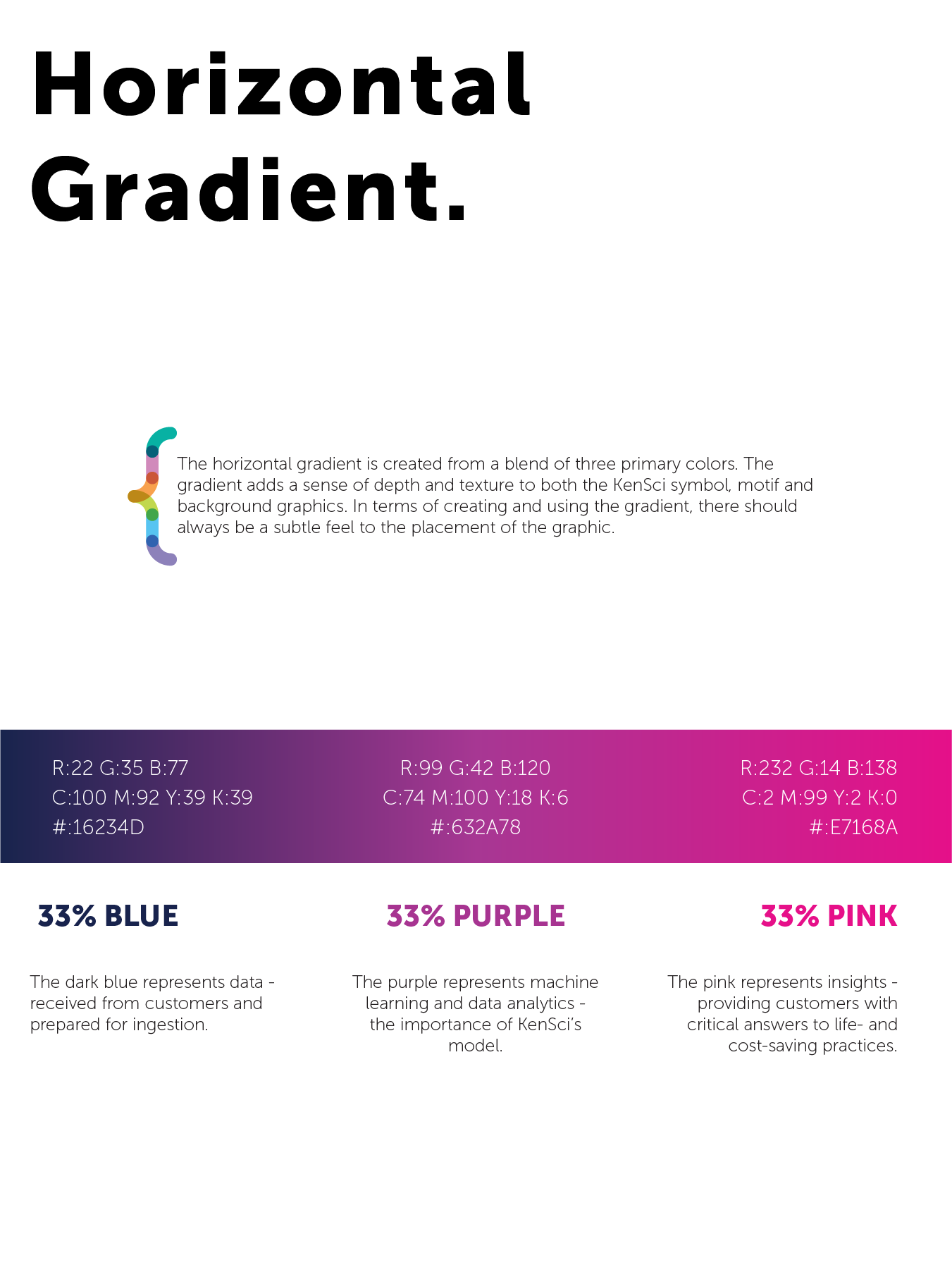
In the second iteration of the brand, I created a unique font that represented KenSci as a brand. It included multiple layers per letter to show the levels of the healthcare system, the gradient as a representation of KenSci, and connection line styles that bring the two together.


'Who We Are' Introductory Video
Presented at Microsoft Inspire; I had two weeks to complete this project. I wrote the script, created a storyboard, developed all the design assets, animated those assets and stitched them together, and then recorded a voiceover for the video. It came together and was presented at Microsoft Inspire as part of KenSci's 'Partner in Healthcare' Award.
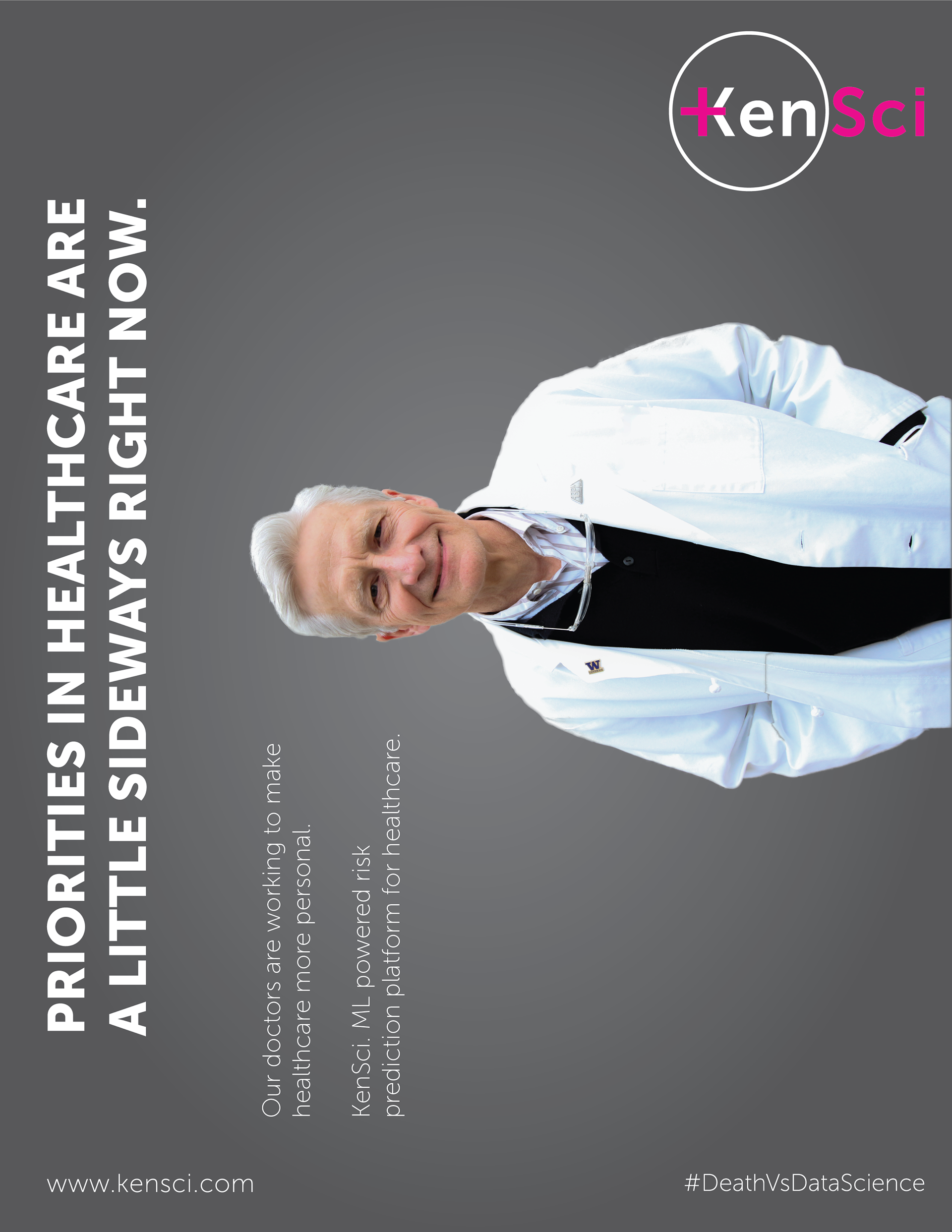
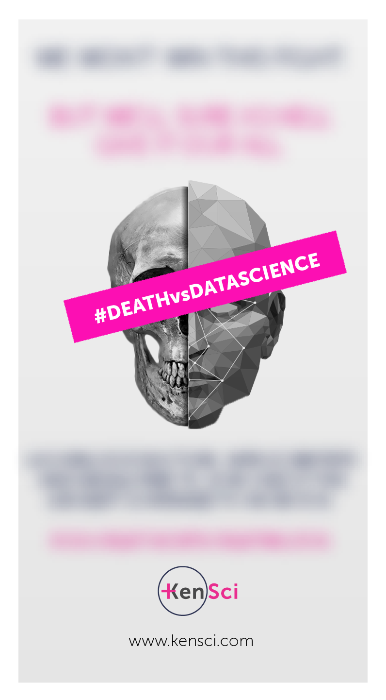
Advertising
There were a few opportunities to create advertising for KenSci. One unique example was when KenSci won the 2018 & 2019 100 Best Places to Work award with with Puget Sound Business Journal. The first ad I ideated, designed, photographed and wrote the copy for. The second ad I led the creative direction.
Marketing Materials
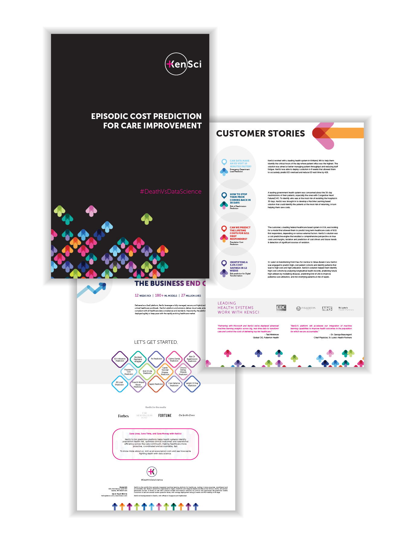
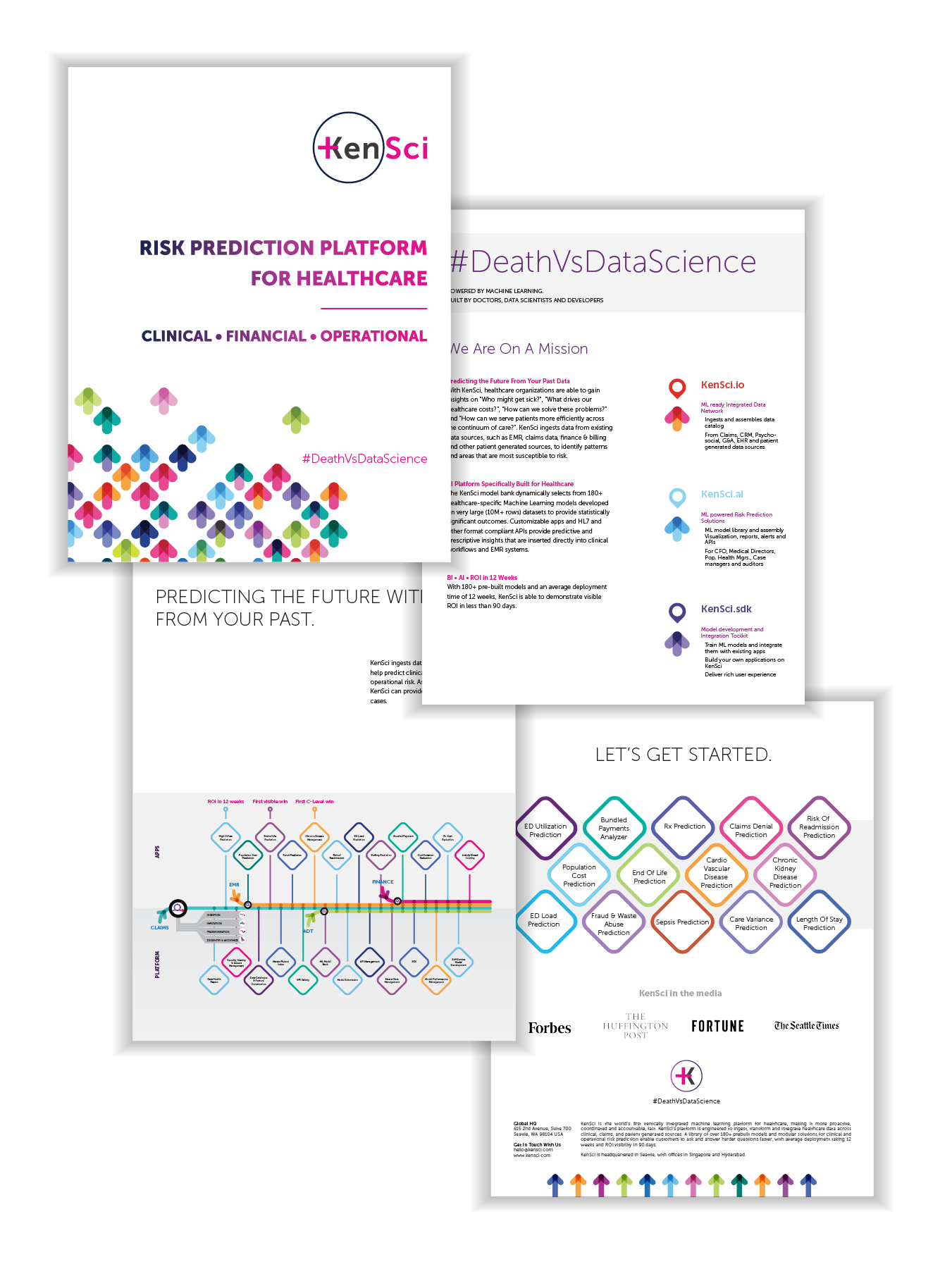
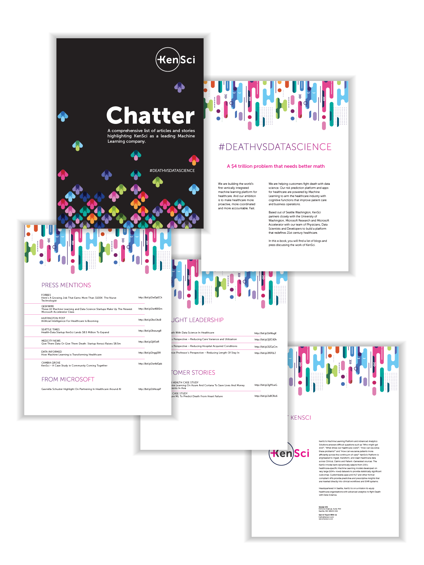
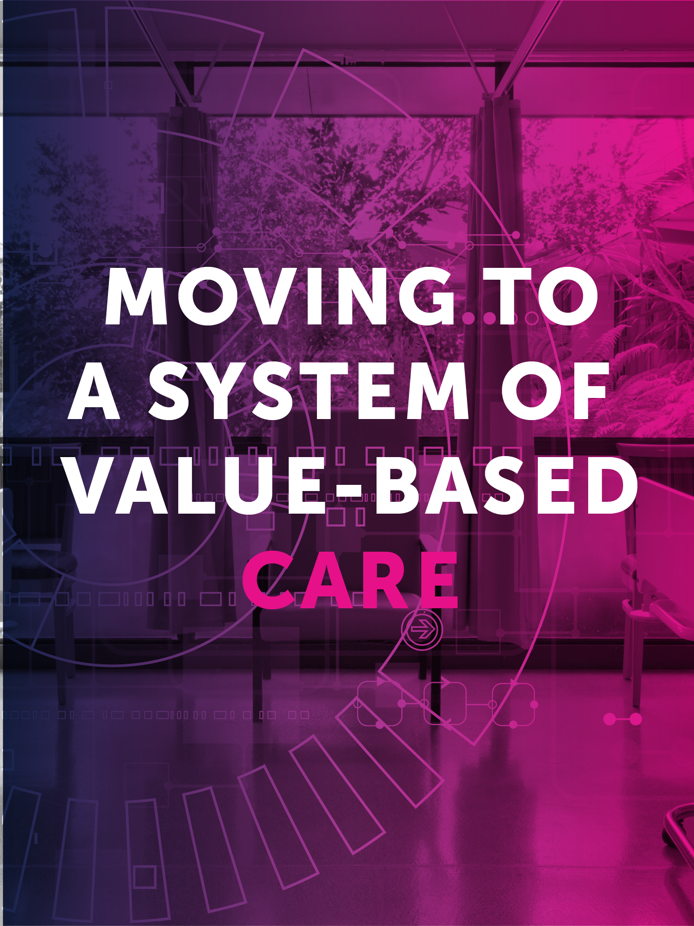
Another section of design I identified as necessary was creating standard marketing materials for the sales and leadership teams. That included created one-pagers, infographics, booklets, how-to guides, and other materials. For each of the pieces, I identified the necessary parties to be involved, worked with them to collect the appropriate and correct information, designed pieces around their needs and specifications, and then delivered those pieces to the pertinent teams or the whole company.
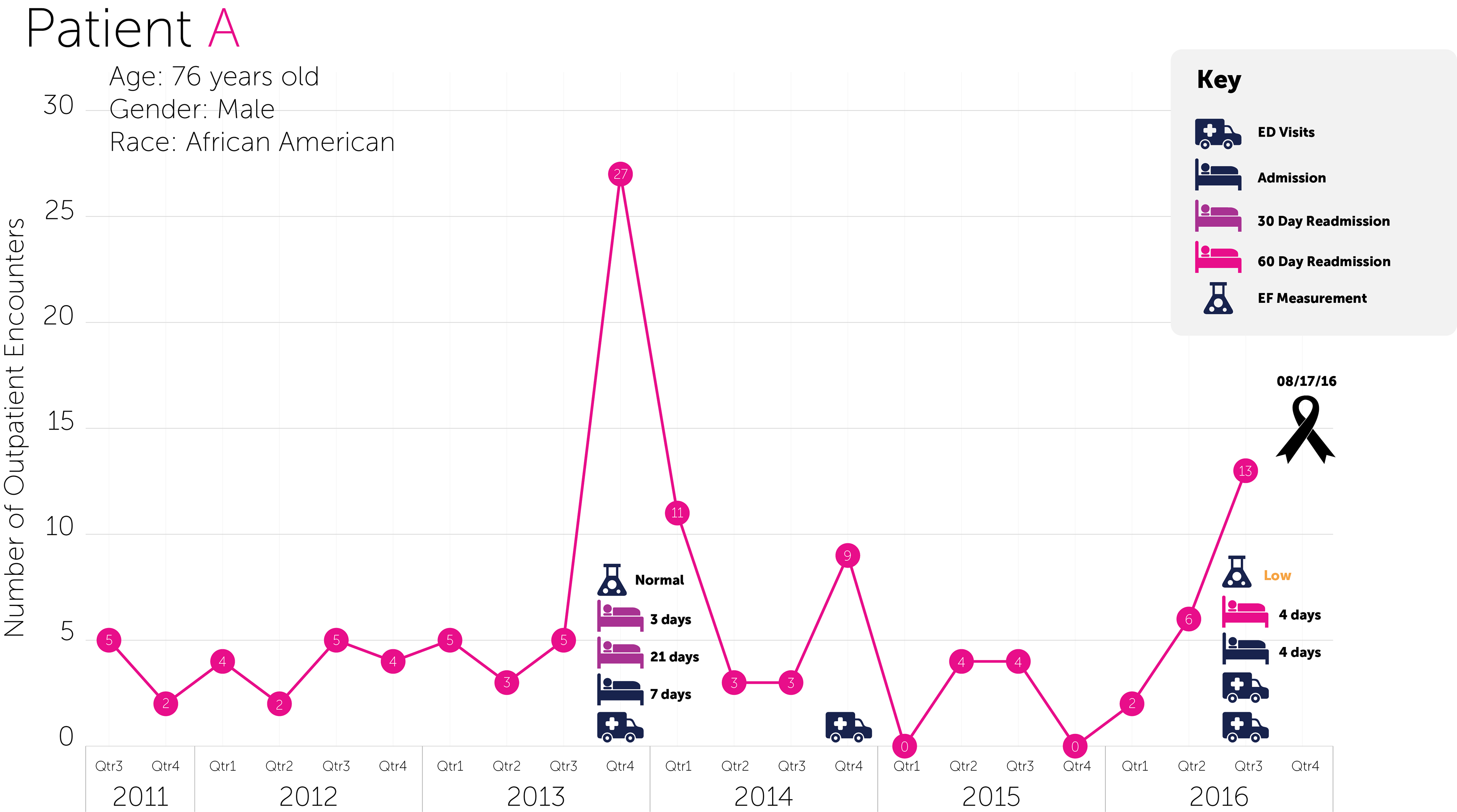
Seen here is a fake hospital I created as a visual aid for talking about KenSci's platform.
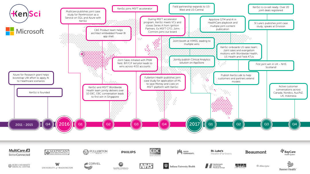
This ultimately became an animated slide used to show the partnership between Microsoft and KenSci over the years.
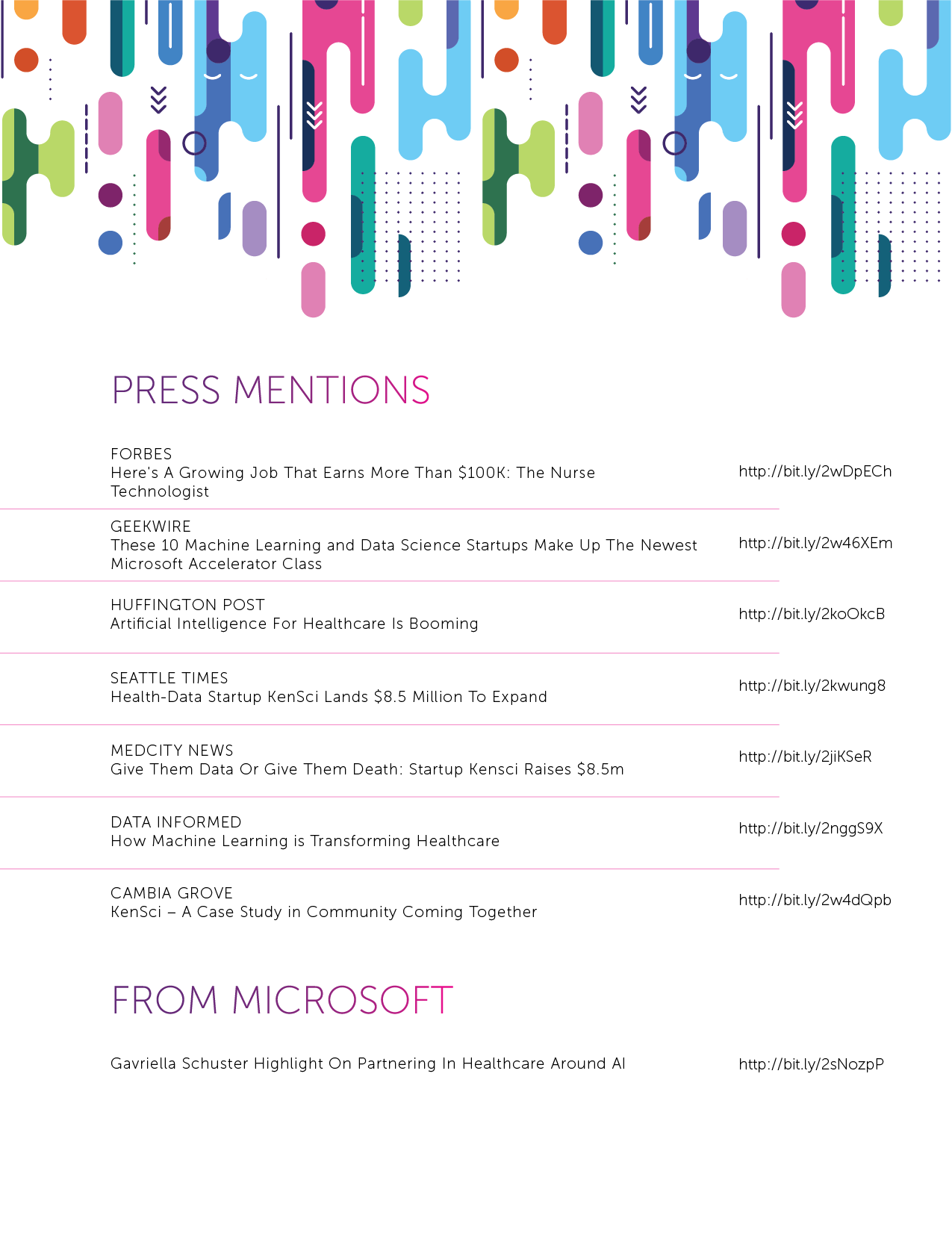
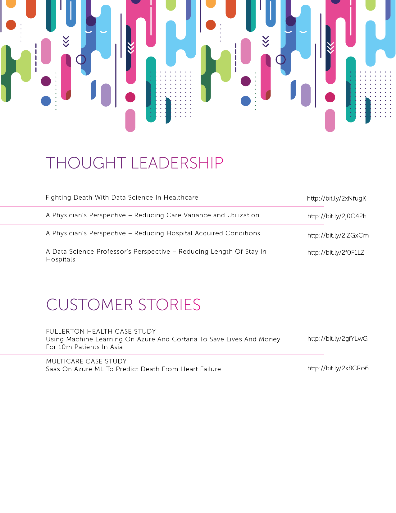
These two brochures highlighted all of the research and press that KenSci published or was featured in, respectively.
This is a quick overview of KenSci that was sent to new potential partners to get a better understanding of the company. I worked to develop the language with the chief growth officer, Director of Marketing, VP of Product and VP of Sales.

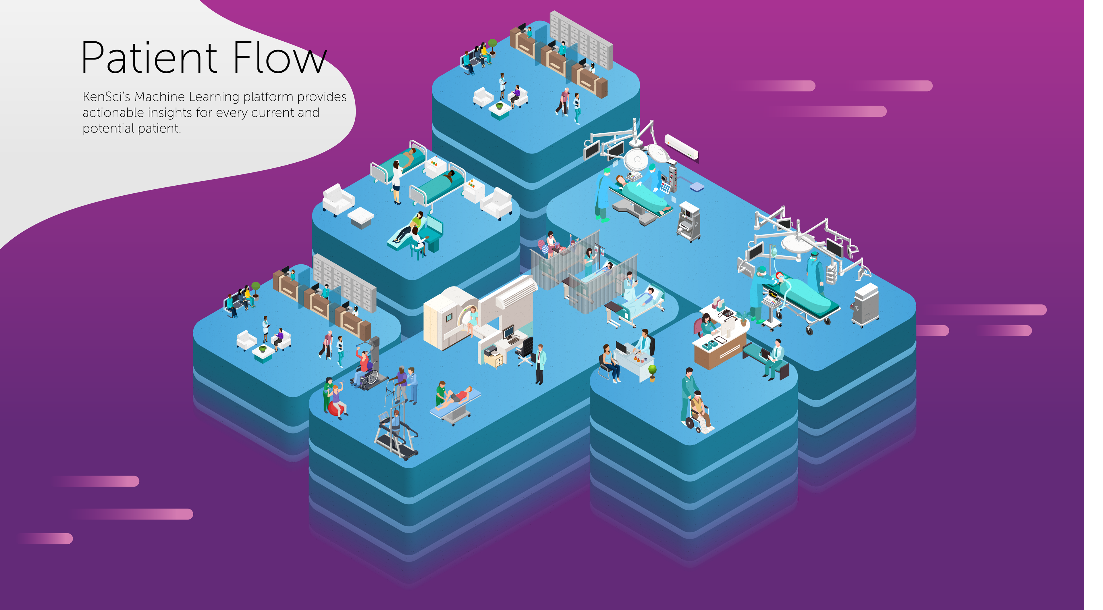
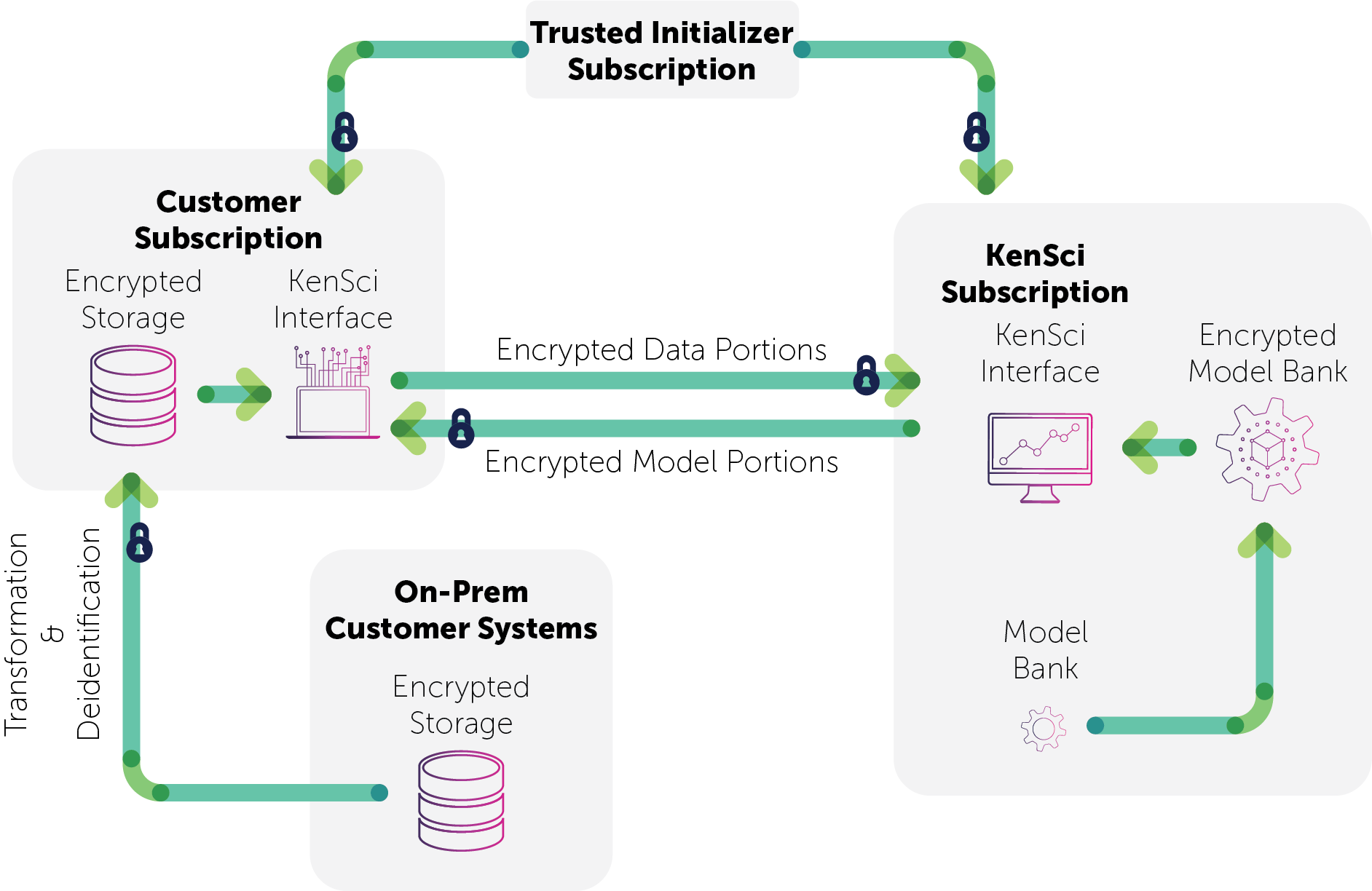
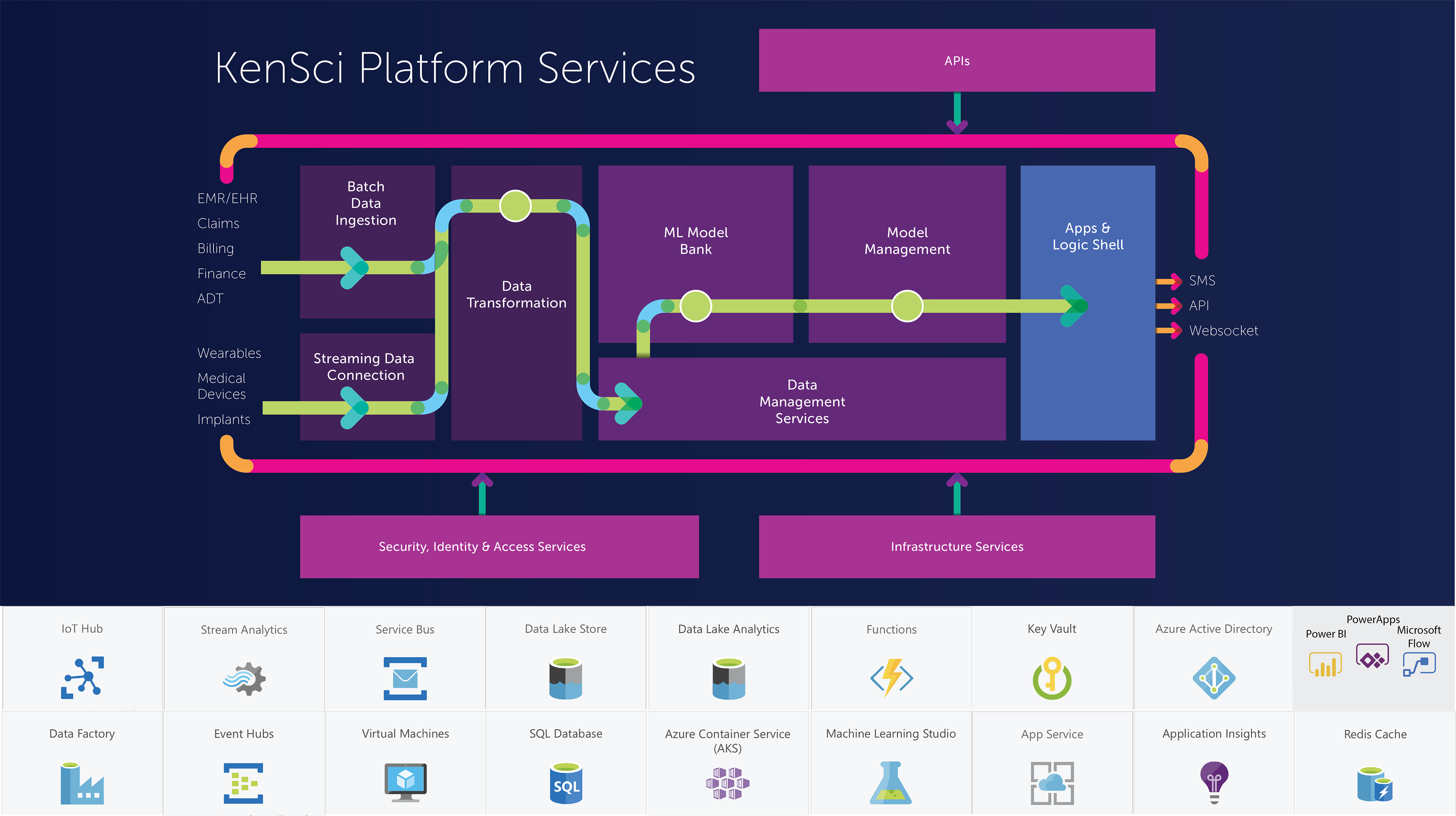
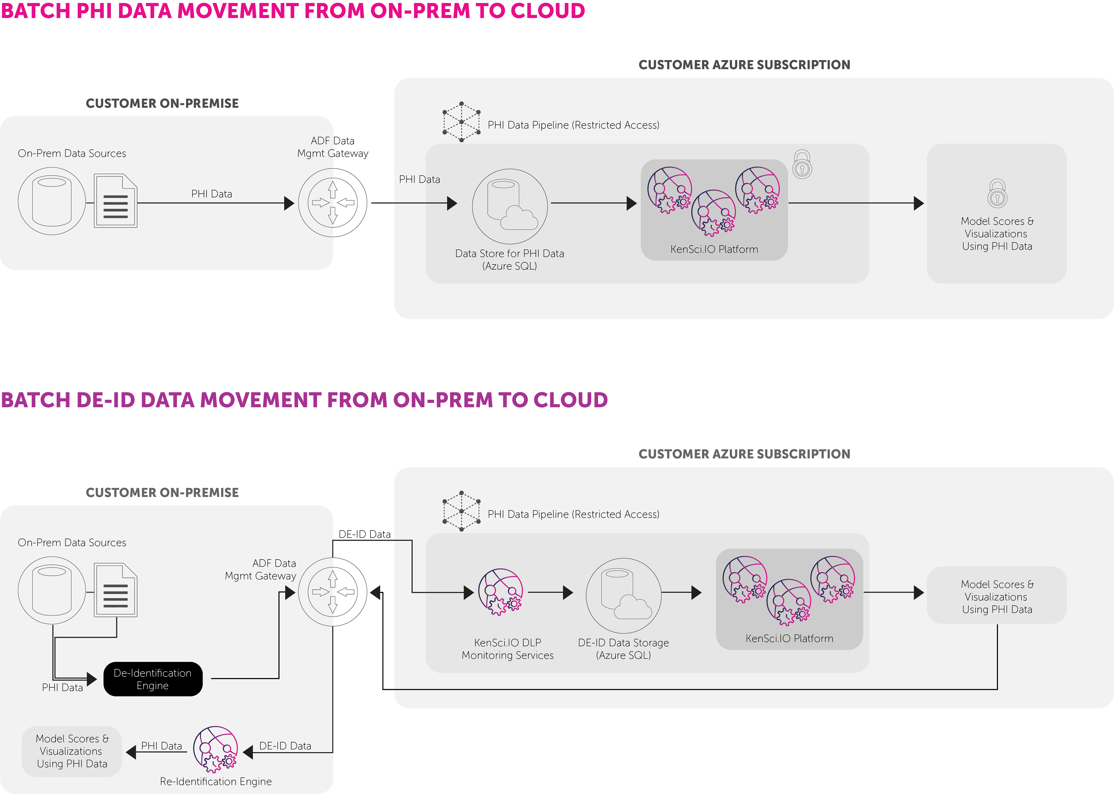
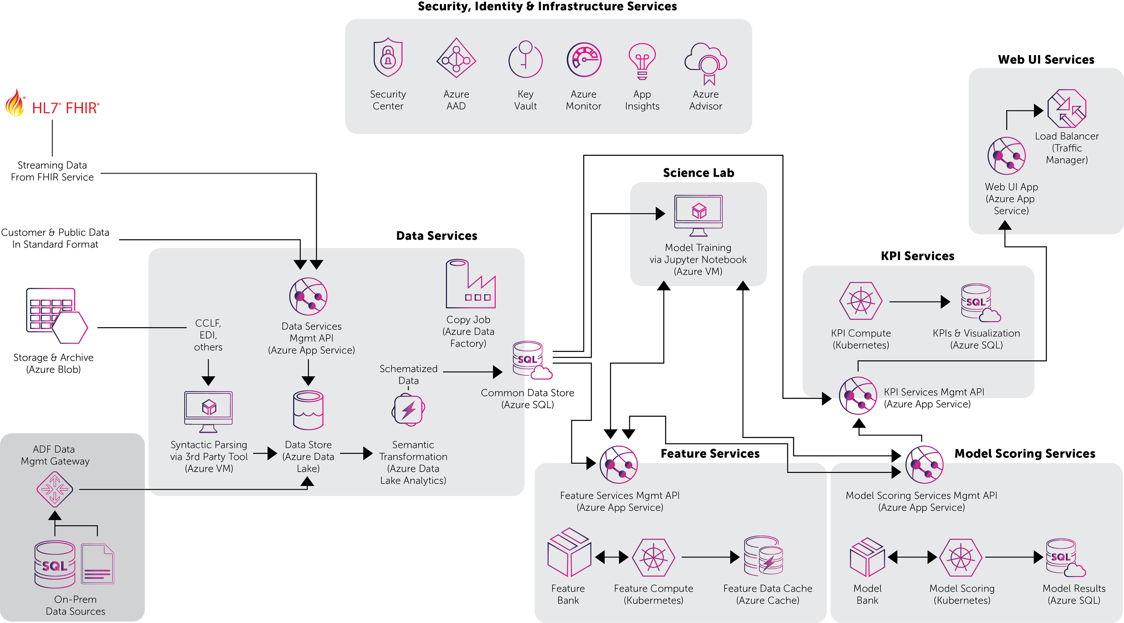
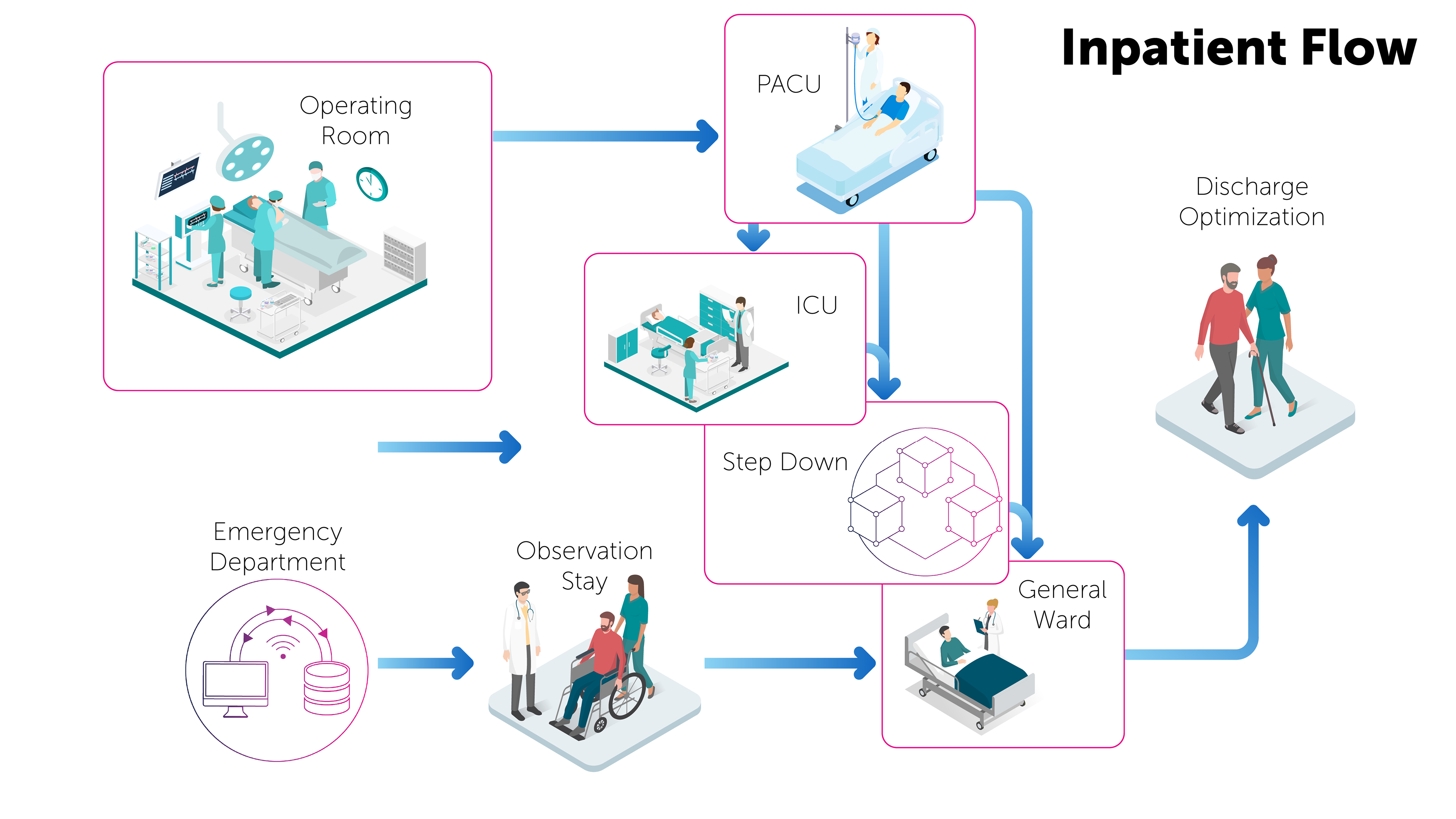
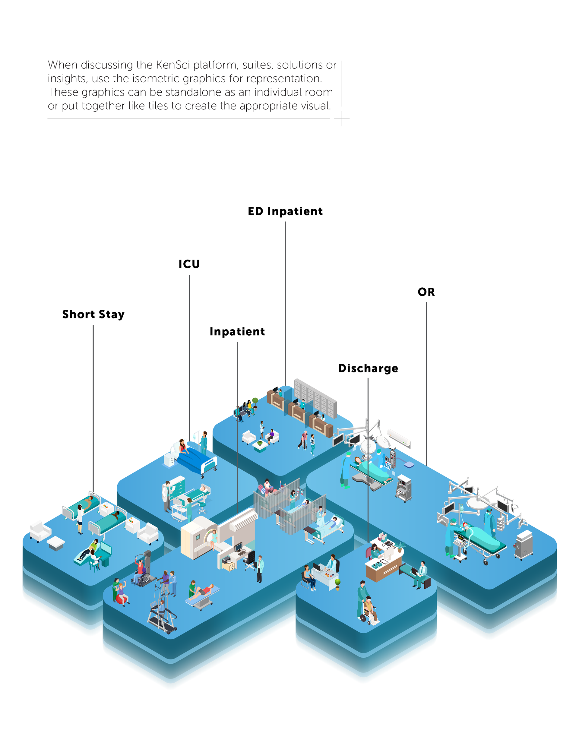
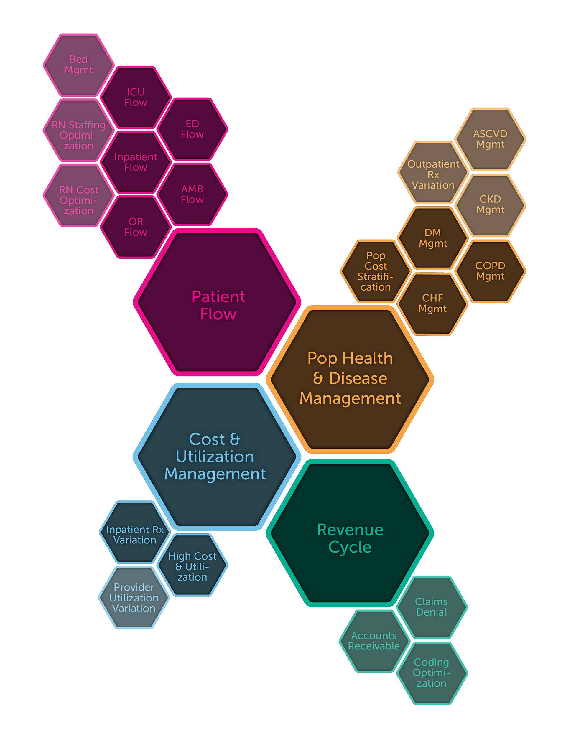
The Patient Flow diagram was an in-depth visual that was used in many case studies, across sales presentations, within product demonstrations and with potential partners/funders. I designed this so the piece could be shown as a whole, to visually represent each part of the hospital that KenSci could support; as well as being able to easily break apart the sections. The entire graphic was configurable to be as versatile as possible.
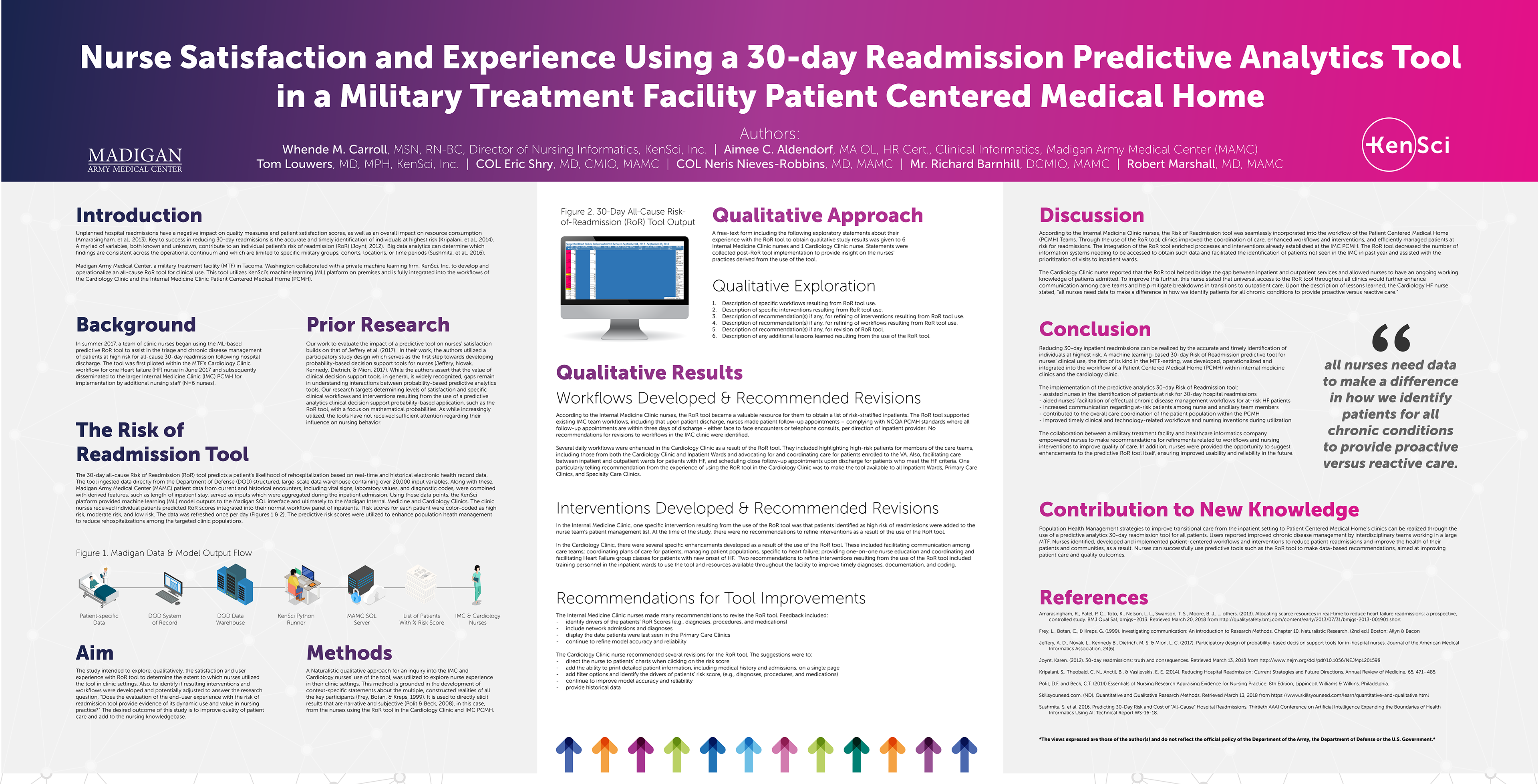
Poster Created for ANIA (American Nursing Informatics Association
I worked with the head nurse to create this large-format poster for a conference she was attending. She provided me all of the information, and specs for the poster. I then set out to create a large (8-foot) poster.
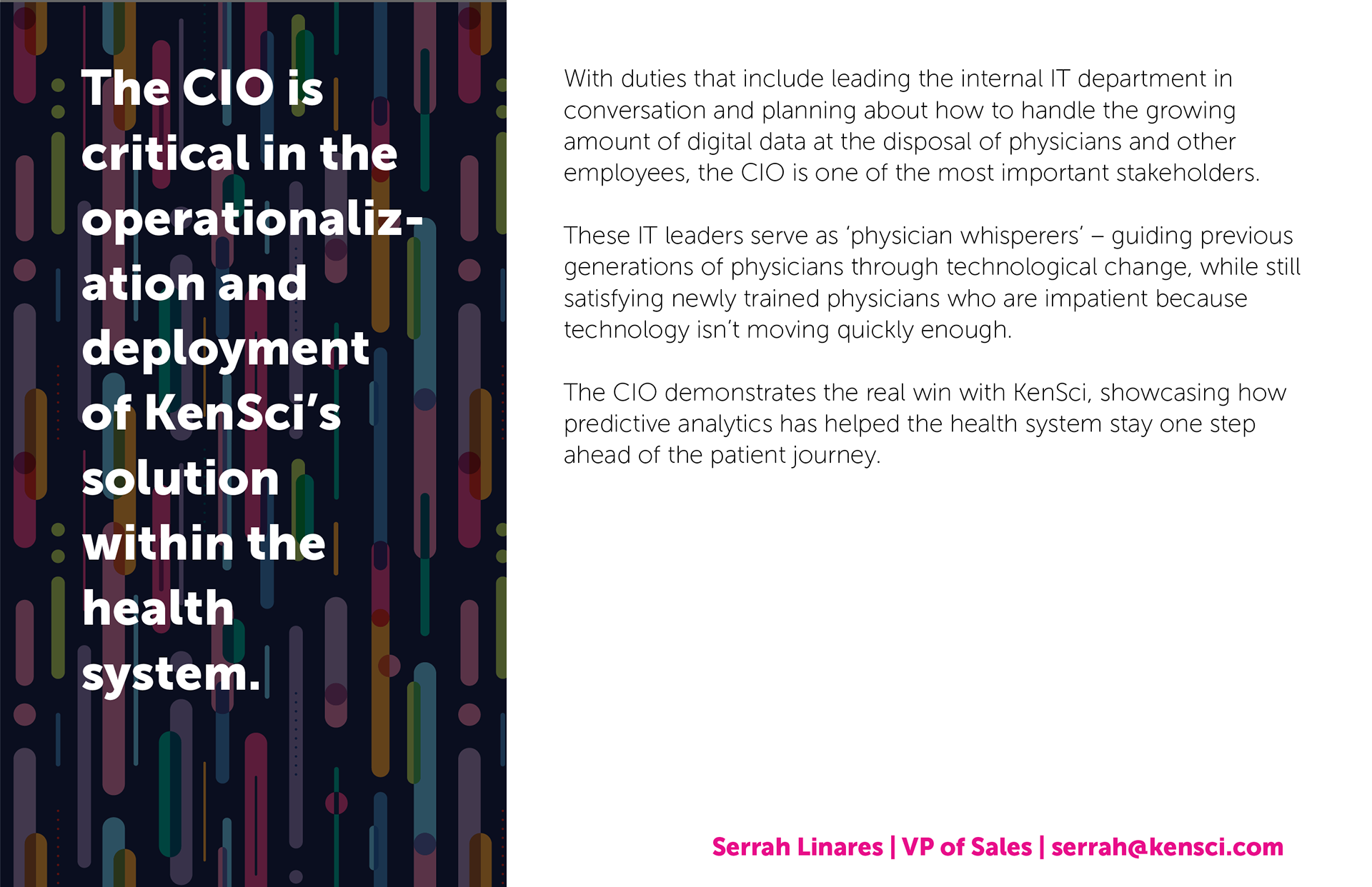
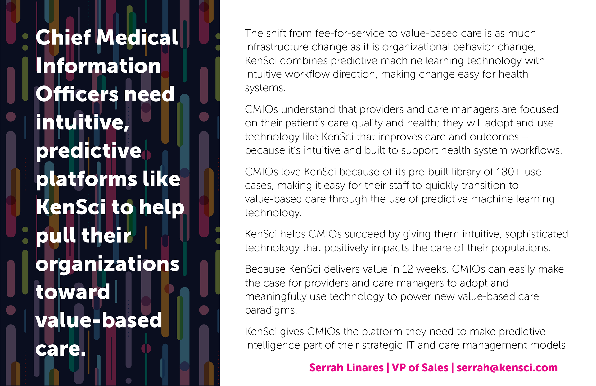
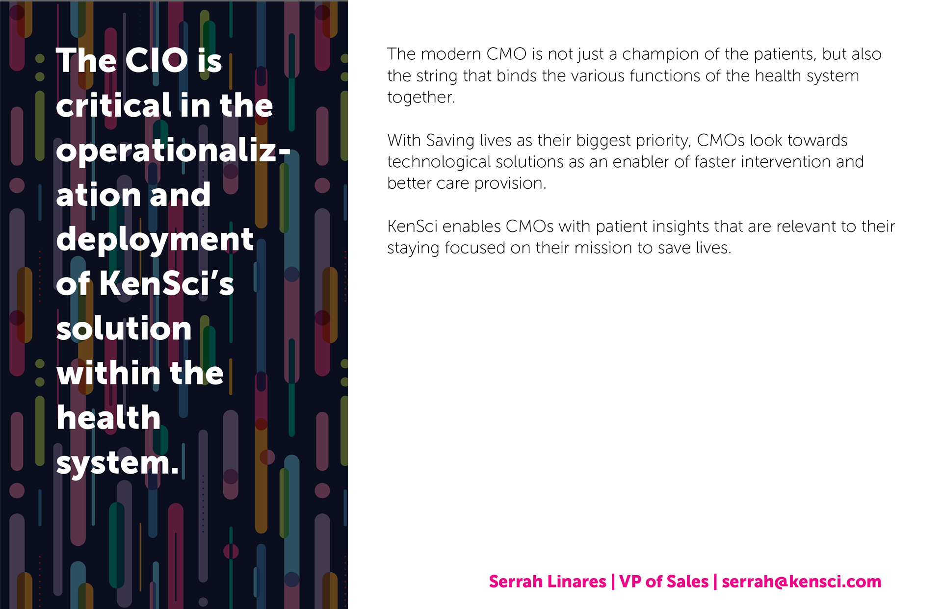
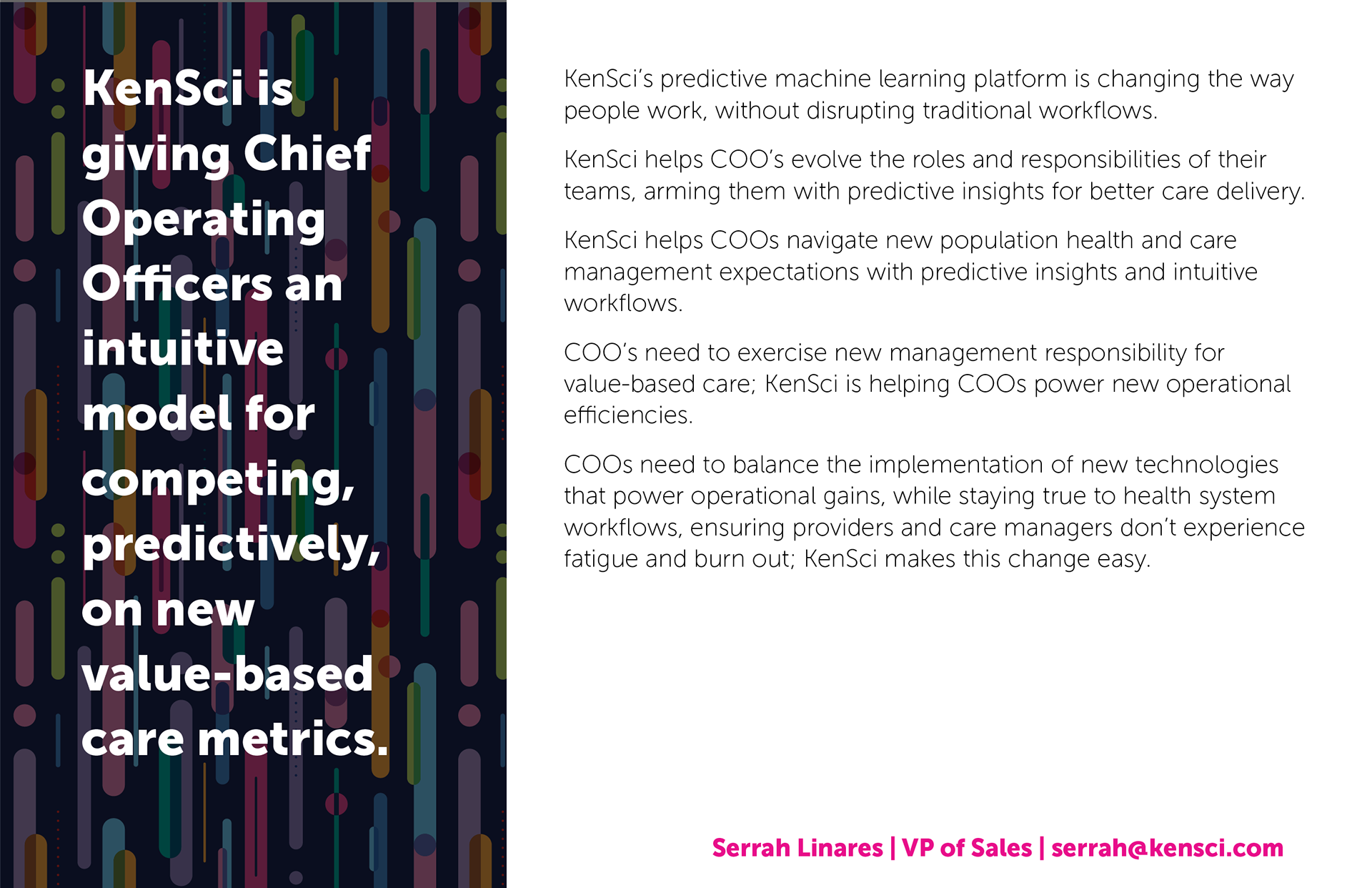
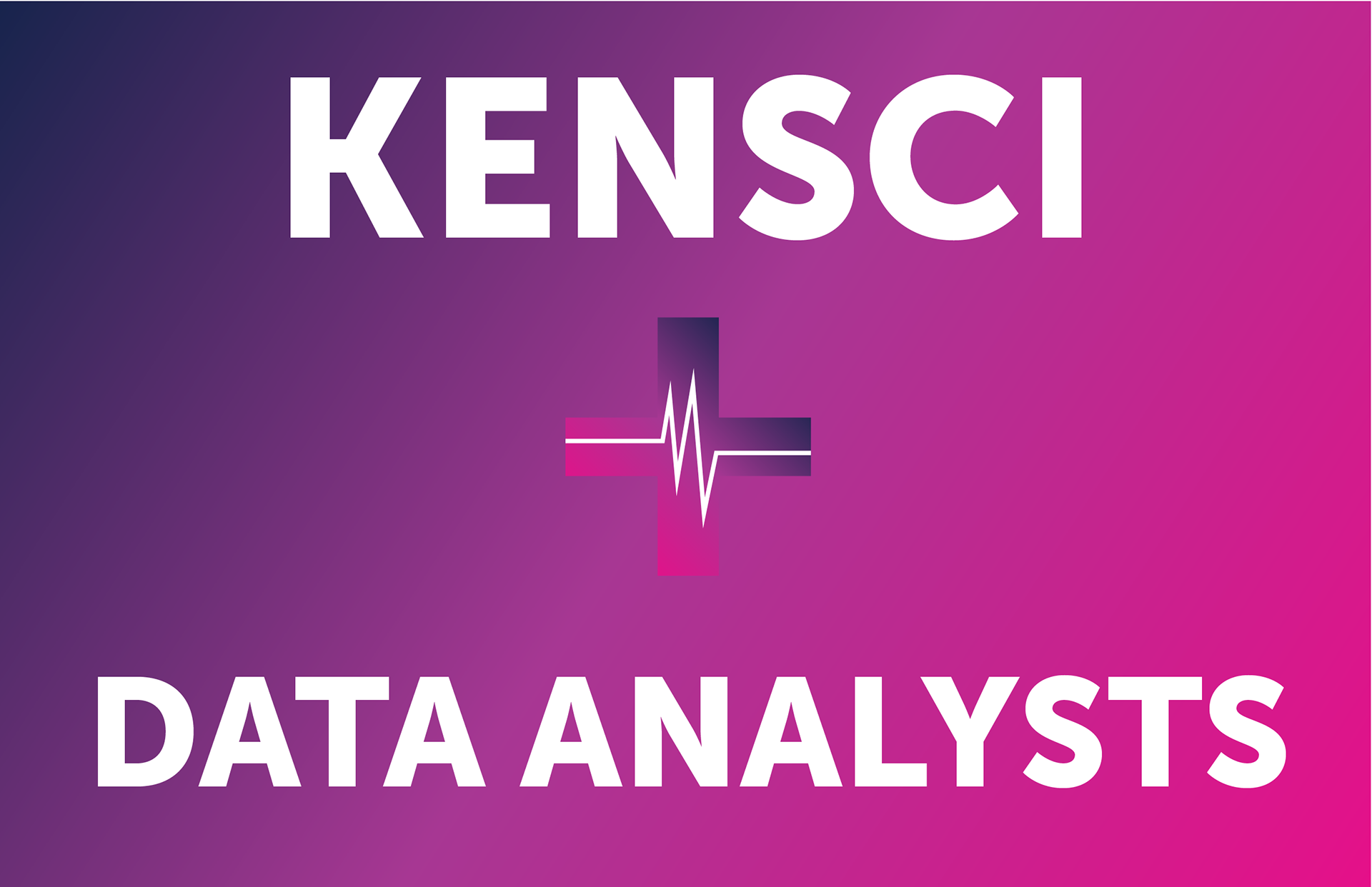
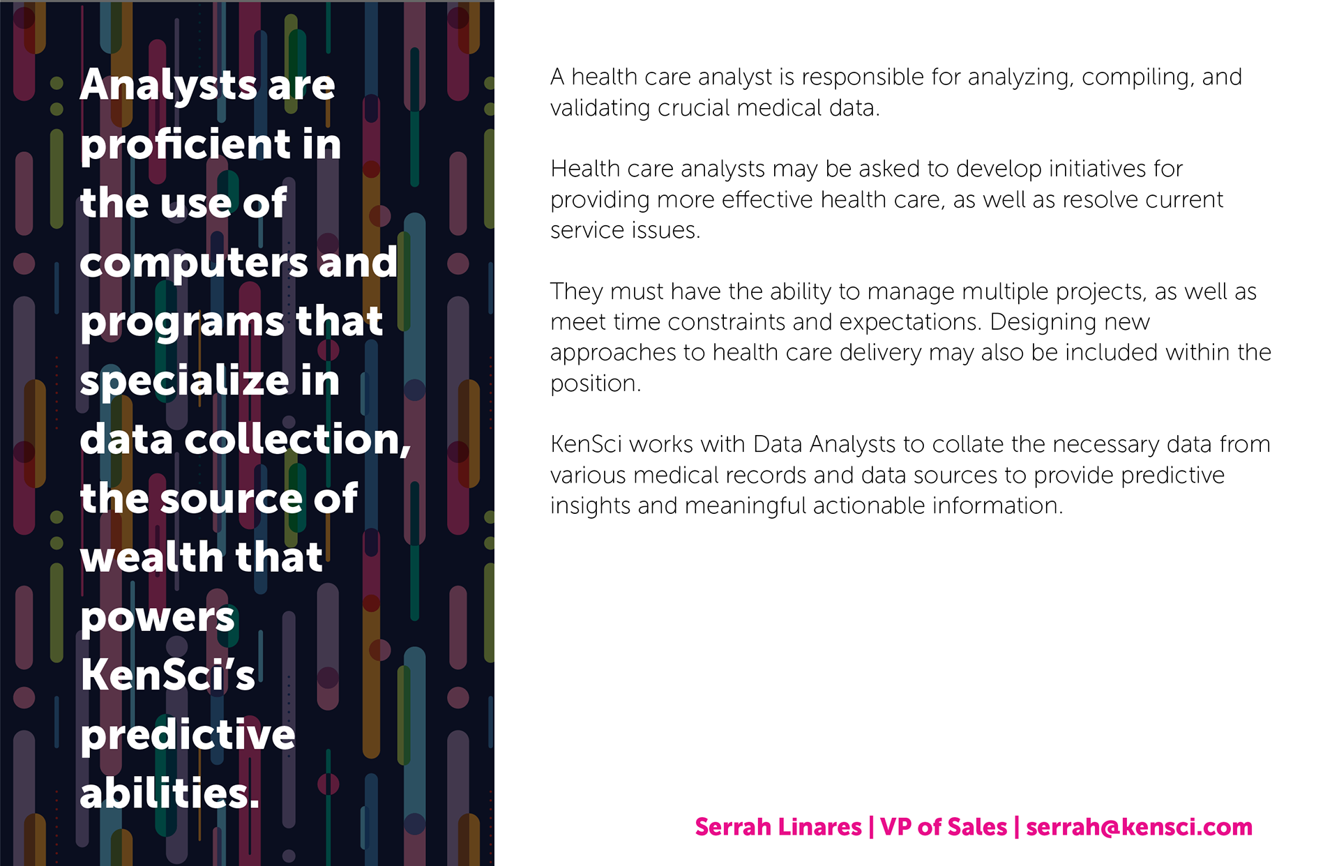
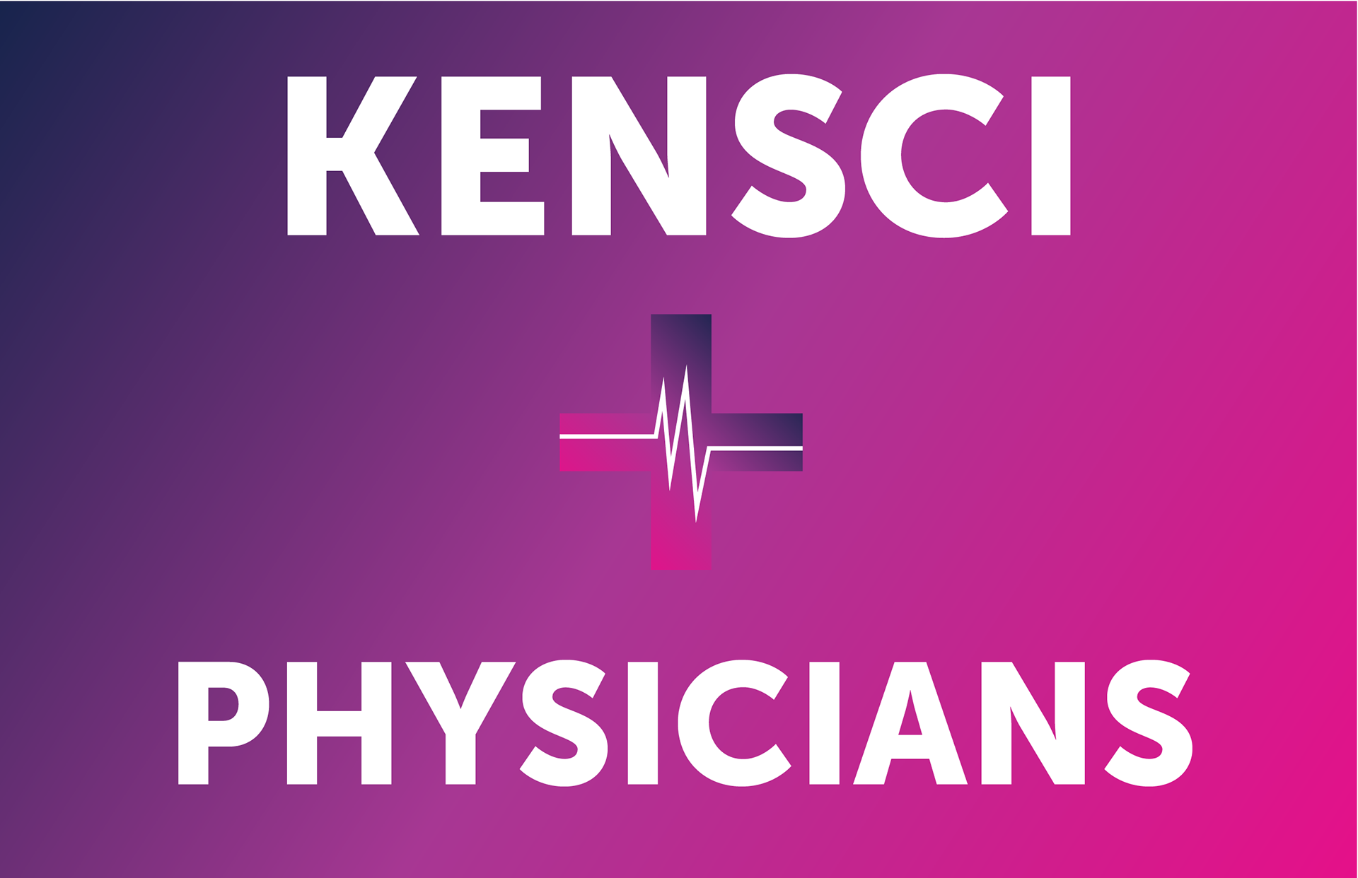
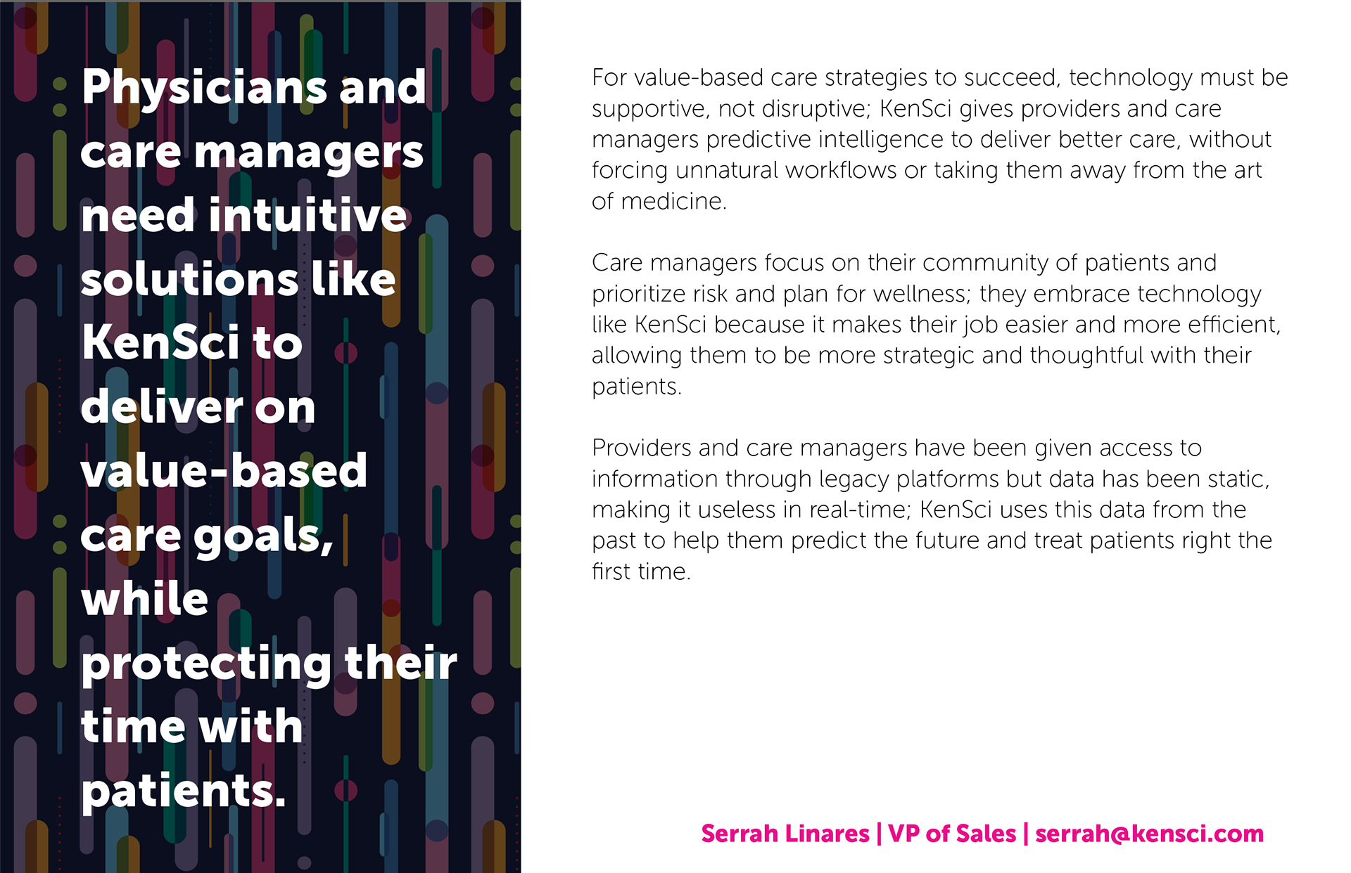
Position-Specific Sales Cards
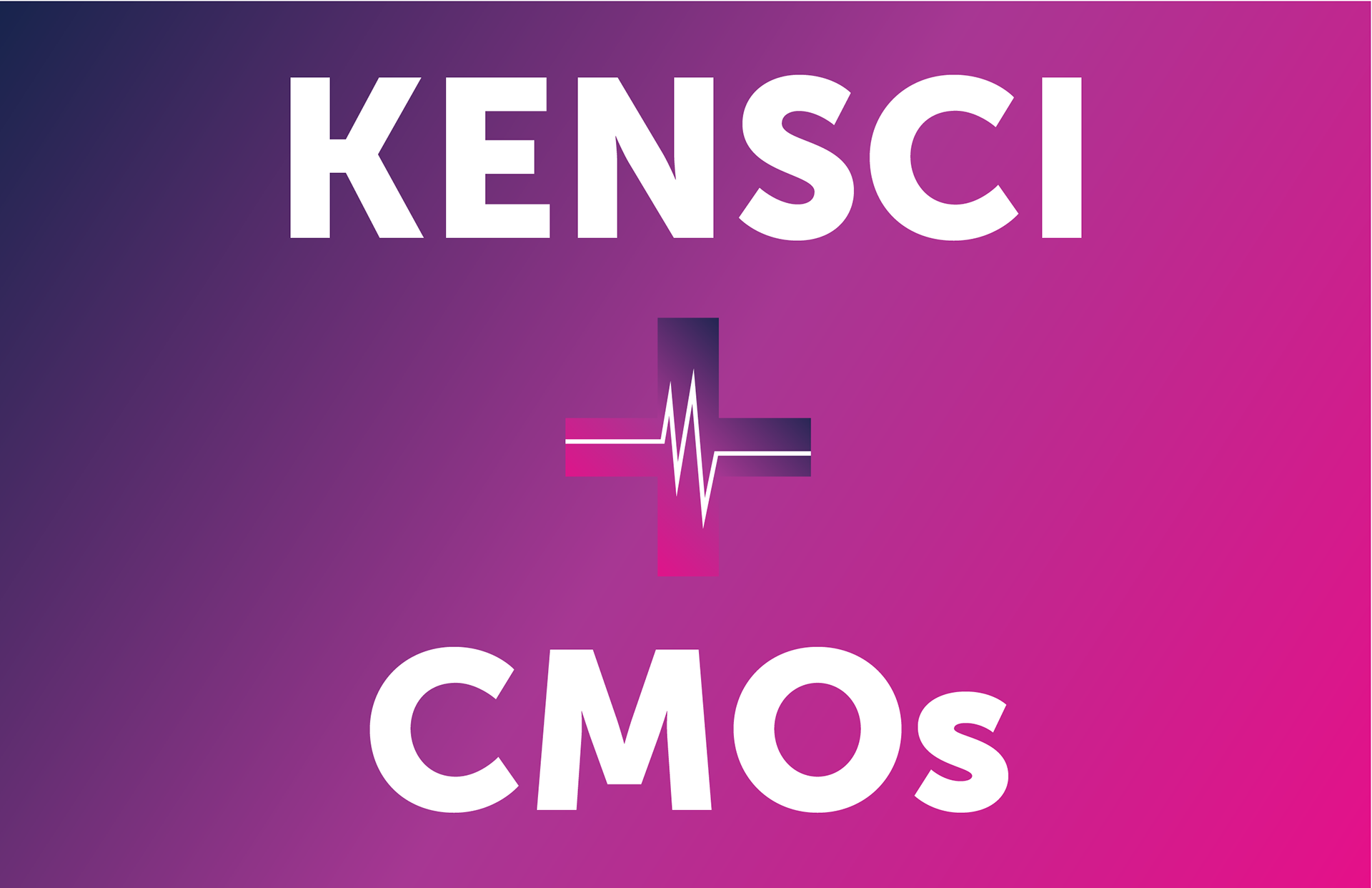
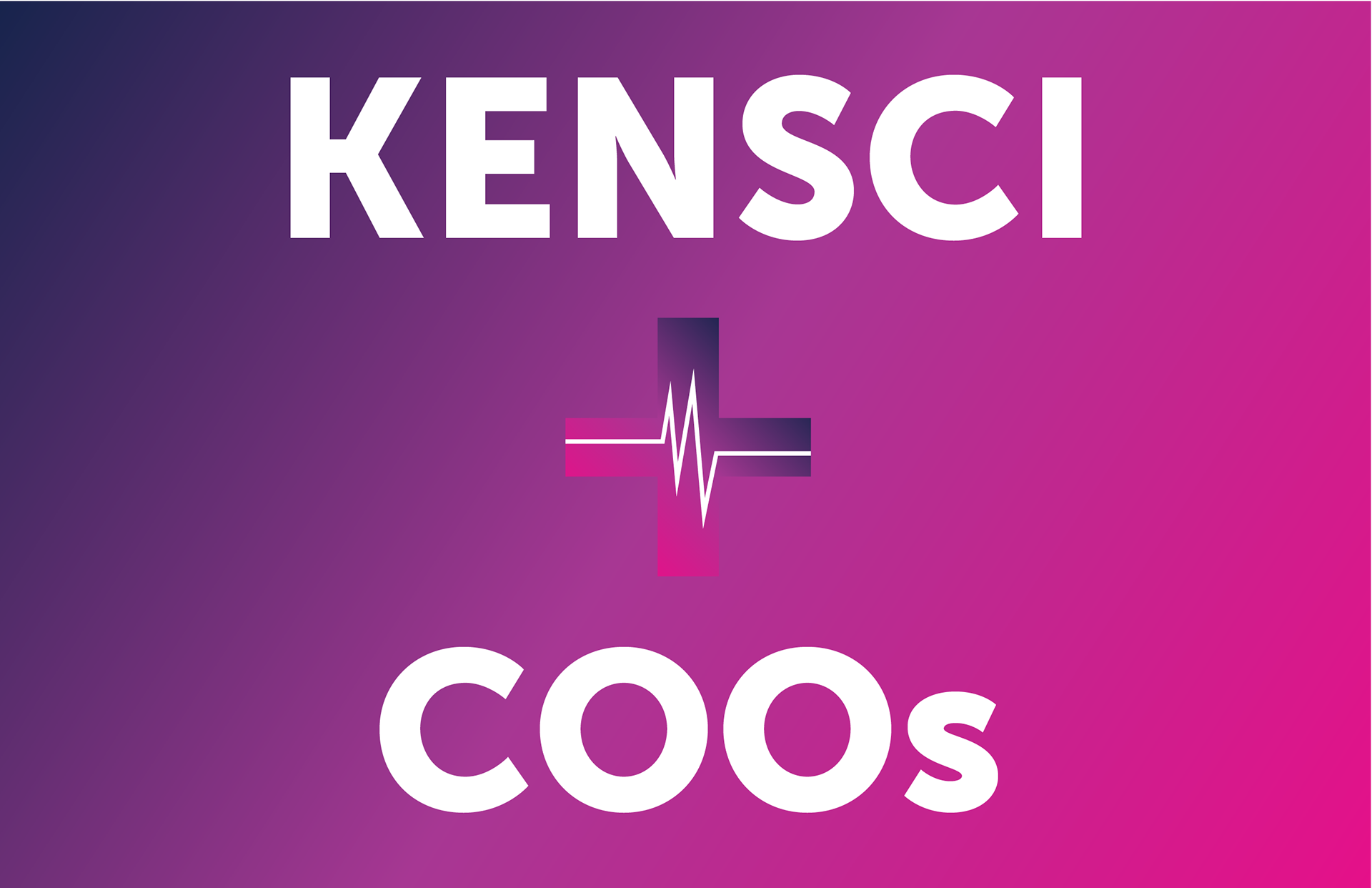
From conversations with the sales team, I identified the need to have position-specific sales cards that the sales team could take with them to their various events and conferences. I gathered all needed information and wrote the copy for each of these cards, designed them, and printed them for the team. The cards were meant to have general talking points that would relate to each position in a company and highlight the benefits that directly impact that position's day-to-day life.
Technical Infographics
Infographics created on demand for various departments. Many used in security and privacy presentations and resource documents for customers.
Case Studies
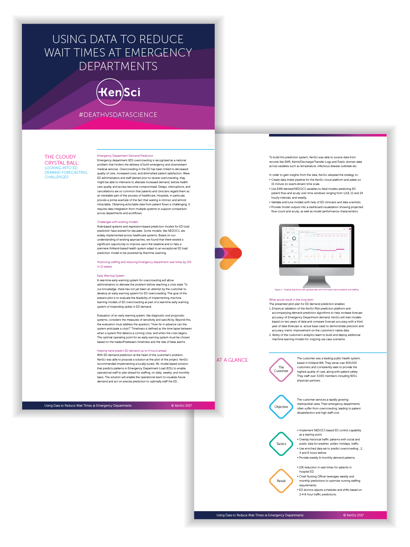
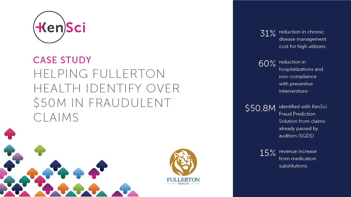
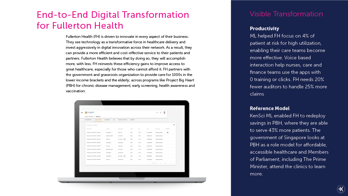
I created multiple case studies that were requested from the sales team. I worked with the data scientists and doctors to gather the information. I then synthesized the information, wrote the copy and laid out the pages. This is one of the case studies that was templatized so the design could be easily used for future studies.
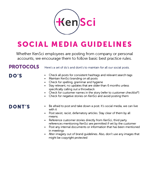
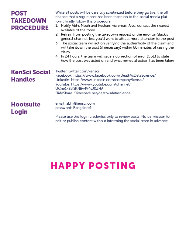
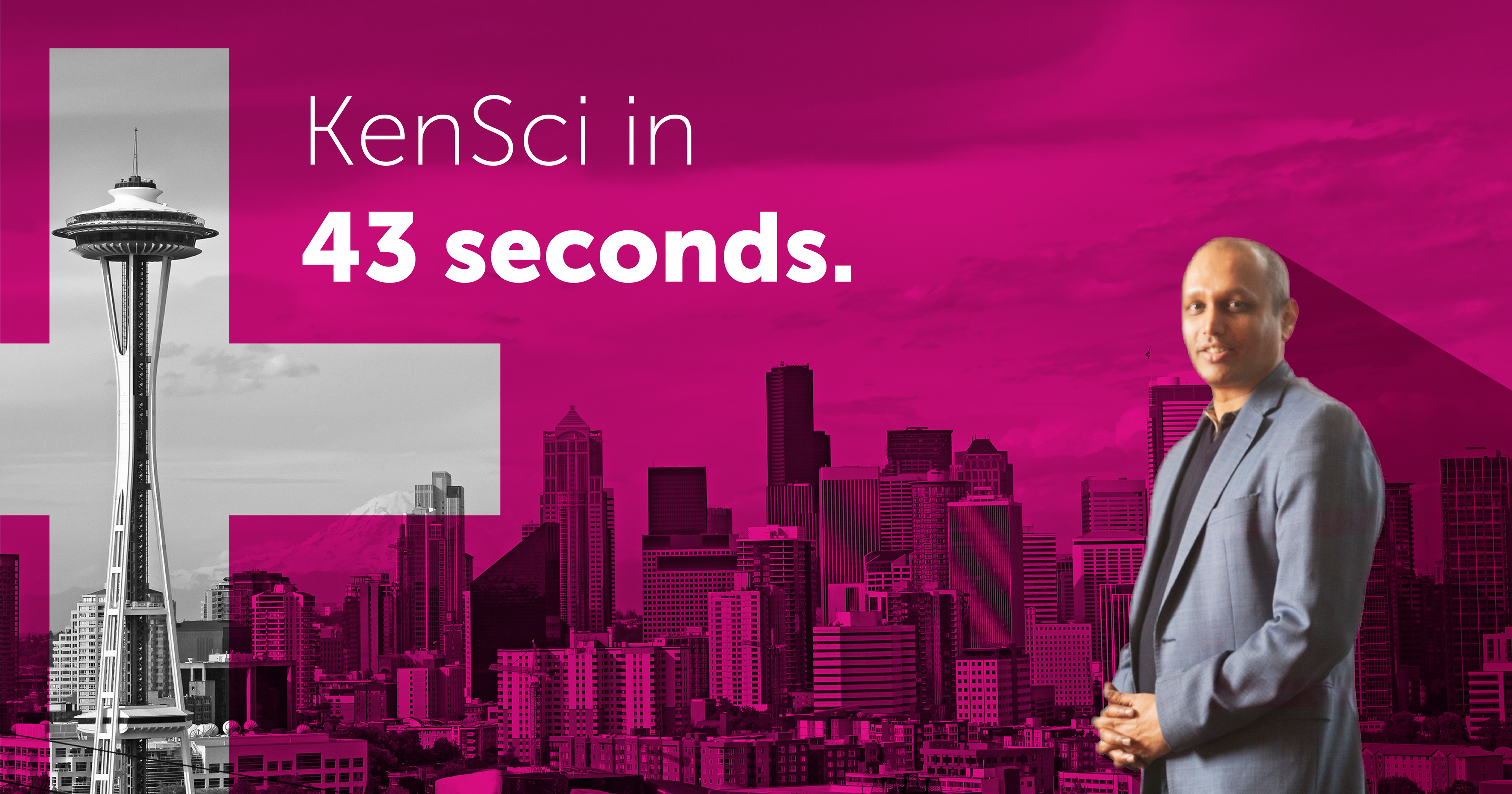
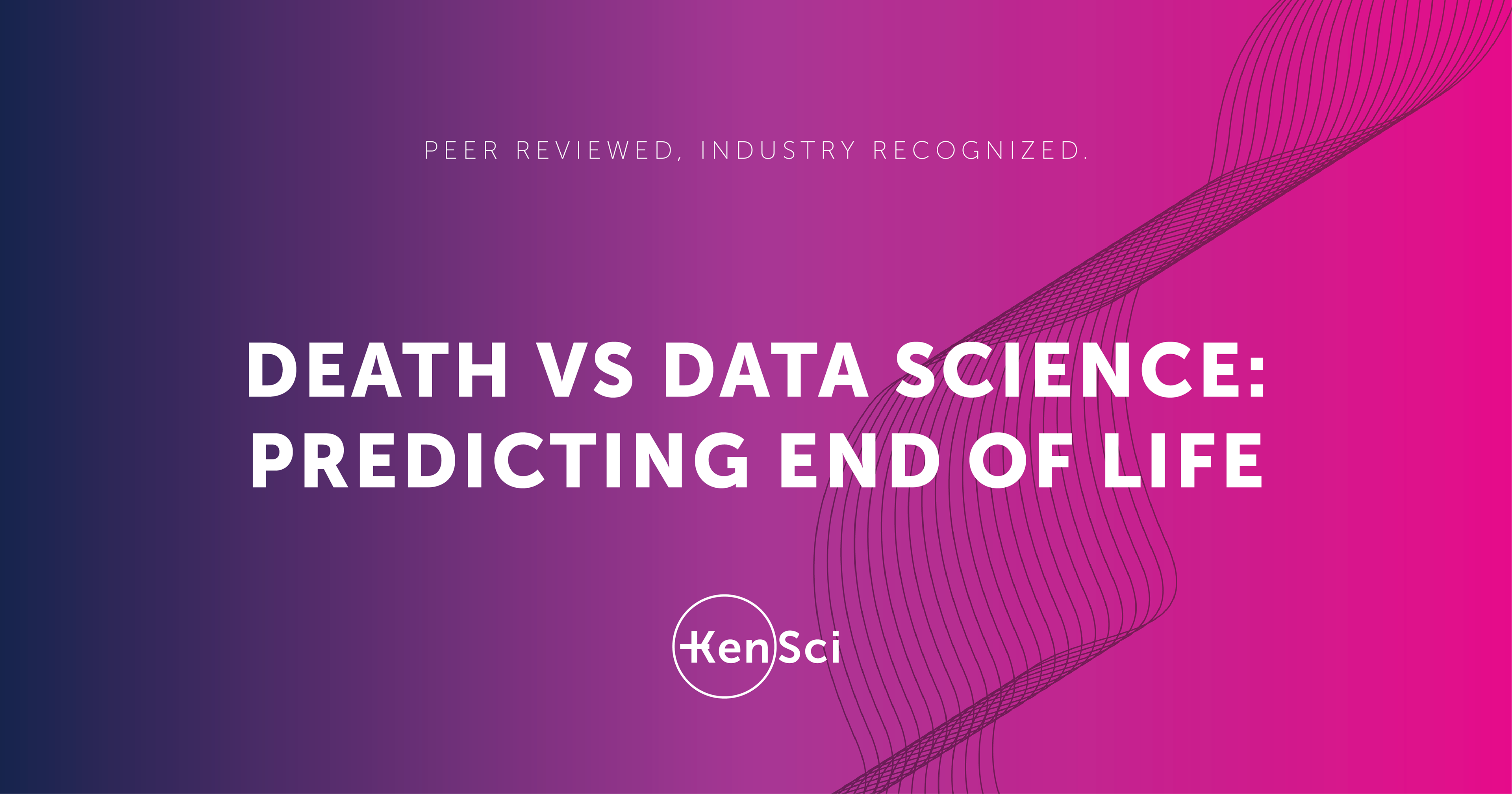
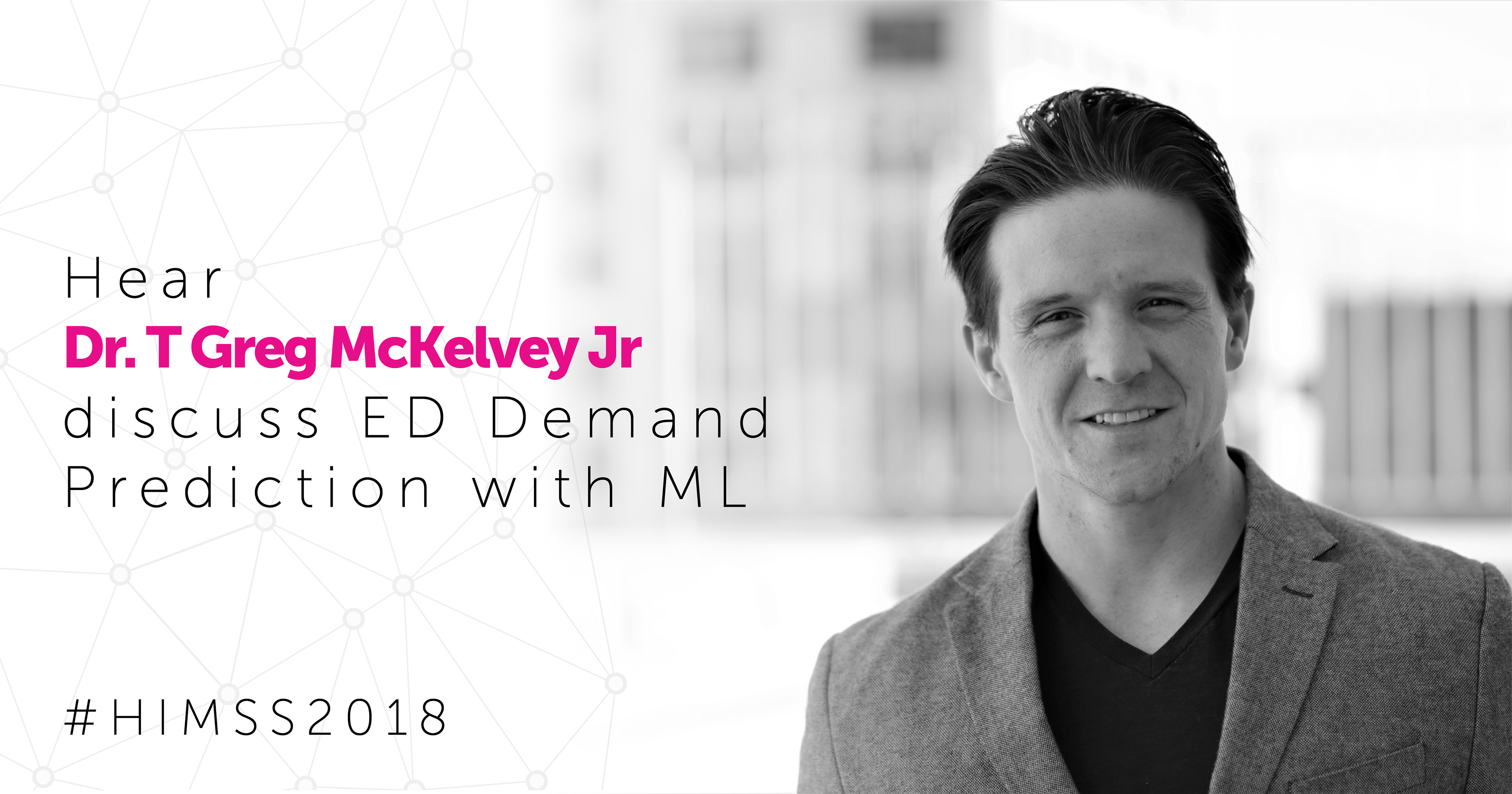
Social Media Strategy & Execution
I worked with the Director of Marketing to create a style guide for social media, as well as the procedure for when a post needed to be taken down. After that I was hands off on the social media strategy and only contributed the graphics as needed. Below are samples from the social media visual assets.


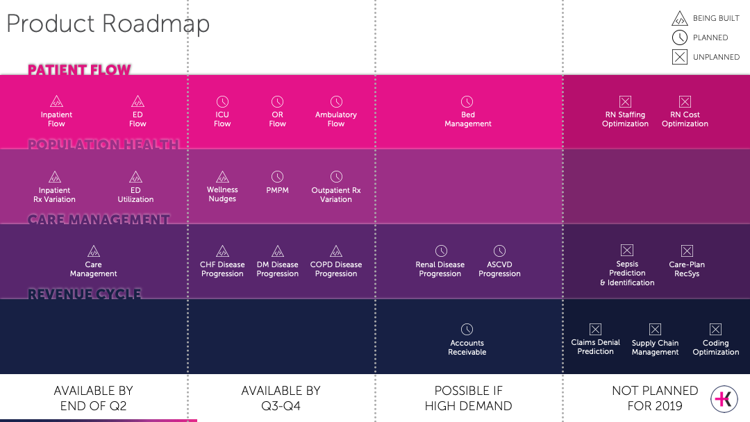
Product Marketing Materials
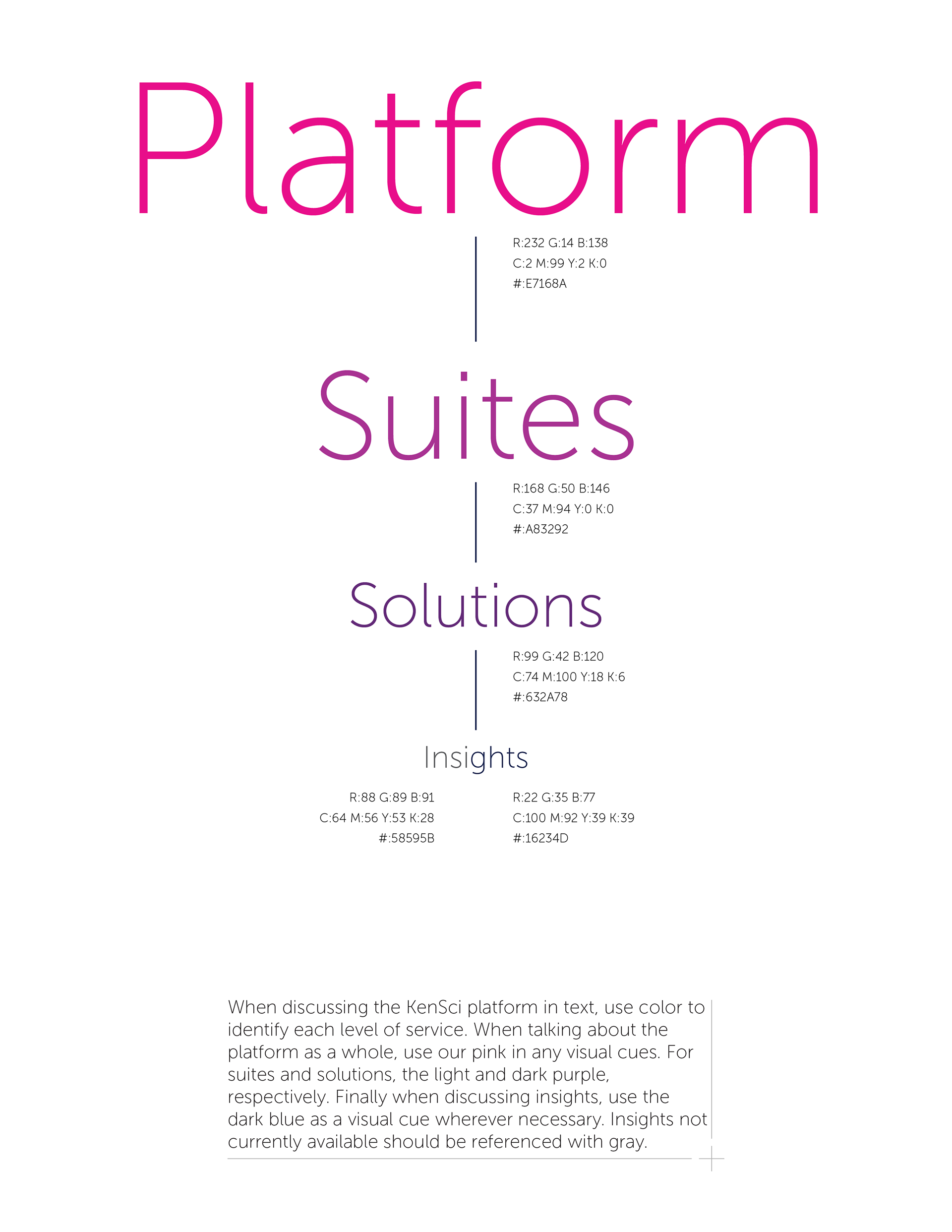
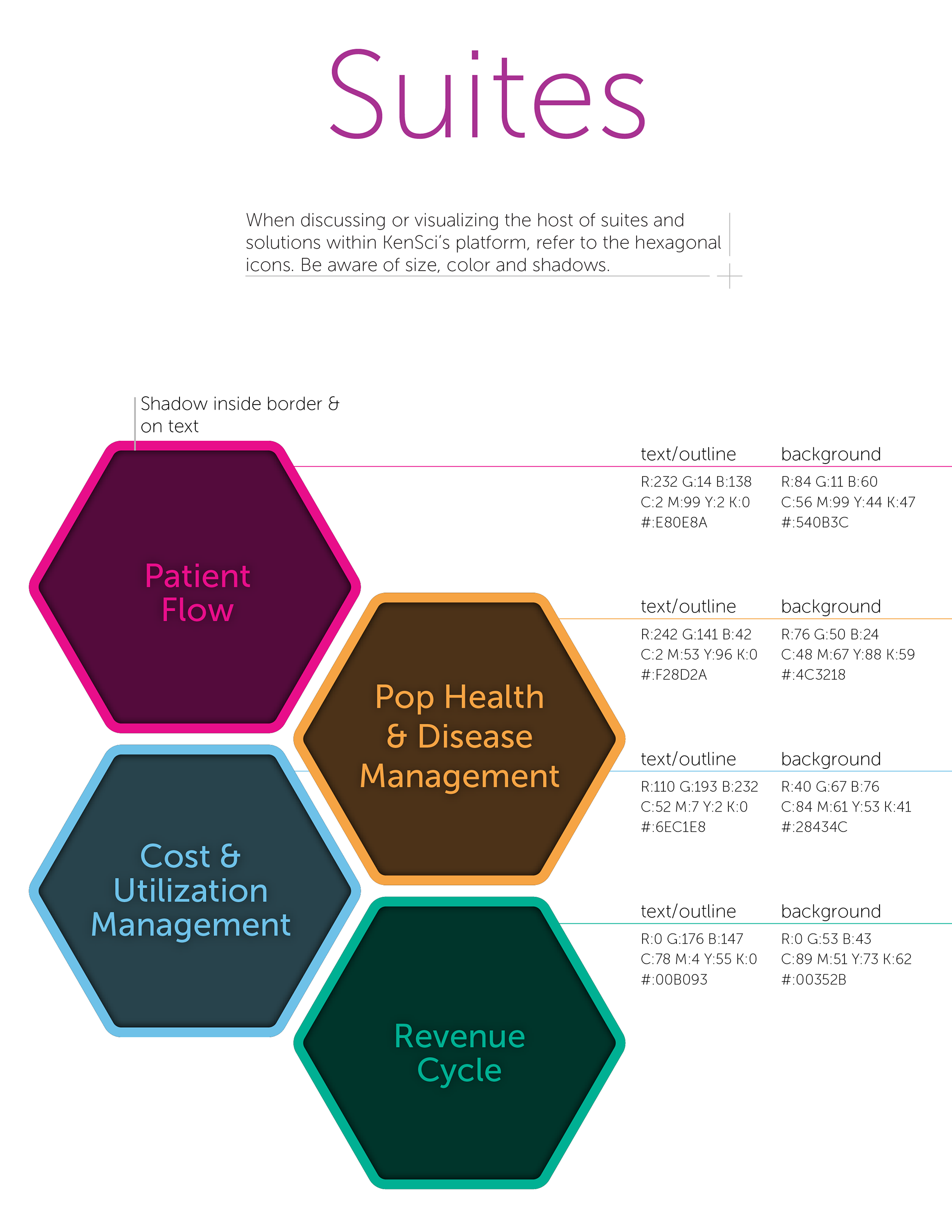
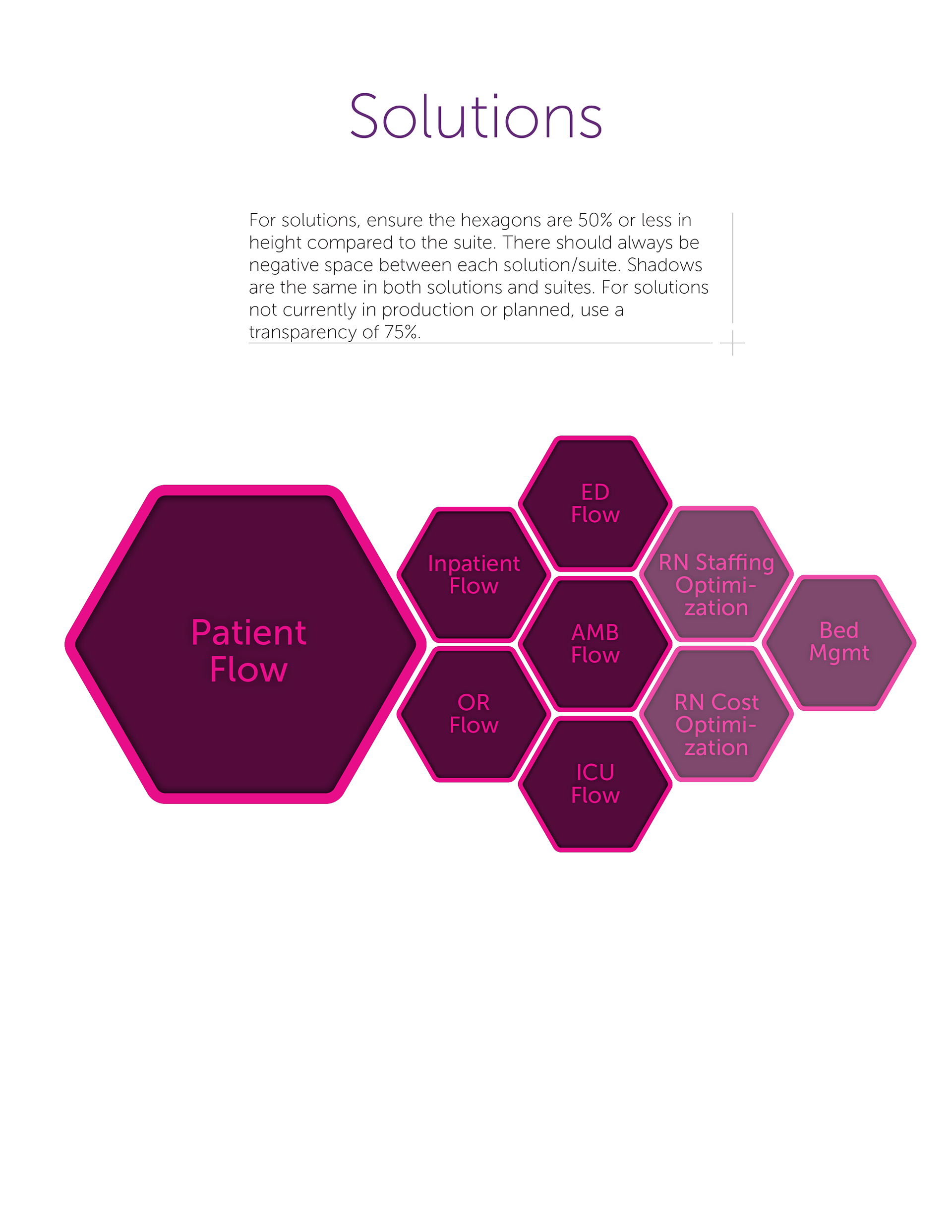
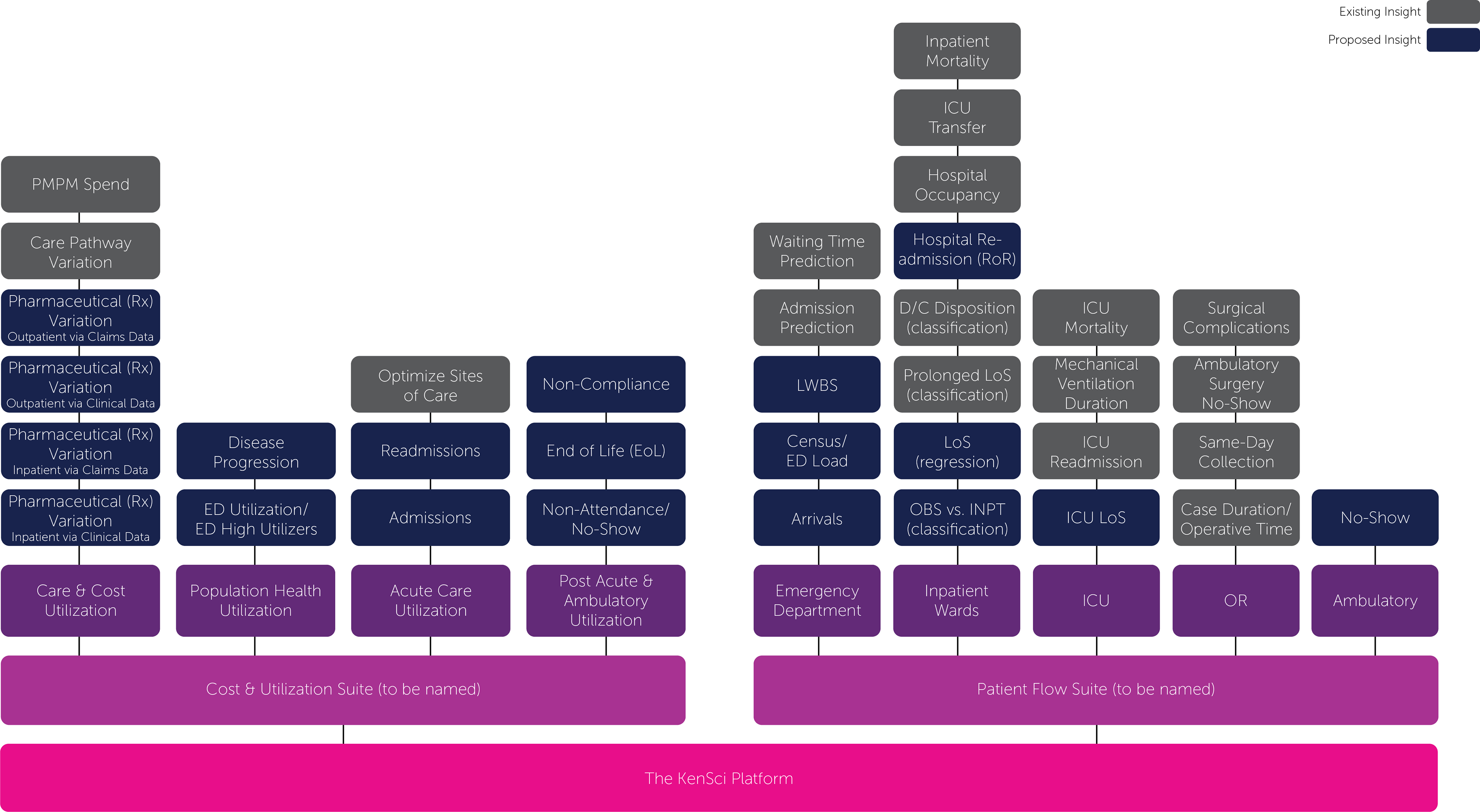
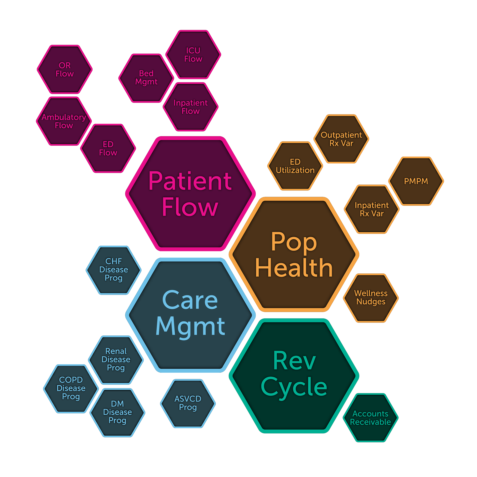
Working closely with the sales team, I began to create a design language for the KenSci product. I worked in subsequently with the team to create product marketing materials they could use in their sales meetings. I helped to create the hierarchy of the product and then moved on to visual representation.
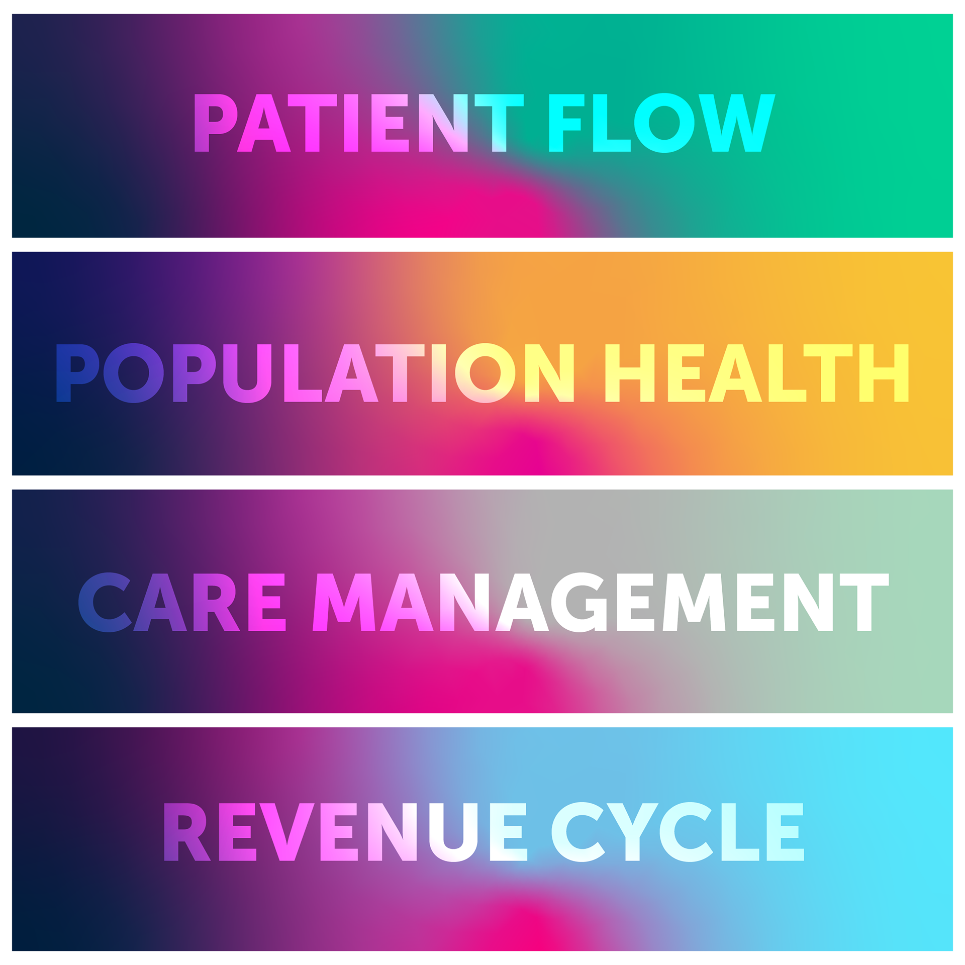
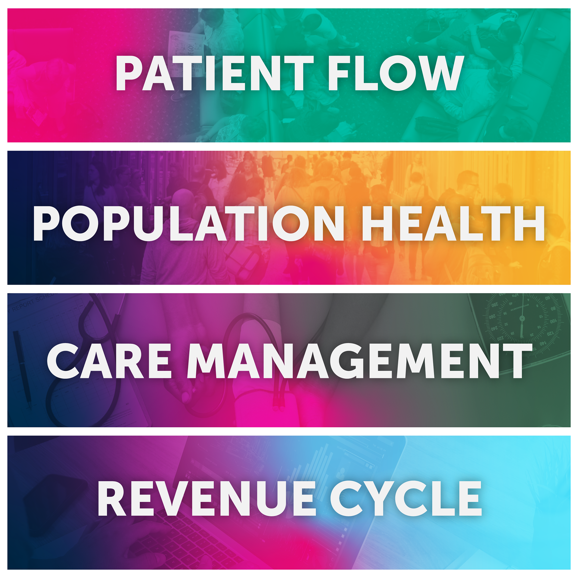
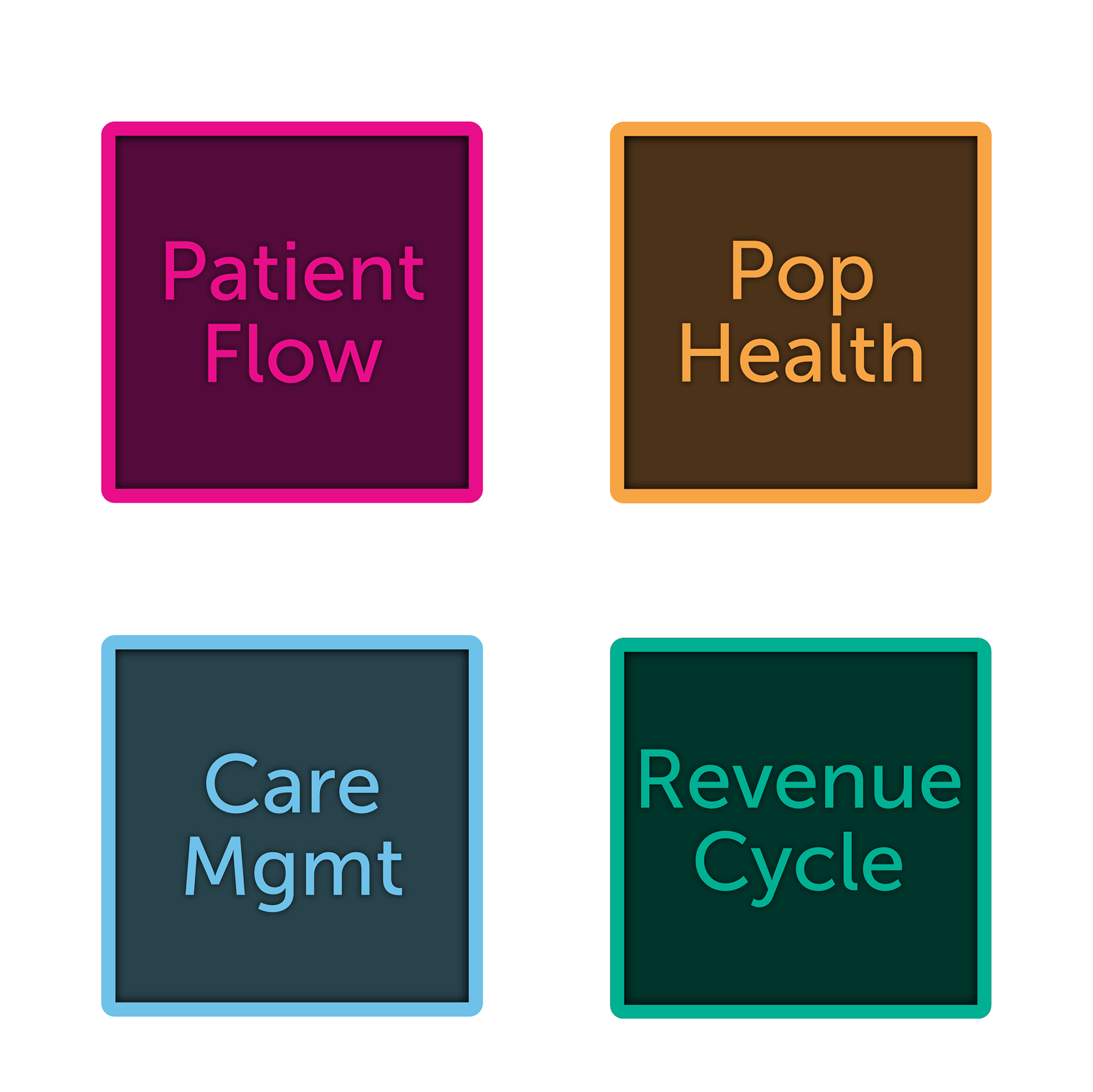
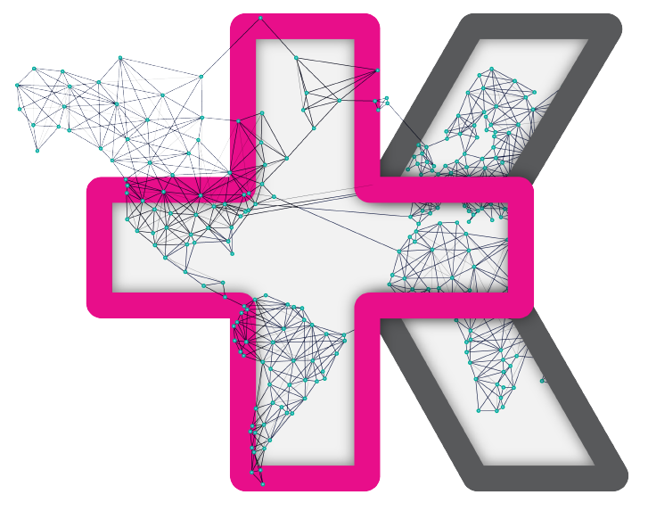
I took initial direction from a honeycomb design. I also tried the more traditional graph style. I took inspiration from Adobe's product for another iteration. I also created unique KenSci 'Ks' for each of the suites. These are various iterations of the product marketing visual hierarchy.


Animated Presentation Design
Another part of my job was created presentations on demand for the C Suite. Along with creating a template, many of the presentations took complex ideas and diluted them down to more simplified visuals. This is an example of an animated design.
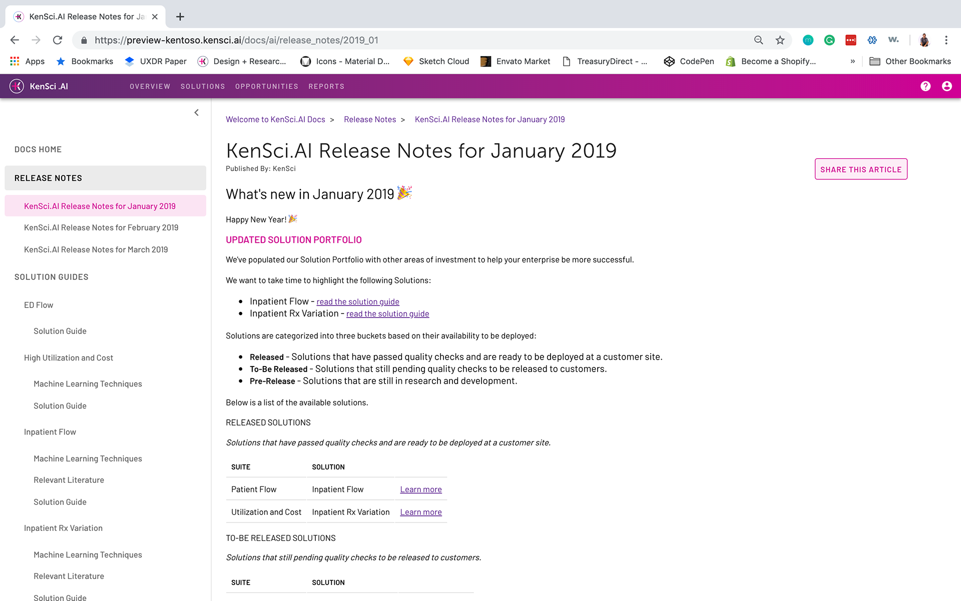
Product & UX Design
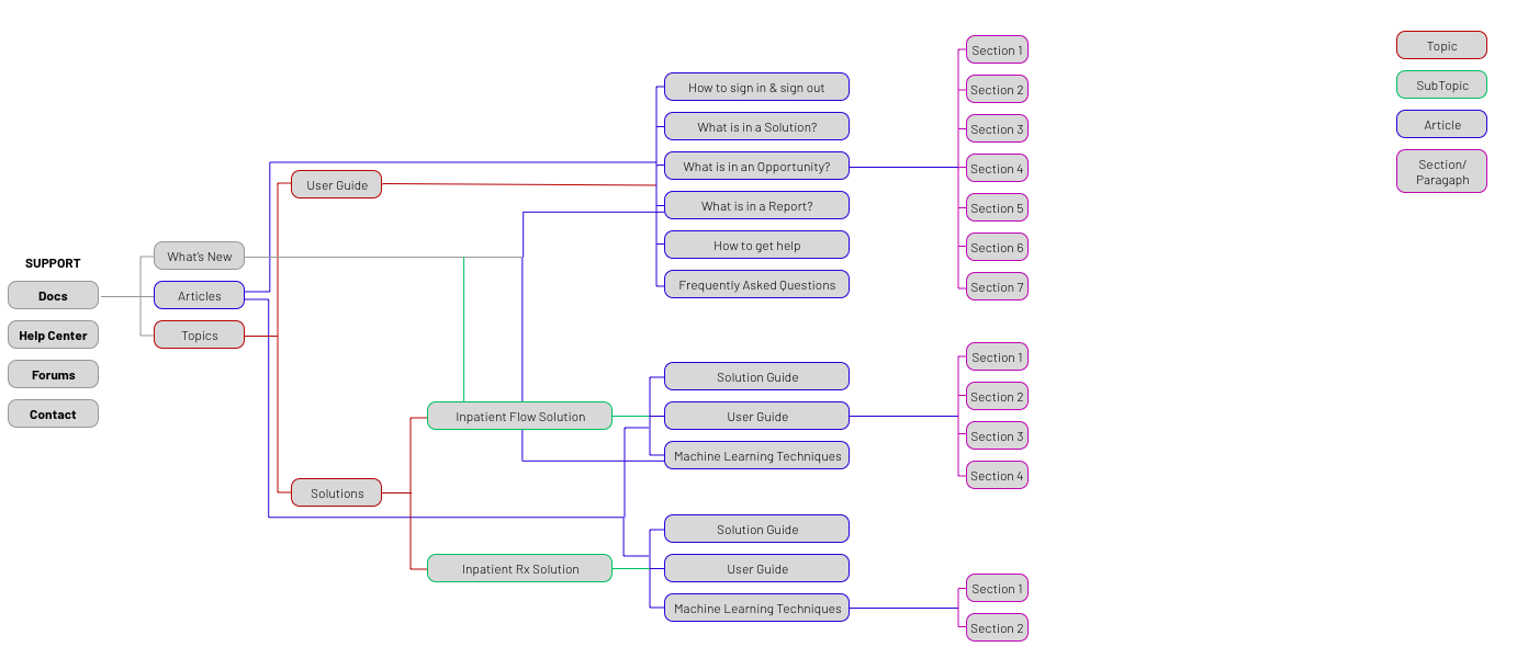
The KenSci.AI Documentation Portal is part of the KenSci product I was in charge of building alongside two other UX designers. The Docs portal began with a PRD agreed upon by myself, the product manager, and the engineering team. Once agreed, I created an information architecture that was socialized throughout the company.
Once agreement was found between product owners/managers, the delivery team, the UX team and engineers, I set out to concept mid fidelity mockups (we skipped low-fidelity since a lot of assets were previously created).
User flow to access Docs Portal.

User flow to access Docs Portal.
User flow to access Docs Portal.
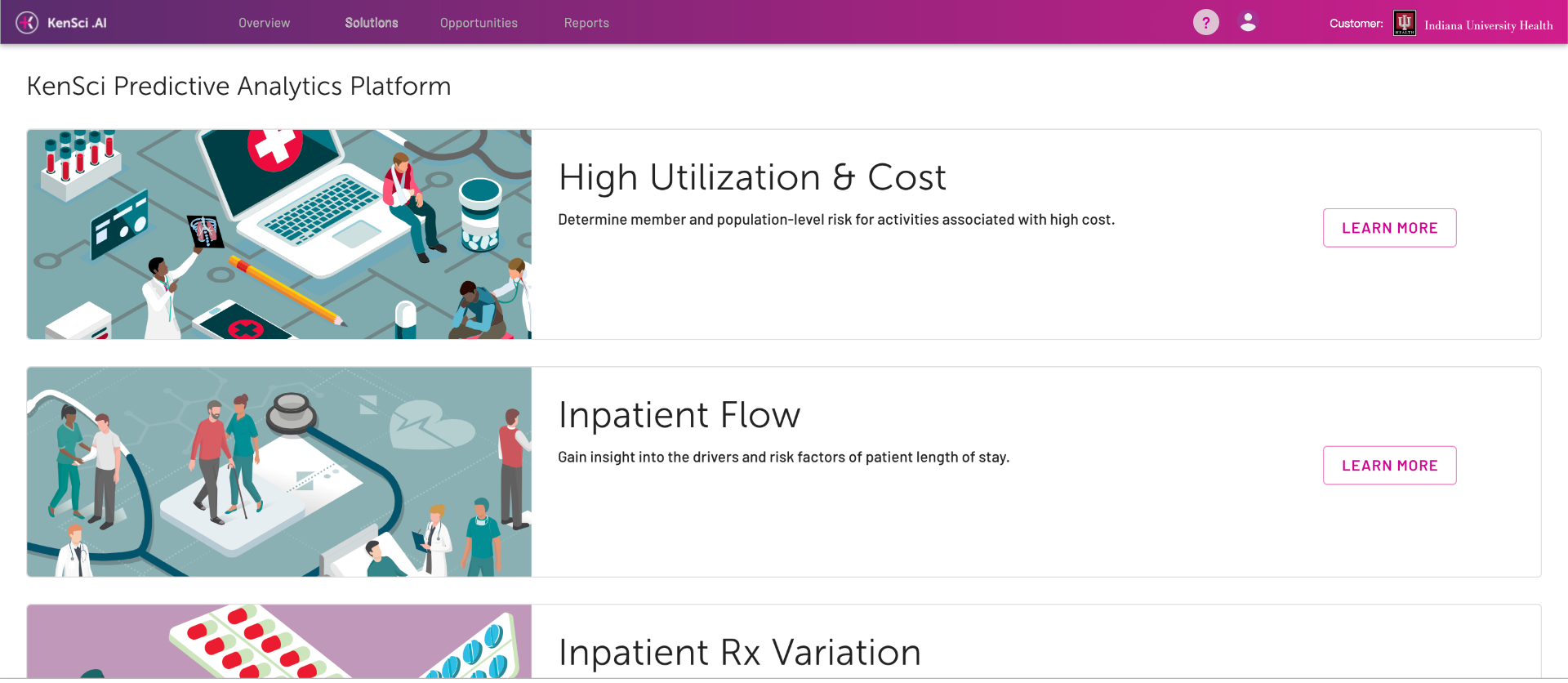
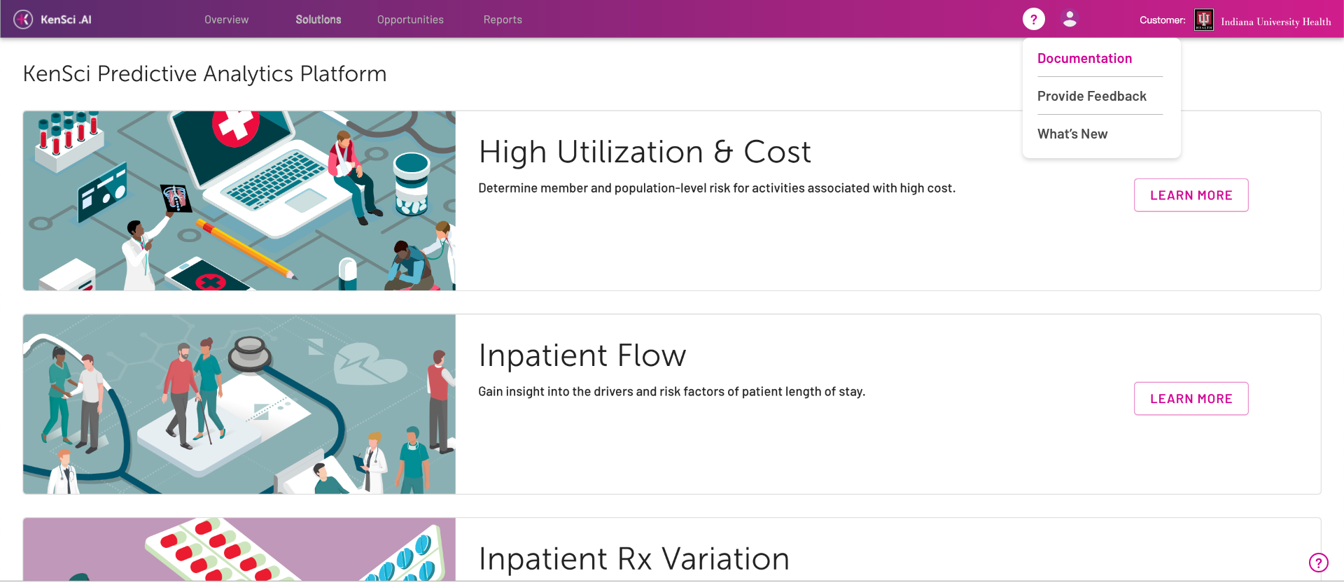
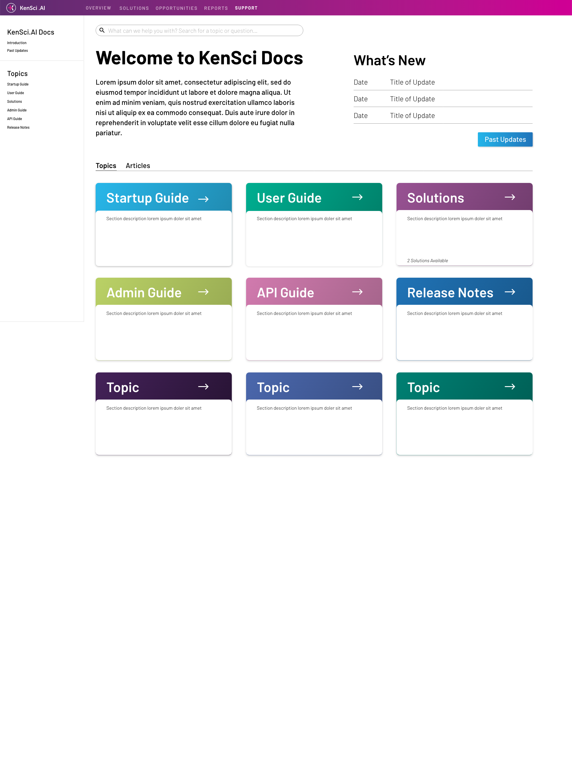
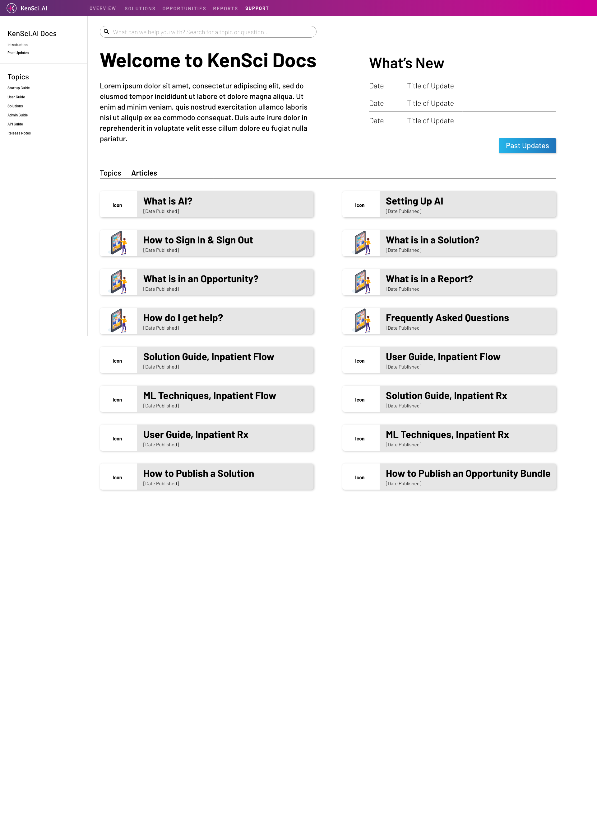
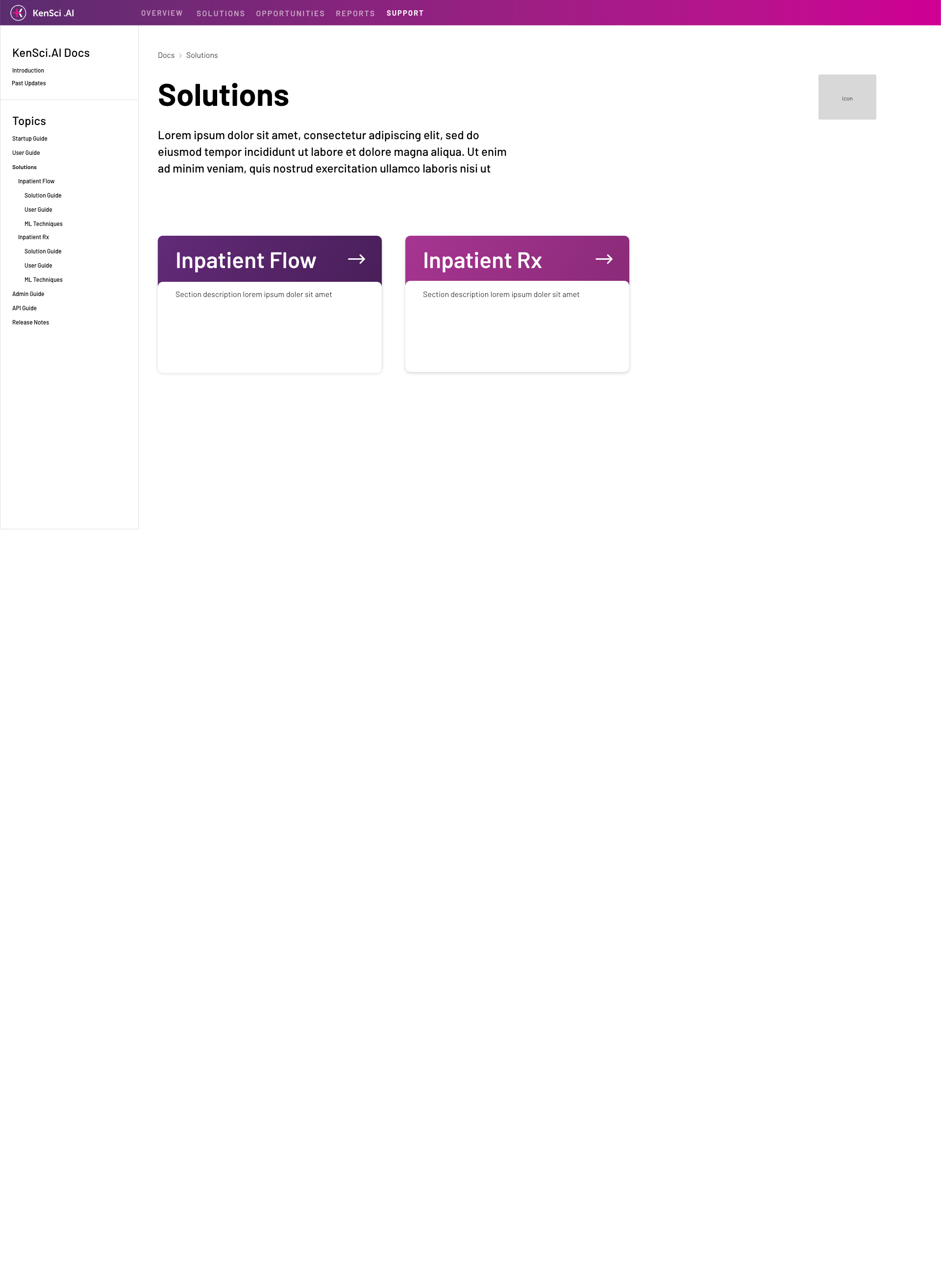
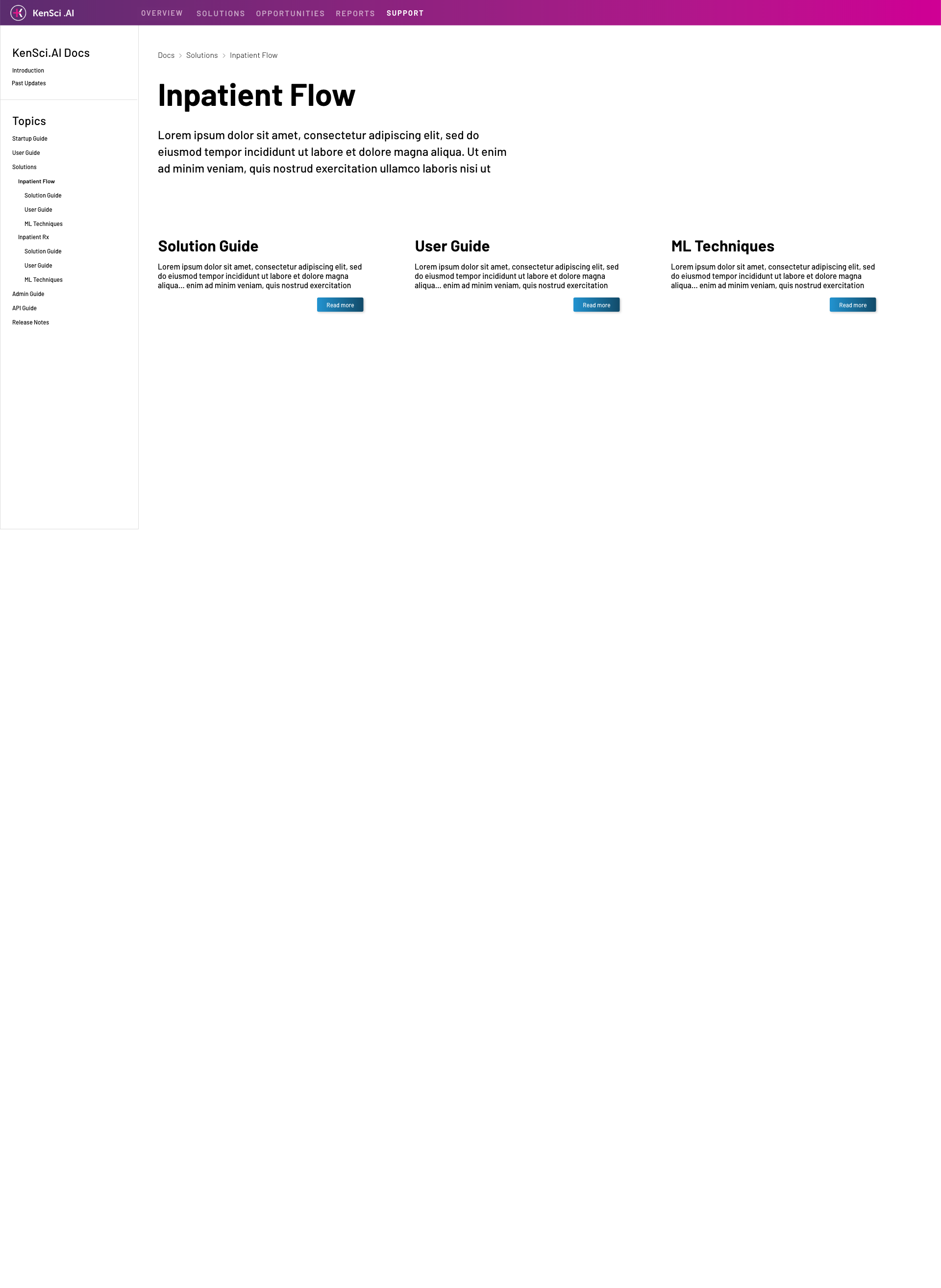
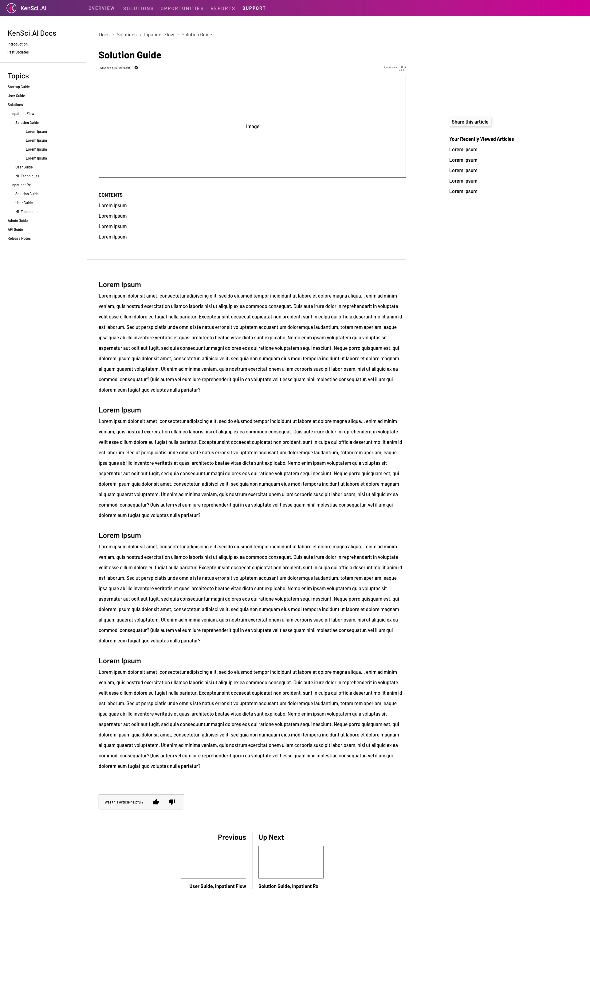
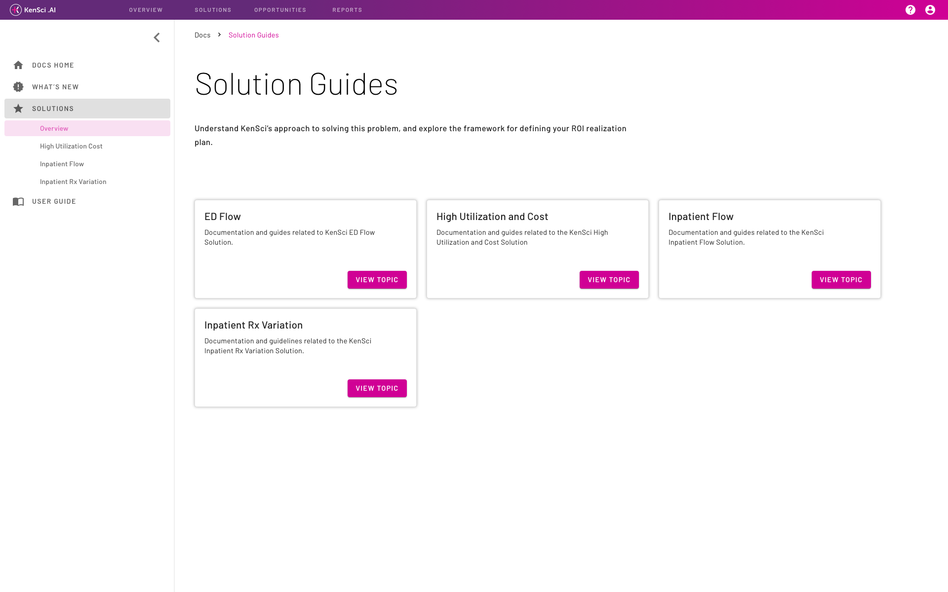
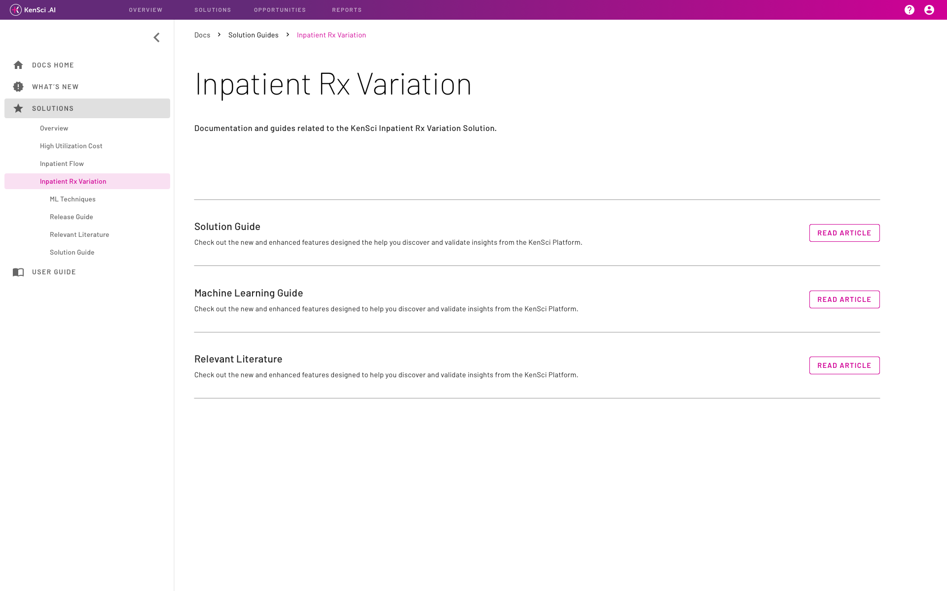
Click-through experience outlining how users will get from Docs Home to specific articles.
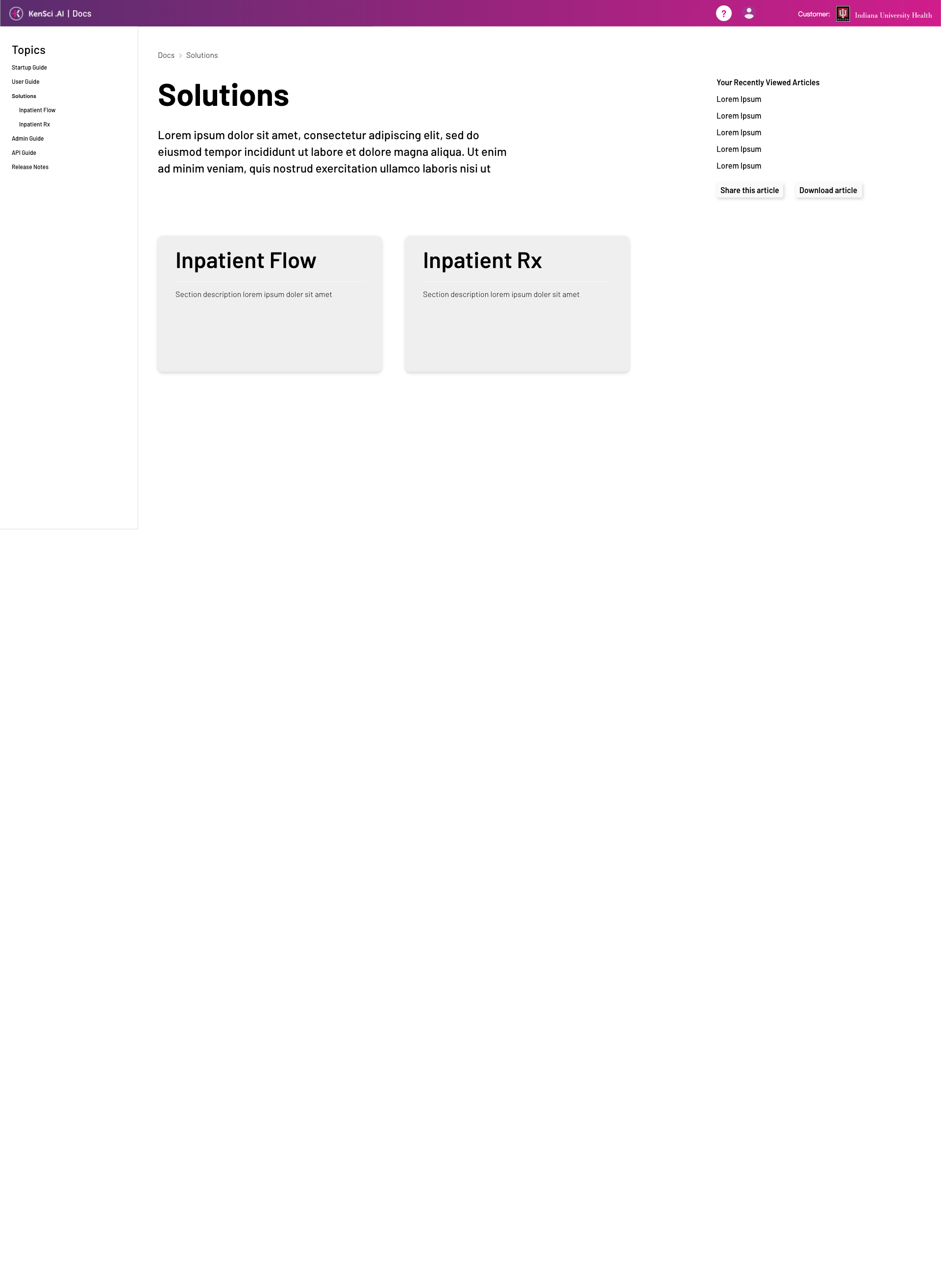
Click-through experience outlining how users will get from Docs Home to specific articles.
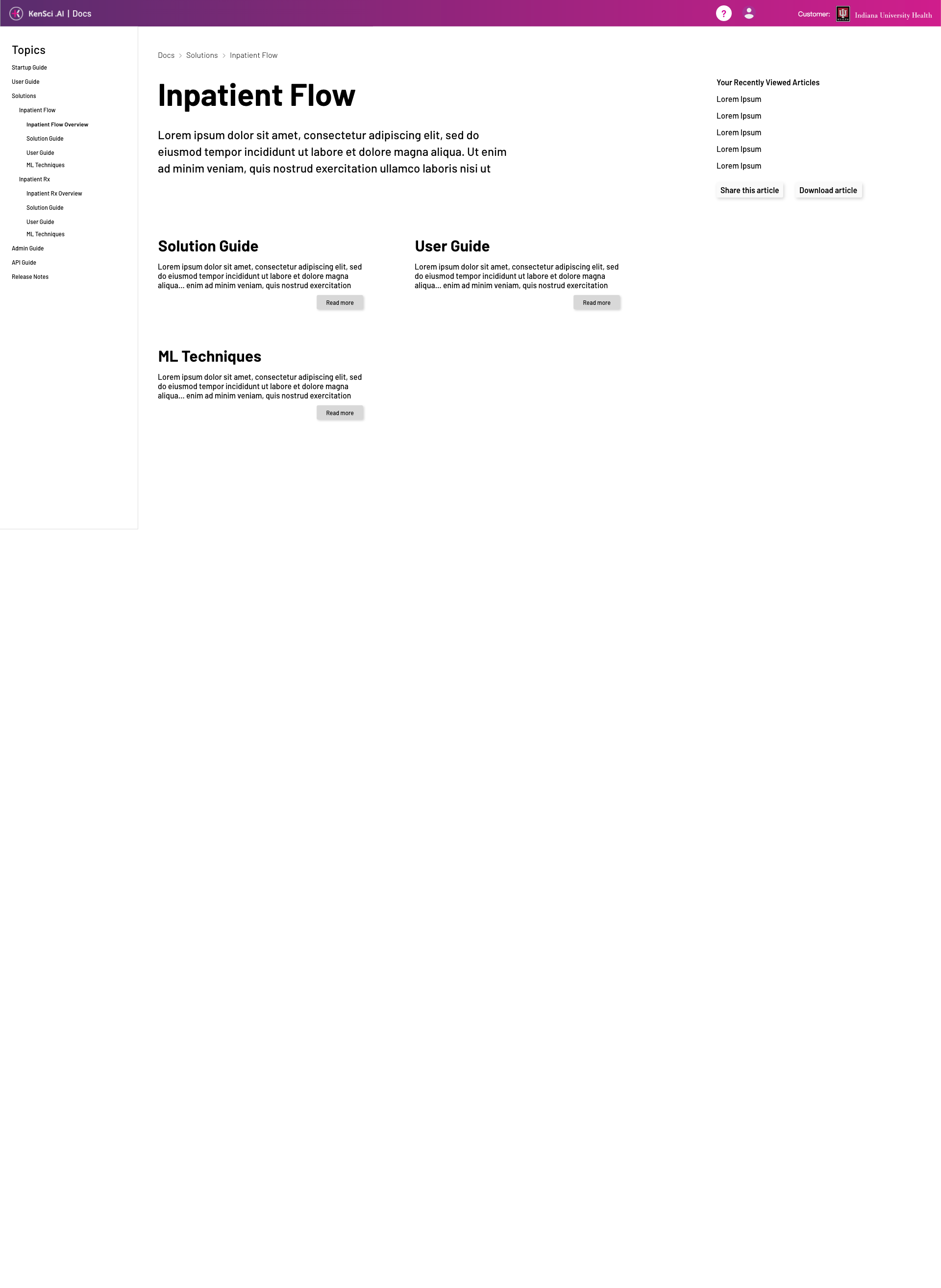
Click-through experience outlining how users will get from Docs Home to specific articles.
Click-through experience outlining how users will get from Docs Home to specific articles.
Because there were many stakeholders in this project, we had multiple rounds of iteration. At each round, I would perform one or two user tests with internal stakeholders. I managed all socialization, feedback collection and iteration management.
One iteration attempted to show stakeholders the importance of simplification, both in pattern and color use.
One iteration attempted to show stakeholders the importance of simplification, both in pattern and color use.
One iteration attempted to show stakeholders the importance of simplification, both in pattern and color use.
One iteration attempted to show stakeholders the importance of simplification, both in pattern and color use.
One iteration attempted to show stakeholders the importance of simplification, both in pattern and color use.
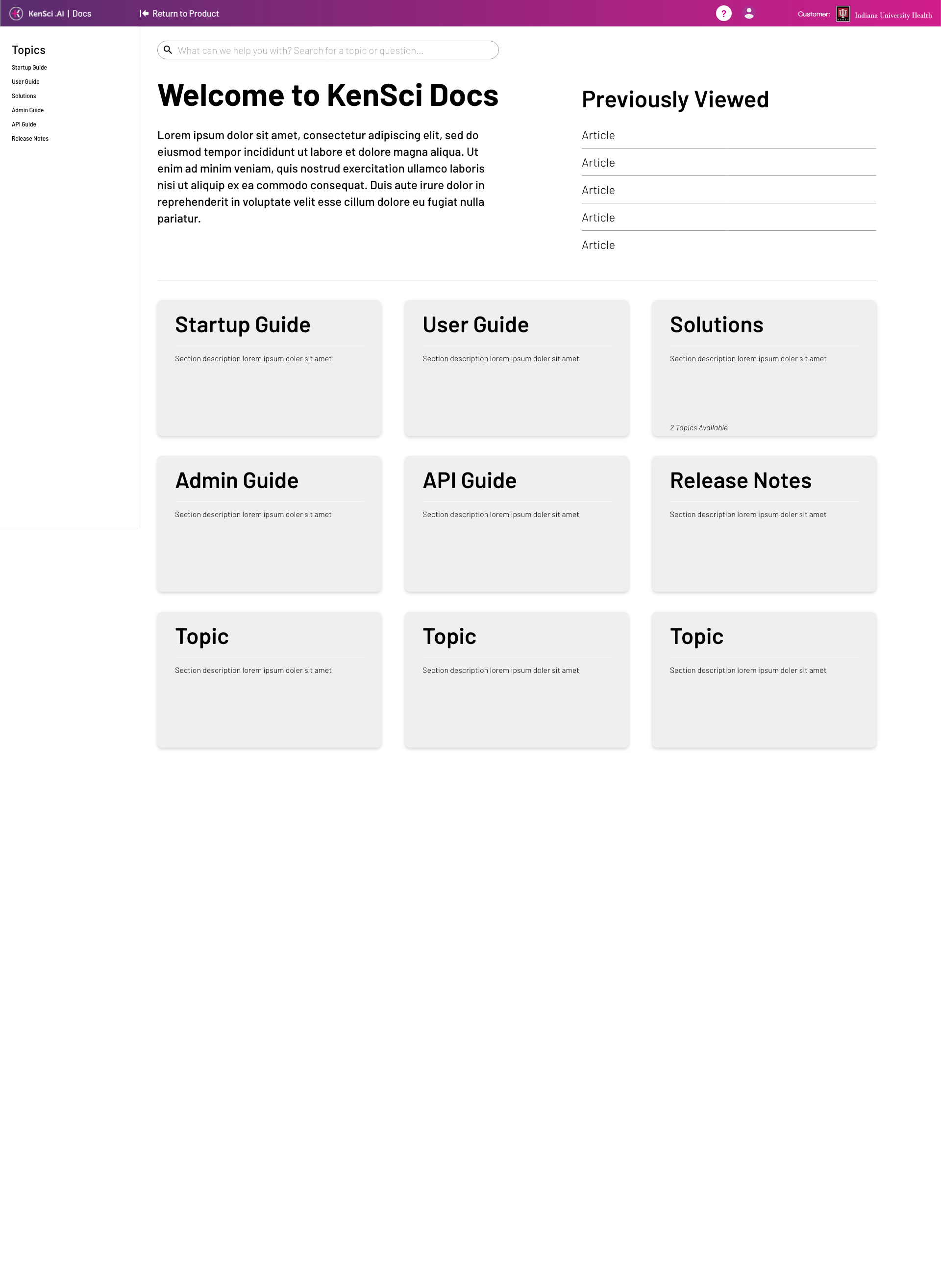
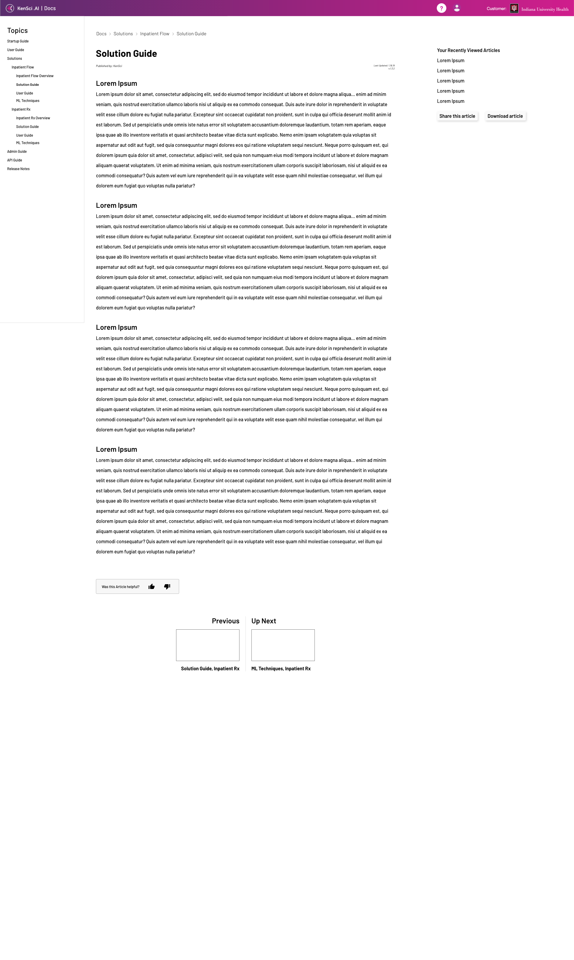
Once consensus was achieved with all stakeholders, I worked with developers to transfer my designs to web. Working in Sketch, Sketch Cloud and Zeplin, we closely went through each aspect of the design. We then held design reviews and bug bashes in order to weed out any issues. The below holds the final design, as well as screenshots of the live pages.
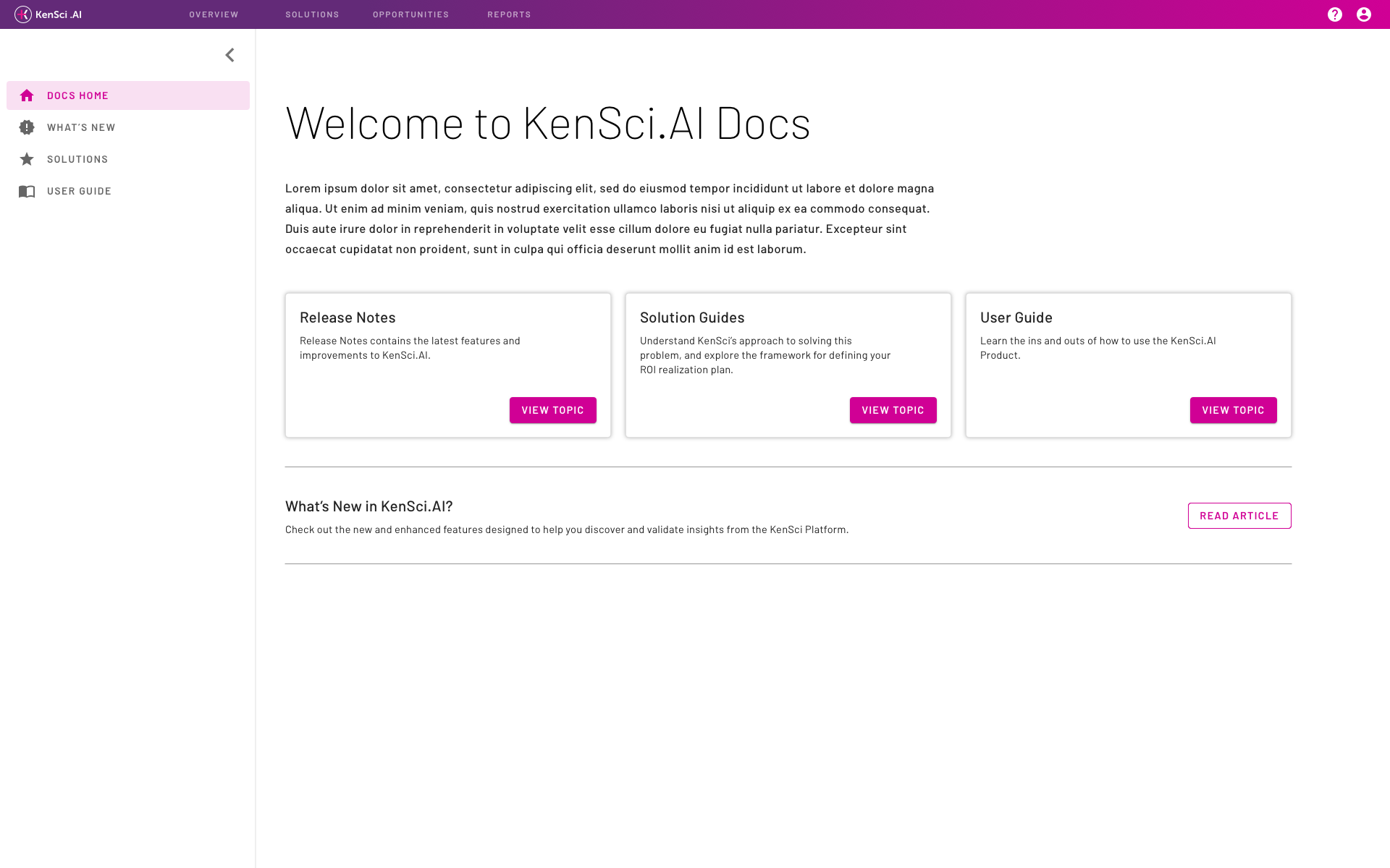
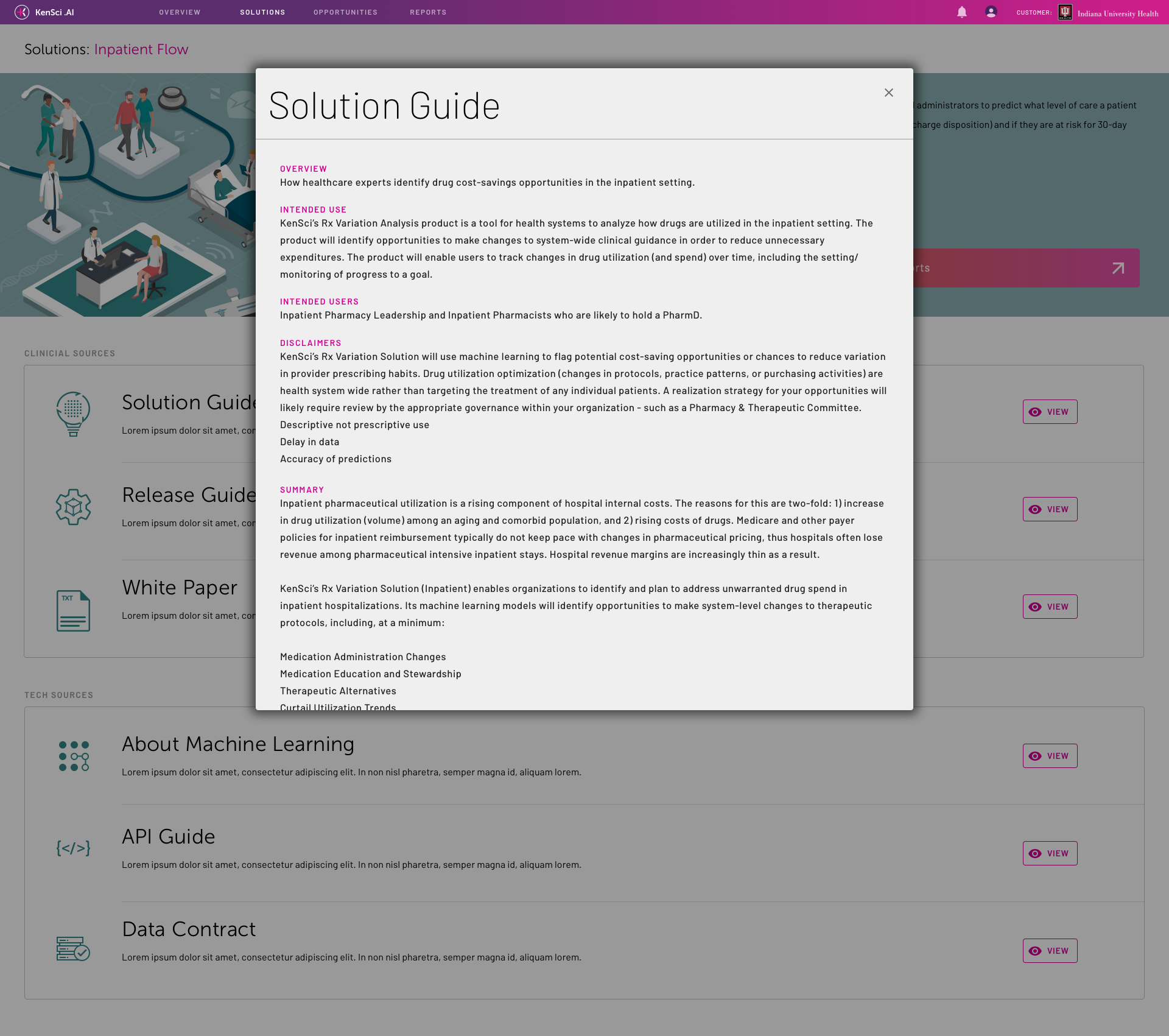
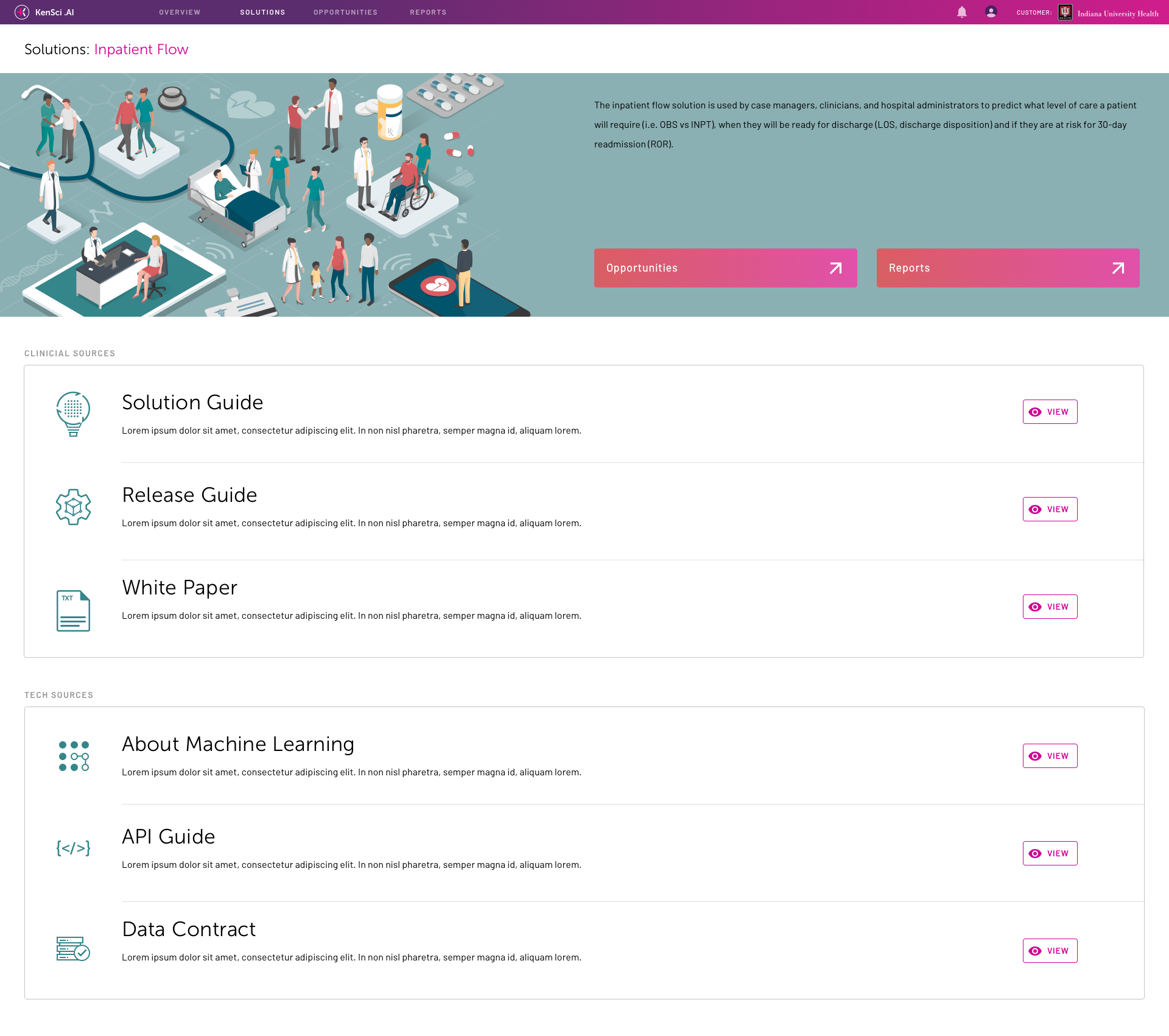
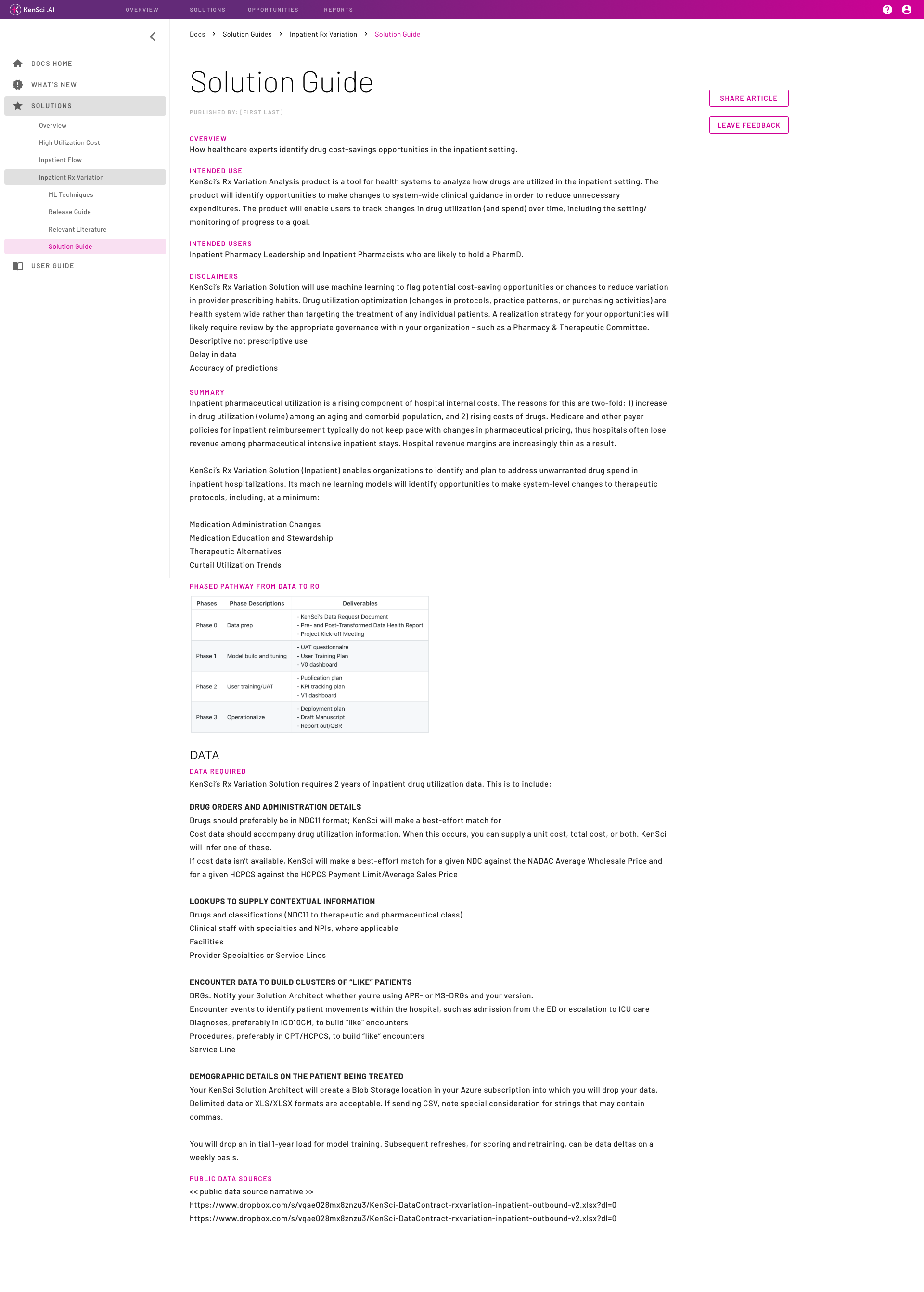
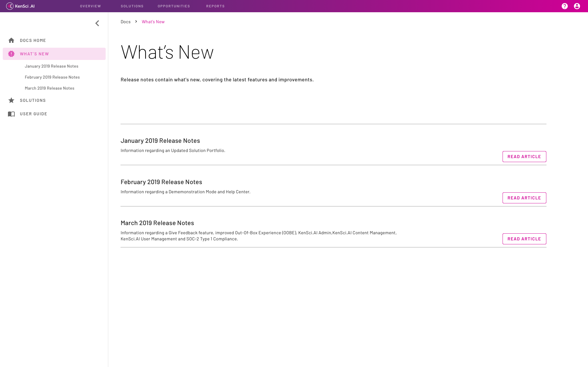
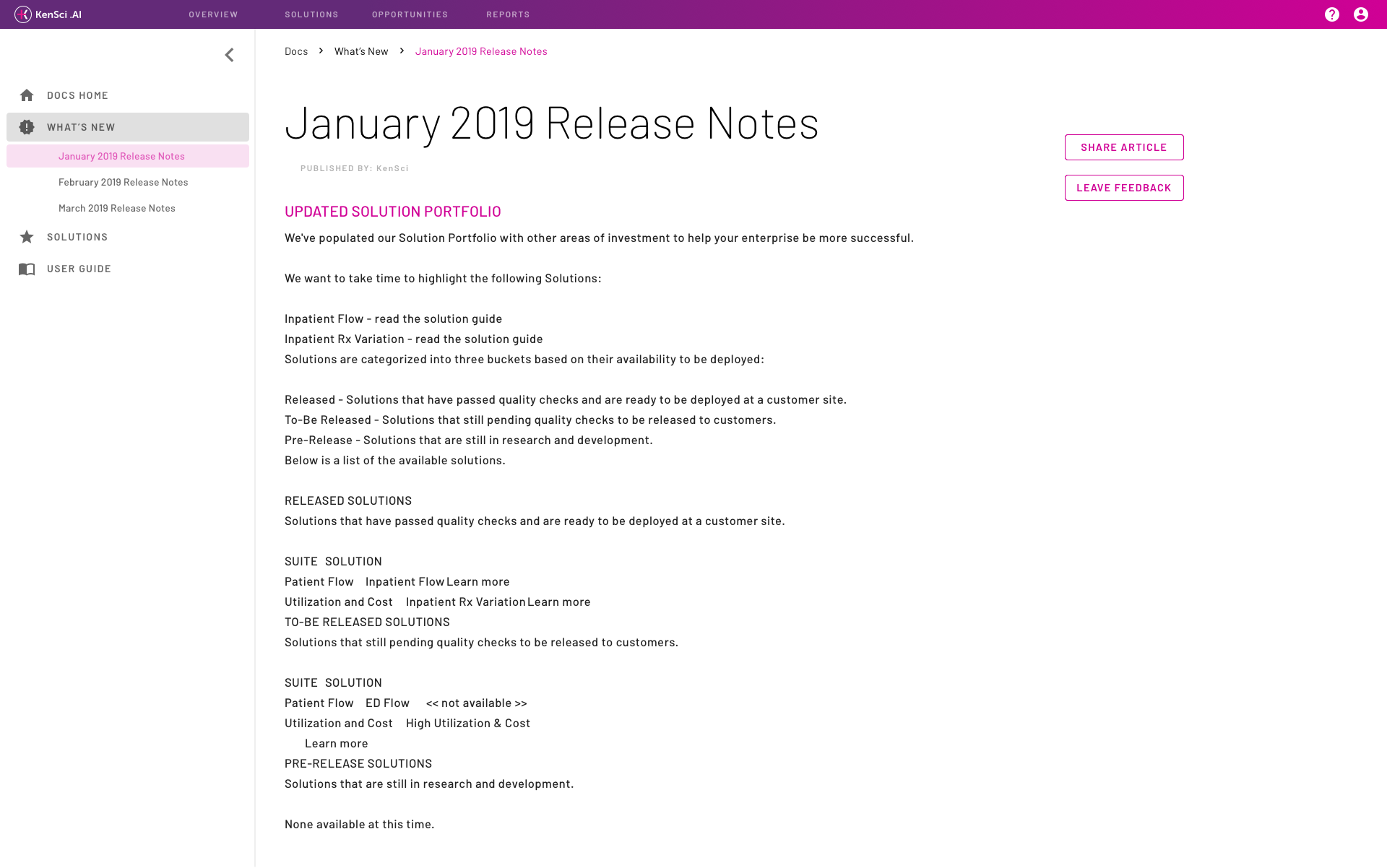
The final product.
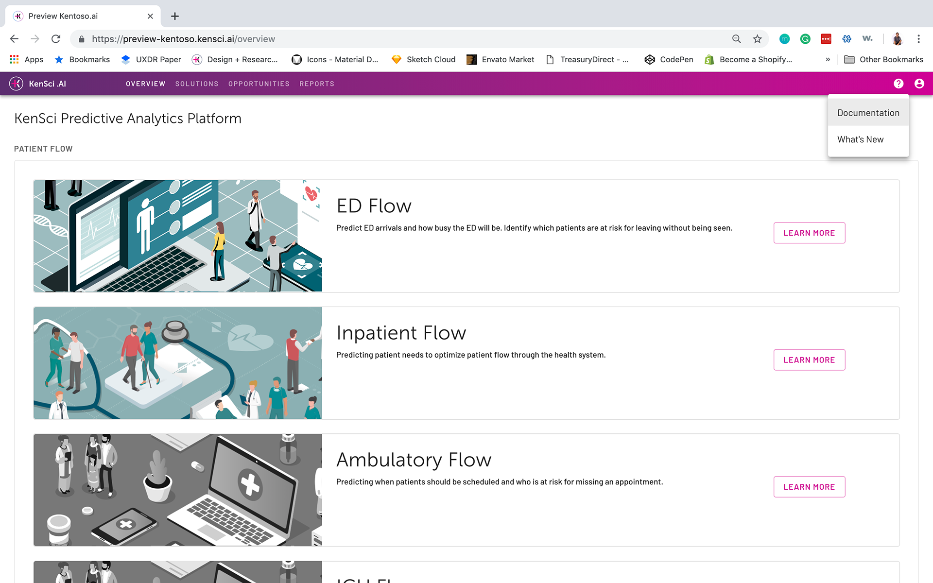
Current live redirect page
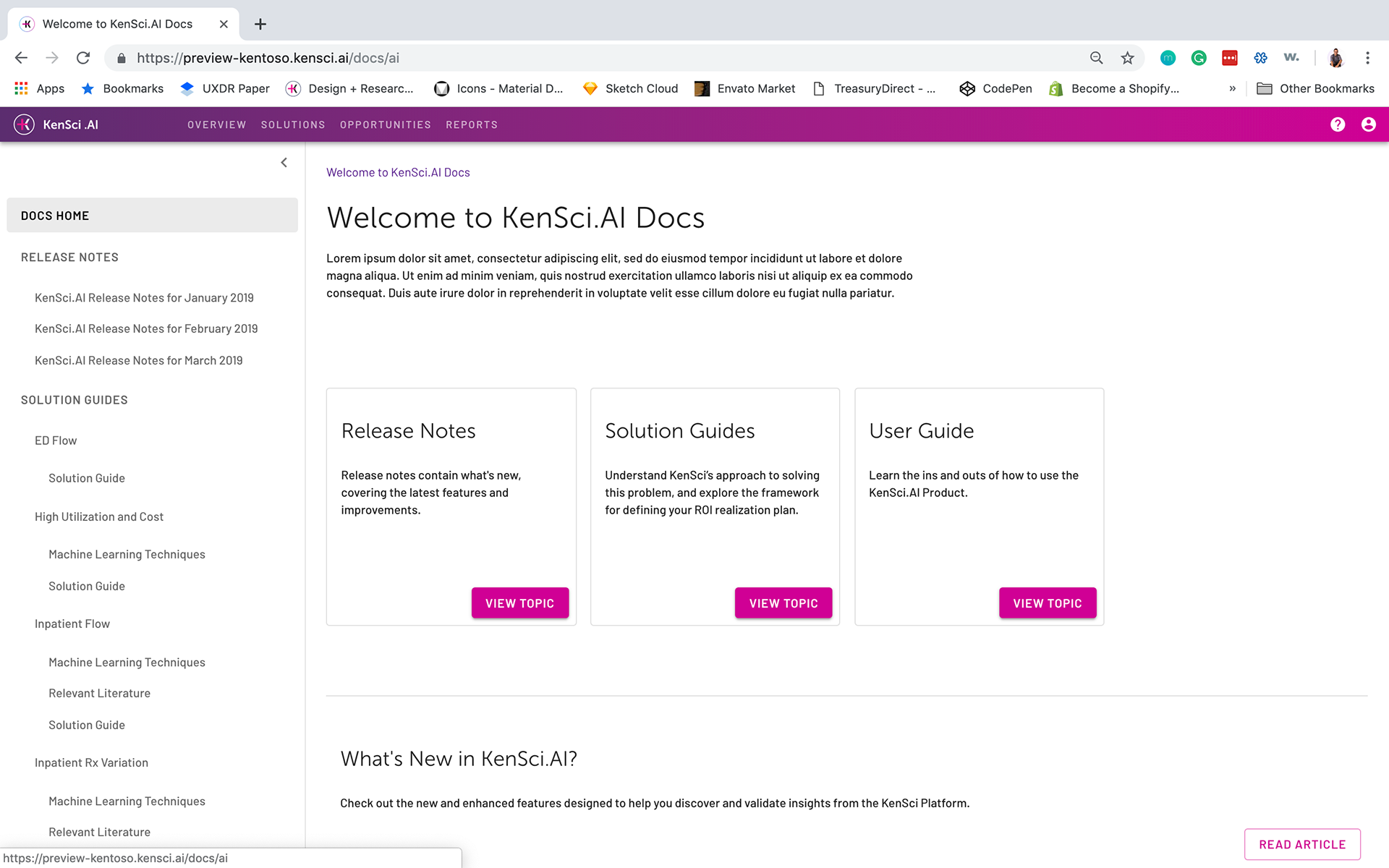
Current live homepage
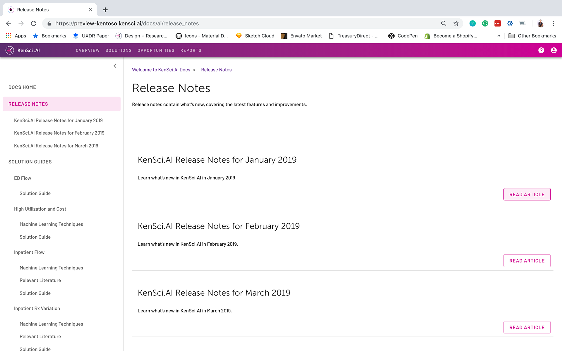
Current live topics page